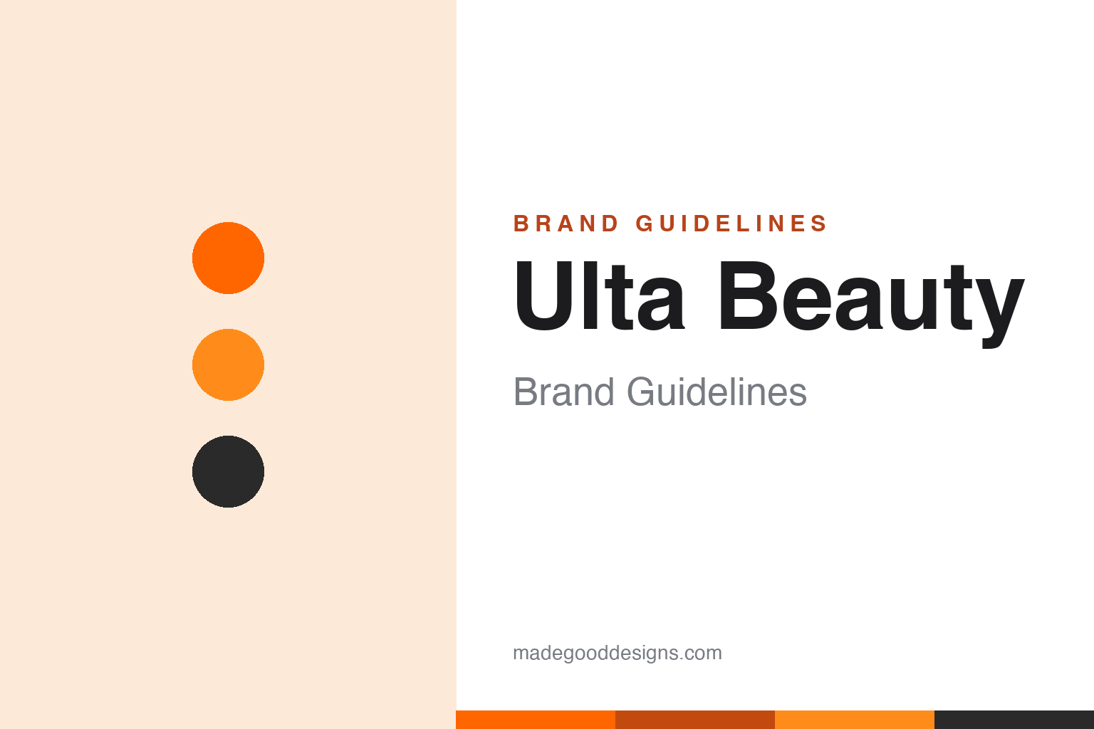
Ulta Beauty Brand Guidelines
Drugstore and prestige beauty under one roof, plus a salon — the orange superstore that became a ‘third option’.
Aa
Two constants: an orange palette and a clean, modern sans. Abstract homage — not the Ulta Beauty wordmark.
The third option
Ulta put mass and prestige beauty in one store.
Ulta is a lesson in a brand built on a category-defining idea. It was founded in 1990 by Richard E. George — a former president of Osco Drug — with co-founder Terry Hanson, launching with five stores in the Chicago suburbs under the name “Ulta3.” The “3” signalled the whole concept: a third option beyond the drugstore and the department store. Where you once had to choose between cheap mass-market cosmetics and pricey prestige counters, Ulta put drugstore and luxury beauty under one roof — plus a full-service salon. That mass-plus-prestige-plus-salon superstore model was genuinely new, and it became the template for modern beauty retail. (Honest caveats: no official brand hex or wordmark typeface is published, so the colours and type here are approximate.)
The name evolved with the business. “Ulta3” became “Ulta” at the end of 1999, and the brand became “Ulta Beauty” in a holding-company reorganisation completed in January 2017. Throughout, the model stayed the same: a beauty superstore mixing high and low, anchored by in-store salons and brow bars and by one of retail’s largest loyalty programs, Ultamate Rewards (tens of millions of members). In 2021 it launched “Ulta Beauty at Target” shop-in-shops (a partnership set to end in 2026), extending the brand’s reach.
The identity is orange — warm, energetic and distinctive in a category full of pinks, blacks and pastels. That confident orange wordmark helped Ulta stand out and signalled an approachable, fun, everyone’s-welcome take on beauty (versus the intimidating luxury counter). On ownership: Ulta Beauty is publicly traded (NASDAQ: ULTA), headquartered in Bolingbrook, Illinois, and is the largest beauty retailer in the United States. A store built on a single, powerful idea: why choose?
Colour
Ulta lives in orange. Click a swatch to copy the hex.
Ulta’s palette centres on a warm, energetic orange — friendly, optimistic and genuinely distinctive in a beauty category dominated by pinks, blacks, whites and pastels — with charcoal and white support. The orange reads as approachable, fun and inclusive (the opposite of an intimidating luxury counter), matching a superstore that welcomes both drugstore and prestige shoppers. It’s a confident, ownable choice that helped Ulta stand out and signal its everyone’s-welcome positioning. The honest caveat: Ulta publishes no official public brand hex — the orange here is an approximation (widely cited around #FF6600), not a confirmed spec.
The lesson is an unexpected colour for differentiation. Ulta’s orange is unusual in beauty and therefore ownable — it says “approachable and fun,” not “exclusive.” For designers, it’s a reminder that choosing a colour the category avoids can be a powerful differentiator. The takeaways: pick a distinctive, unexpected colour to stand apart (orange in beauty); use it to signal your positioning (approachable, inclusive); and treat specific hexes as approximate when no official spec is published.
Typography
The wordmark is a clean, modern sans — friendly and approachable.
Ulta Beauty’s clean, modern sans wordmark — the orange “ULTA Beauty” — is friendly and approachable. The even, contemporary letters read as fresh, welcoming and inclusive, matching a beauty superstore that deliberately isn’t intimidating, and the warm orange keeps it energetic and fun rather than exclusive or clinical. It’s legible and confident, the visual equivalent of the brand’s “beauty for everyone” promise. It reads as accessible and modern — exactly the come-as-you-are personality Ulta wants. (Because the exact face is undocumented, the honest description is “a clean, modern sans,” not a named font.) The type behaves like the brand: friendly, modern and approachable.
Aa
A clean, modern sans — friendly and approachable. (Specimen set in Poppins, a geometric sans in the spirit of the Ulta Beauty wordmark; the real face is undocumented.)
Why choose?
Ulta won by refusing to make shoppers choose.
Ulta is a lesson in winning a category by refusing its false choice. Beauty retail had long forced a choice — cheap drugstore or pricey prestige counter — and Ulta’s whole idea (the “third option”) was to reject it: put everything under one welcoming roof, add a salon, and make beauty approachable for everyone. That single, clear positioning, expressed through a warm, distinctive orange identity, turned Ulta into the largest beauty retailer in the US. The design’s job was to feel inclusive and fun rather than exclusive, and the orange does exactly that. Sometimes the best strategy is to dissolve the category’s assumed trade-off.
For designers and brand-builders, Ulta offers a clear takeaway: a clear, category-redefining idea plus a differentiating identity can win a market. The lessons: find and reject the category’s false choice (drugstore vs. prestige → both, plus salon); pick a colour that signals your positioning and stands apart (approachable orange in a pink-and-black category); and reinforce loyalty with a strong program (Ultamate Rewards). It’s also a reminder to keep the facts precise — Ulta was founded in 1990 by Richard George as “Ulta3” (the “third option”), became Ulta Beauty in a 2017 reorganisation, runs the mass-plus-prestige-plus-salon superstore model, and is the largest US beauty retailer (NASDAQ: ULTA), with its Target partnership ending in 2026. Ulta won by refusing to make shoppers choose — proof that dissolving a false trade-off can define a brand.
Explore & save
Keep Ulta Beauty’s identity on hand — save it to a board in the Made Good inspiration library.
Ulta Beauty identity set
Pin the orange palette and the modern-sans spirit to your own board.


