Zaptec Brand Guidelines
The Stavanger charging company with a lightning-bolt Z and a charger the size of a tablet.
Aa
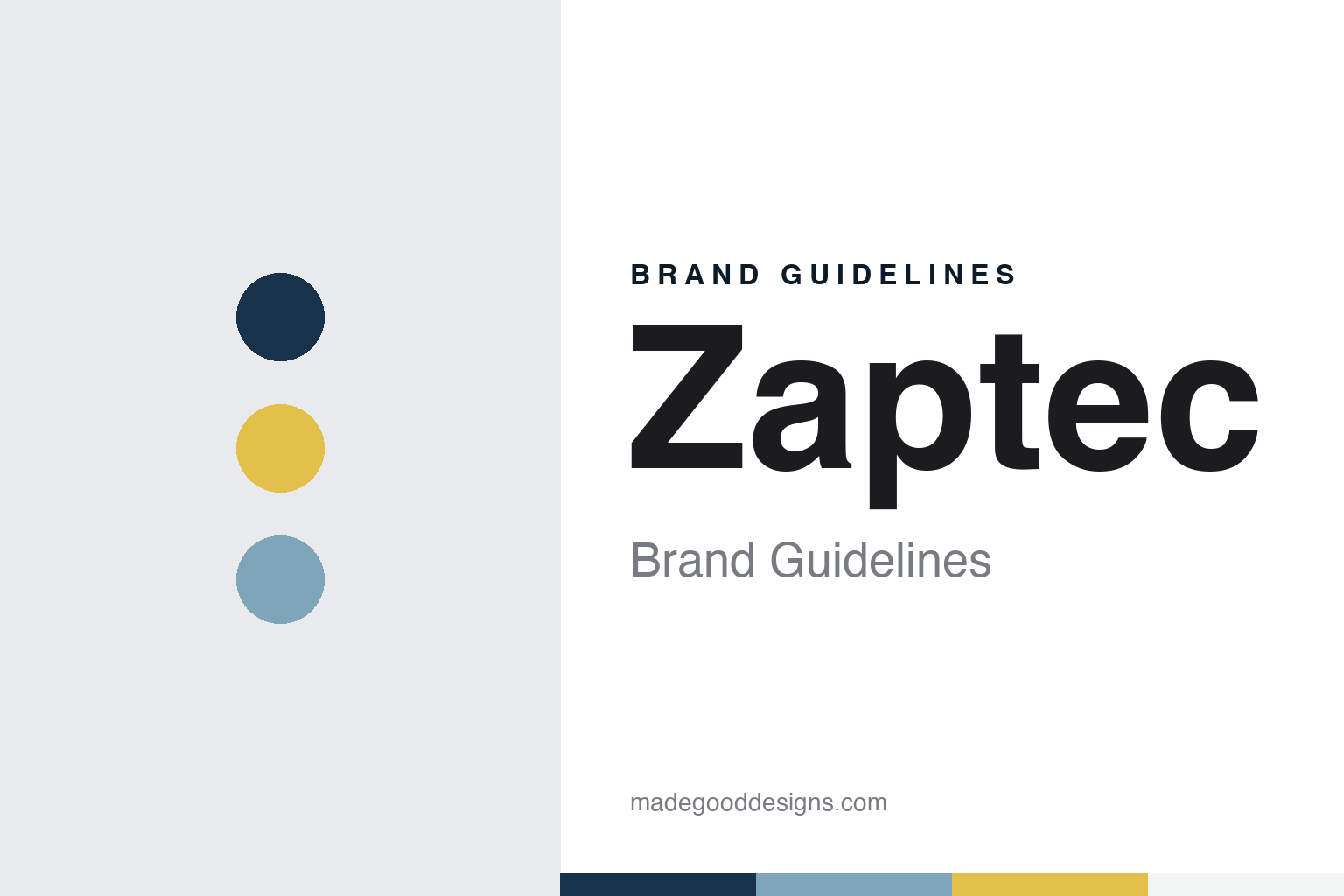
Two constants: a fjord blue, mist and spark yellow palette and a Nordic sans register. Abstract homage — not a Zaptec product or mark; no charger, logo or Z-sign is reproduced.
Zensor
A Stavanger start-up and a transformer cable.
Zaptec is a Norwegian company from Stavanger, founded in 2012, according to Norwegian Wikipedia and to Red Dot’s 2021 award entry for the company. Norwegian Wikipedia describes it as a technology company that designs, produces and sells charging stations and software for electric cars, with its head office in Stavanger, a branch in Oslo and offices in other European countries, among them Sweden, Denmark, the United Kingdom and Germany.
Its first headline product was not a wall charger. In 2015 Zaptec won the Norwegian Tech Award, the prize the engineering weekly Teknisk Ukeblad gives for the year’s biggest Norwegian technology achievement, for a charging cable with a fully isolated galvanic transformer, which the magazine described as a first. Developed with Renault, the cable changed the voltage so that Renault’s Zoe could charge on the Norwegian “IT” grid, Teknisk Ukeblad reported. The magazine named Øyvind Wetteland as one of the company’s two founders and Brage Johansen as its chief executive at the time, and traced the firm back to a predecessor called Zensor, which it had first written about in 2012.
The transformer did not last. In November 2018 Teknisk Ukeblad reported that the award-winning technology had been shelved, that the collaboration with Renault had ended and that the company had changed its management several times, though it still existed. Norwegian Wikipedia’s list of honours from those years also includes the Vebjørn Tandberg award in 2016, and both the Telenor Greenovation award and a regional win in the Made in Norway competition in 2017.
Colour
Charging stations and a stock listing.
Zaptec rebuilt itself around the charging station. Norwegian Wikipedia lists five products, from the Zaptec Go home charger and the Zaptec Pro system charger to a load balancer called Zaptec Sense, a cloud service for managing chargers and a payment service, and it says the company offers ways to match charging to the power capacity available on a site. In its stock-exchange notices the company describes itself as a developer of charging systems for blocks of flats, single-family homes and office buildings, with a range it says makes room for a large number of charging points on one site. Its notices from December 2022 also listed charging columns and a payment service called Charge365 alongside the Go and the Pro.
The growth was financed on the stock market. Zaptec listed on Euronext Growth in Oslo in 2020, its then chief executive, Peter Bardenfleth-Hansen, said in an Oslo Børs announcement two years later. On 22 December 2022 its shares moved to the Oslo Børs main market under the ticker ZAP, after the Norwegian Financial Supervisory Authority approved its prospectus on 20 December, the company announced. The Oslo Børs announcement described Zaptec as the market leader in Norway, developing charging systems for homes and office buildings, and Bardenfleth-Hansen named the United Kingdom, Germany, the Netherlands and France as markets the company wanted to grow in.
The leadership has changed since then. In February 2024 Zaptec announced that Kurt Østrem, who had been its finance chief and, for the third time in his career with the company, its acting chief executive, had been appointed chief executive after a search by the board.
Typography
How EV charger makers present themselves.
Makers of electric-vehicle chargers sell a box that most people only notice when they need it. Their pictures therefore tend to put the hardware where it lives: a wallbox on a garage wall beside a parked car, a row of rapid chargers under a canopy at a motorway service area, a cable plugged into a car at dusk with the screen lit. The setting tells the buyer which kind of charging the company means, from overnight at home to a short stop on a long trip.
The second set of images is about the system rather than the plug. App screens show a charging session, a schedule or a fleet of chargers on a map, and diagrams show how power cabinets, posts and software connect. For makers that sell mainly to charging operators, depots and retailers, these pictures often matter more than the car, because the customer is buying a network that has to be installed, monitored and serviced.
Factories are the third theme. Many charger makers show their own production lines, with cabinets moving between stations, technicians testing power electronics and finished units waiting to be shipped, as a way of making engineering visible. Trade fairs play a similar part: events such as Power2Drive in Munich and the international EVS electric-vehicle symposium are where new chargers are unveiled, photographed and compared.
Many of these chargers spend their working lives in someone else’s colours. A rapid charger may carry the livery of the operator, the supermarket or the fuel company whose forecourt it stands on, so a maker’s identity often rests on form: the shape of the cabinet, the placement of screen and cable holders, and a name that may appear only in small type. Reading these brands means looking at the hardware as closely as at the logo.
Aa
A clean Nordic sans for a home-charger brand. (Specimen set in Manrope, a sans STAND-IN; NOT the Zaptec logo.)
Zaptec
A Z-sign drawn like lightning.
Zaptec’s design is better documented than most in its field, thanks to two awards. In 2021 its brand relaunch won a Red Dot award in the Brands & Communication Design category. Red Dot’s entry credits the Stavanger agency Montaag and says the company launched a new visual profile in 2020 to position itself internationally as a forward-looking brand in electric-car charging. According to the entry, the brand design centres on the freedom of charging a car at home; the colour palette reflects Zaptec’s Norwegian roots, while the photography is meant to inspire “a greener everyday life”; and the Z-sign recalls a bolt of lightning as a symbol of energy, an idea carried into the slogan “Zaptec powers adventure.” The entry also presents the product name Zaptec Go as part of that relaunch.
The product followed the brand. In 2022 the Zaptec Go won a Red Dot award for product design. Red Dot describes a home charger “no bigger than a tablet,” weighing 1.3 kg, whose understated colours are meant to let it blend into its surroundings, and its jury singled out the regular software updates and a design “reduced to the essentials.” The entry credits the design to the Stavanger studio Elleve and names Westcontrol, of Tau in Norway, as the manufacturer. Norwegian Wikipedia adds that the Go came top in the Norwegian Automobile Federation’s 2022 test of home chargers.
For a design guide, Zaptec shows how a Stavanger engineering start-up rebuilt its identity around a Z drawn like lightning, a palette meant to speak of Norway and a charger small enough to fade into a garage wall. Compare Easee, another Nordic home-charger brand, and Wallbox, another maker of home chargers. For this guide we use a fjord blue, a coastal mist and a spark yellow with a sans, an unofficial interpretation; no product or logo is reproduced.
Explore & save
Keep Zaptec’s identity on hand — save it to a board in the Made Good inspiration library.
Zaptec identity set
Pin the Zaptec fjord blue, mist and spark yellow palette and the Nordic sans register to your own board.