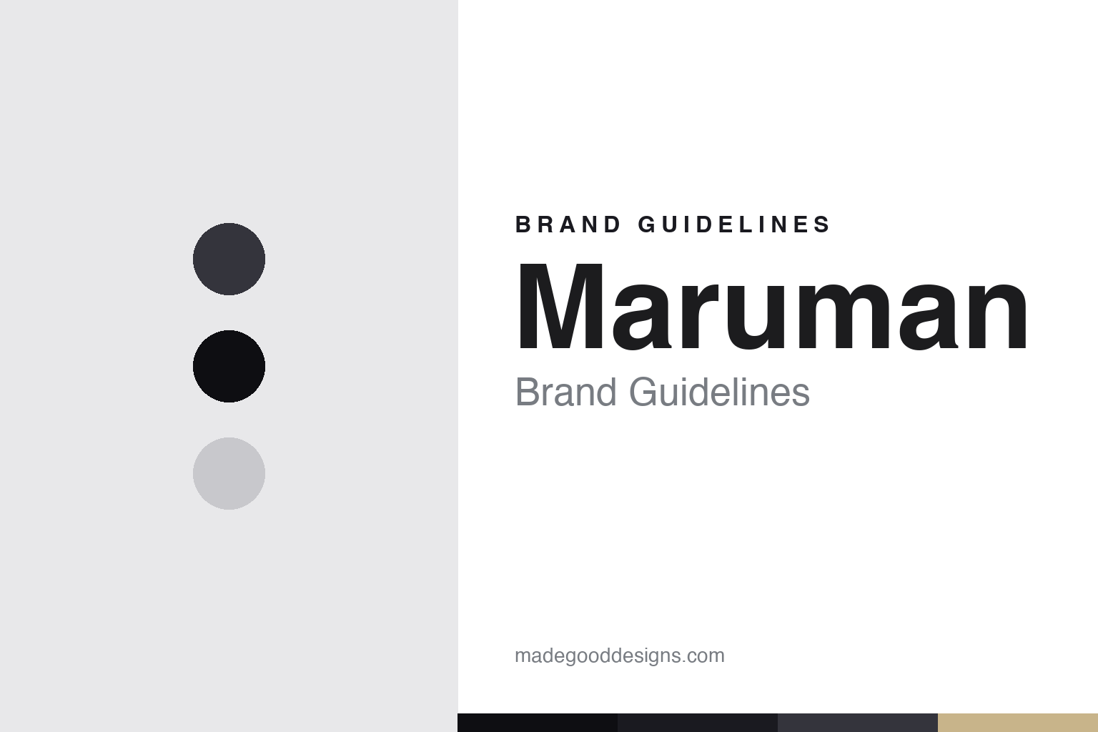
Maruman Brand Guidelines
A century of paper — the humble yellow Zuan sketchbook and the matte-black Mnemosyne.
Aa
Two constants: a graphite palette and a clean geometric sans. Abstract homage — not the Maruman wordmark or Zuan cover.
A century of paper
Maruman spans the sketchbook and the notebook.
Maruman is a lesson in an everyday icon and a premium flagship under one roof. It was founded in 1920 by Koichi Iguchi, making student sketchbooks — a genuine, foundational heritage (incorporated 1947, renamed Maruman Co., Ltd. in 1962; HQ Nakano, Tokyo; it marked its 100th anniversary in 2020). (An honest disambiguation: this stationery Maruman is not the unrelated “Maruman” golf-equipment company.)
Its most beloved product is the Zuan Series sketchbook (図案) — the instantly recognizable yellow cover with a green cross-hatch grid and spiral binding, a fixture of Japanese schools and art rooms whose cover design dates to 1958 (it won a Good Design Long Life Design Award in 2008). Alongside it, the Croquis book (around 1970) — a cream/tan cover with thin drawing paper, loved for quick gesture sketching. At the other end of the range sits the Mnemosyne line (2004): a premium, matte-black professional notebook built around “writing and thinking create creativity,” aimed at business and knowledge work.
Maruman also pioneered spiral-bound notebooks in Japan (1960) and built a major business in loose-leaf paper and binders (from 1968), plus the vivid, slim Septcouleur (“seven colours”) notebooks. It remains an independent Japanese stationery maker. The through-line is a company that spans, in its own framing, “from kindergarten to professional artist” — the humble classroom sketchbook and the premium thinking tool. (No official brand hex or typeface is published.)
Colour
Maruman lives in a graphite palette. Click a swatch to copy the hex.
Maruman’s identity is understated, crafted and dual-natured — the graphite and matte black of the Mnemosyne, lifted by the cream of a Croquis cover. The palette reads as pencil and paper: the tones of drawing and thinking, restrained and material. It’s a crafted, understated world that signals paper, drawing and the thinking tool. It’s a graphite palette that signals crafted understatement and the sketchbook-and-notebook. The honest caveat: Maruman publishes no official brand hex, so the graphite, black and cream here are an original, unofficial interpretation of its products, not first-party values.
The lesson is a graphite palette signals paper and craft. Maruman’s understated world reads as material and considered. For designers, it’s a reminder that the tones of pencil and paper — graphite, black, cream — can express a maker rooted in drawing and thinking. The takeaways: use graphite-and-cream for a paper craft; let restraint read as quality; and treat specific hexes as unofficial when there’s no published spec.
Typography
The wordmark is a clean geometric sans — considered and modern.
Maruman’s identity carries a considered, understated, modern spirit — a “Maruman” wordmark whose clean forms read as crafted and quiet. A clean geometric sans captures the mood: it’s considered and modern, matching a maker that spans the humble sketchbook and the premium Mnemosyne. Set against a graphite palette, the geometric sans feels understated and crafted — exactly the paper-and-drawing personality Maruman carries. It’s clean and considered rather than loud or ornate, mirroring a matte-black notebook. (Maruman’s real wordmark is a trademark we describe but don’t reproduce.) Because the exact wordmark isn’t ours to use, the honest description is “a clean geometric sans spirit,” not the Maruman logo. The type behaves like the brand: considered, understated and modern.
Aa
A clean geometric sans spirit — considered and modern. (Specimen set in Jost, a geometric sans; NOT the Maruman logo, which is a trademark.)
An everyday icon as the difference
Maruman made the yellow sketchbook.
Maruman is a lesson in an everyday object that becomes cultural furniture. The Zuan sketchbook — that yellow-and-green spiral book — isn’t expensive, isn’t precious, and has barely changed since 1958; yet generations of Japanese students and artists have drawn in it, and its cover is as instantly recognizable as any luxury logo. That’s the quiet power of a humble, consistent, beloved everyday object: by staying the same, staying affordable, and being genuinely good, it becomes part of the culture’s furniture — an icon earned through familiarity rather than prestige. And Maruman proves the same company can hold that humble icon and a premium flagship (Mnemosyne) at once, because both rest on the same paper craft. The lesson is that consistency and honest quality in an everyday object can build an icon as durable as any premium brand — sometimes more so, because it lives in everyone’s hands. Anyone can make a sketchbook; Maruman made the one a country grew up drawing in. Stay humble and consistent, and the everyday becomes the difference.
For designers and brand-builders, Maruman offers a clear takeaway: a consistent everyday object can become an icon. The lessons: keep a beloved design consistent (the Zuan since 1958); let one craft serve both humble and premium tiers (sketchbook and Mnemosyne); and keep the facts precise — Maruman was founded in 1920 making sketchbooks, and the Zuan cover dates to 1958. It’s also a reminder to keep it honest: this is not the Maruman golf company; the Zuan and Croquis are distinct lines; and no official brand hex or typeface is published, so the palette and type here are an interpretation. Maruman made the yellow sketchbook — proof that an everyday icon can be the difference.
Explore & save
Keep Maruman’s identity on hand — save it to a board in the Made Good inspiration library.
Maruman identity set
Pin the graphite palette and the geometric-sans spirit to your own board.