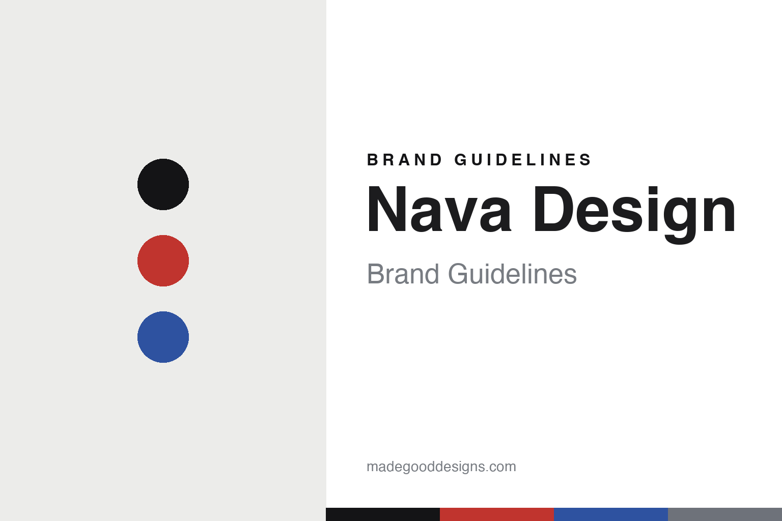
Nava Design Brand Guidelines
The Milanese agenda.
Aa
Two constants: a signal-red-and-blue palette and a rational sans register. Abstract homage — not the Nava Design agendas or packaging.
The Milanese agenda
Nava Design made the diary a design object.
Nava Design is a lesson in rational graphic design as identity. A Milanese house with roots in a family graphic-arts and printing business dating to 1922, its design brand — most often dated to 1970 — made the humble diary into a design object.
Its identity is the Milanese agenda. Nava Design makes agendas, diaries, notebooks, calendars and pencils (and bags and leather goods) in a clean, rational, functional register — its icon the “Settegiorni” weekly agenda with colour-coded page edges. That clarity comes from working with the greats of Italian graphic design. A diary, engineered like a system.
(Honest notes: Nava’s roots run to a Nava-family graphic-arts and printing business from 1922 (the 1922 founder’s name is reported inconsistently), and the “Nava Design” brand is most commonly dated to 1970, though sources conflict — so we hedge the year. Its design pedigree is real and documented: Bob Noorda designed the “Settegiorni” agenda (1972) and Max Huber the “Day by Day” agenda (1972), and collaborators include Massimo Vignelli, Enzo Mari and Ettore Sottsass — but we don’t attribute names we couldn’t confirm. On ownership we’re careful: Nava is not simply independent — it went through a judicial liquidation in 2024 and was acquired by the Osama Group in 2025. We don’t claim a Compasso d’Oro for Nava’s products (those awards belong to its designers’ other work), and “Made in Italy” we treat as a press claim. There’s no official brand hex, and we reproduce no cover, colour-edge treatment or logo — these tones are an unofficial interpretation. This is design commentary and does not promote any product.)
Colour
Nava Design lives in a signal-red-and-blue palette. Click a swatch to copy the hex.
Nava Design’s identity is rational, graphic and Milanese — a signal red, an ink, a blue, a grey, and a chalk. The palette pairs a red with a blue — the register of rational Italian graphic design. It signals system and clarity rather than novelty. The honest caveat: with no published brand hex, these tones are an original, unofficial interpretation, not first-party values.
The lesson is a red with a blue signals a rational design house. Nava Design’s world is a clear, engineered graphic object. For designers, it is a reminder that applying serious graphic-design thinking to an everyday object — a diary, a calendar — can be a whole identity. Because a bright red can fail as small text, keep type dark and let the colour live in the accents, palette and band. The takeaways: engineer the everyday; work with the greats; keep it rational; and treat any single hex as unofficial.
Typography
The register is a rational sans — clear, functional, Milanese.
Nava Design’s identity carries a clear, functional, Milanese spirit — a rational graphic object. A clean neo-grotesque sans captures the mood: it is precise and modern, the register of Italian rationalist design. Set in a signal-red-and-blue palette, the rational sans feels clear and functional — exactly the personality Nava Design carries. It is systematic rather than decorative, mirroring an engineered diary. (Nava Design’s real agendas, colour-edge treatments and wordmark are works we describe but do not reproduce, and the exact typeface is not ours to use.) Because it is not ours to use, the honest description is “a rational sans spirit,” shown here in a stand-in. The type behaves like the brand: clear, functional and Milanese.
Aa
A rational sans spirit — clear and functional. (Specimen set in Libre Franklin, a clean neo-grotesque sans STAND-IN; NOT the Nava Design packaging.)
Rational design as identity
Nava Design stands for the Milanese agenda.
Nava Design is a lesson in engineering the everyday. A signal-red-and-blue palette, a rational sans and a clear diary make the Milanese agenda the whole brand — rational, graphic, Milanese. The rigour is the differentiator. The differentiator is serious graphic-design thinking applied to a diary, a calendar, a notebook.
Put to work, the identity is a system. A designer building in this spirit would treat an everyday object as an information-design problem — a logic to the layout, a colour code that does real work (as with those page edges), a grid that reads as clarity — and let a rational sans and a tight palette carry it. The lesson Nava Design teaches is that ordinary objects reward serious design attention: by bringing the leading Italian graphic designers to a diary, it turned a commodity into a design icon, and showed that rigour itself can be a brand.
For designers and brand-builders, Nava Design offers a clear takeaway: bring rigour to the ordinary. The lessons: engineer the everyday; work with the greats; keep it rational; and be honest about the story. It is also a reminder to stay accurate: its graphic-arts roots run to 1922 and its brand to around 1970, its “Settegiorni” was designed by Bob Noorda, and it is now owned by the Osama Group after a 2024 liquidation — the palette here is an unofficial interpretation. Nava Design made rational design the brand — proof that rigour can be the difference.
Explore & save
Keep Nava Design’s identity on hand — save it to a board in the Made Good inspiration library.
Nava Design identity set
Pin the signal-red-and-blue palette and the rational-sans register to your own board.