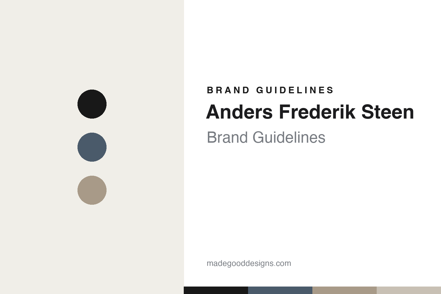
Anders Frederik Steen Brand Guidelines
The sentence is the label.
Aa
Two constants: an ink-on-paper palette and a literary serif register. Abstract homage — not the Anders Frederik Steen labels.
The sentence is the label
Anders Frederik Steen makes the wine’s name a whole sentence.
Anders Frederik Steen is a lesson in words as design. A Danish former chef and sommelier, Steen began making wine in 2013 and settled in Valvignères, in the Ardèche, France, working with his partner Anne Bruun Blauert — an independent, “grapes and only grapes” natural-wine project.
Its brand identity is text-forward and minimal — the cuvée name is the design. Wines are named with long, spoken-word, diaristic sentences, set in plain, unadorned type on minimal labels, with no crest or illustration doing the work. Because each batch is improvised, the labels read like captions on singular moments — for example, “Go Visit Nature Before It Is Too Late” or “Flickering Through My Naked Thoughts.”
(Honest notes: his partner is Anne Bruun Blauert (not “Anne Bossi”). The wines change batch to batch — there’s no fixed range. And there’s no official brand hex, so the tones here are an unofficial interpretation.)
Colour
Anders Frederik Steen lives in an ink-on-paper palette. Click a swatch to copy the hex.
His identity is plain, quiet and text-led — an ink, a slate blue, a warm grey, a stone, and a paper. The palette leans on black ink on warm paper with a soft slate blue — the register of a plainly typeset page. It signals words, honesty and restraint rather than imagery. The honest caveat: with no published brand hex, these tones are an original, unofficial interpretation, not first-party values.
The lesson is ink on paper signals a text-first identity. Steen’s world is a plainly typeset sentence. For designers, it is a reminder that black ink on warm paper reads as literary and honest — right for a label that is all words. The takeaways: keep it ink-on-paper; add one soft accent; and treat any single hex as unofficial — using ink for small text so the palette stays quiet.
Typography
The register is a literary serif — plain and diaristic.
His identity carries a literary, plain, diaristic spirit — sentences as labels. A literary serif captures the mood: it is readable and human, the register of a page of writing. Set in an ink-on-paper palette, the literary serif feels plain and diaristic — exactly the personality the wines carry. It is written rather than designed, mirroring a typeset sentence. (Anders Frederik Steen’s real labels are works we describe but do not reproduce, and the exact typeface is not ours to use.) Because the labels are not ours to use, the honest description is “a literary serif spirit,” shown here in a stand-in. The type behaves like the brand: literary, plain and diaristic.
Aa
A literary serif spirit — plain and diaristic. (Specimen set in Lora, a literary serif STAND-IN; NOT the Anders Frederik Steen labels, which are their own work.)
Words as identity
Anders Frederik Steen stands for the sentence as the label.
Anders Frederik Steen is a lesson in making words the identity. An ink-on-paper palette, plain type and sentence-length names make text the whole brand — literary, minimal, personal. The words are the differentiator. The differentiator is a text-as-label, diaristic, minimal identity.
For designers and brand-builders, Steen offers a clear takeaway: a sentence can be a brand. The lessons: let language carry the design (a spoken-word name, plainly set); match form to philosophy (improvised, per-batch wines get per-batch captions); and resist decoration (no crest, no illustration). It is also a reminder to stay accurate: his partner is Anne Bruun Blauert, there’s no fixed range, and the palette here is an unofficial interpretation. Anders Frederik Steen made the sentence the brand — proof that words can be the difference.
Explore & save
Keep Anders Frederik Steen’s identity on hand — save it to a board in the Made Good inspiration library.
Anders Frederik Steen identity set
Pin the ink-on-paper palette and the literary-serif register to your own board.