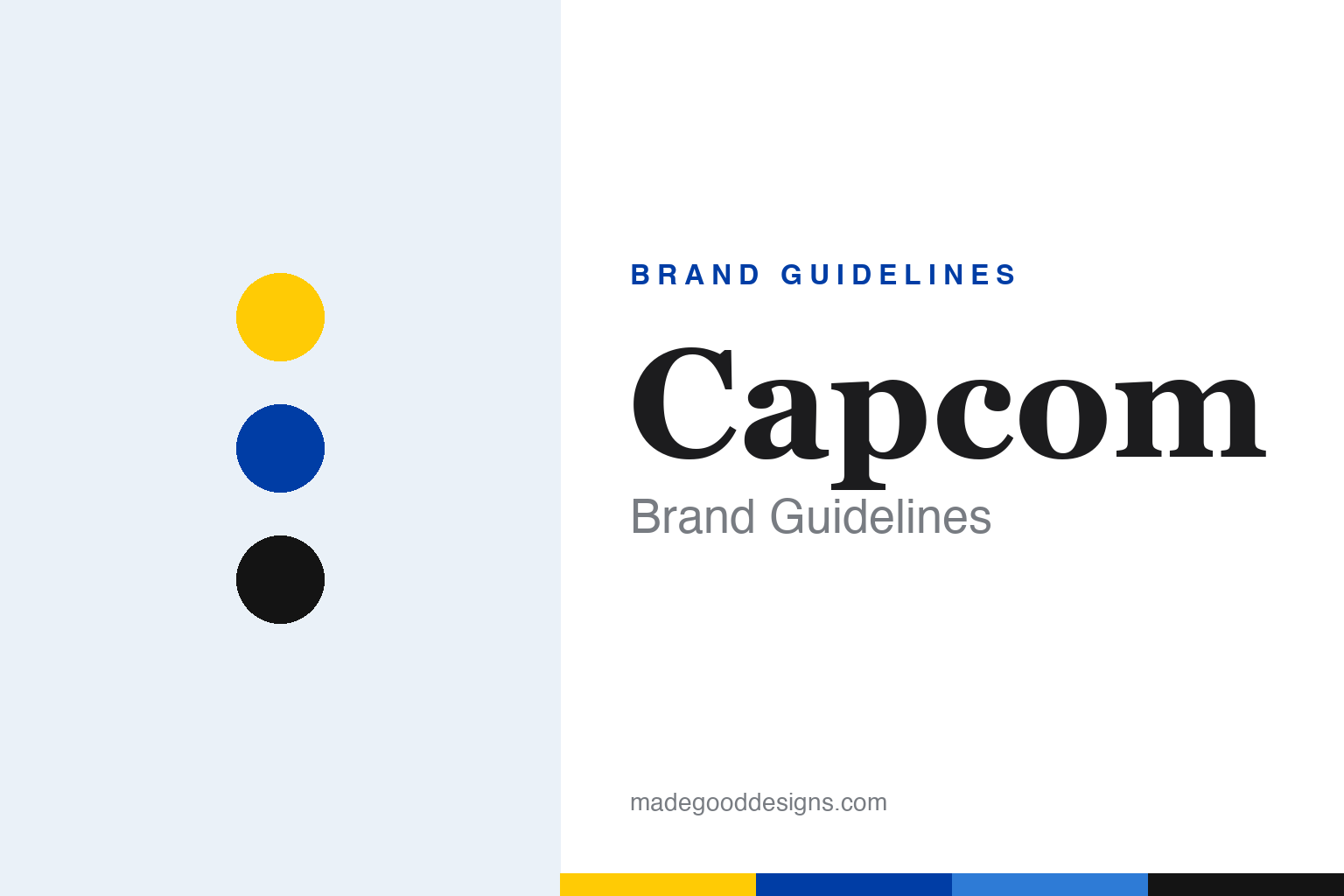
Capcom Brand Guidelines
A yellow wordmark with a blue outline — the Osaka studio behind Street Fighter and Resident Evil.
Aa
Two constants: a yellow-and-blue palette and a warm, rounded slab/serif. Abstract homage — not the Capcom wordmark.
Yellow letters, blue outline
Capcom’s wordmark is one of gaming’s most recognisable — and it has a real typeface behind it.
Capcom’s logo is a bold all-caps “CAPCOM” wordmark: yellow letterforms with a blue outline/contour and filled counters, a flat 2-D mark in use since around 1990. Older players will remember the famous 1990s “chrome/3-D” boot-screen version — a beveled, metallic blue-and-yellow rendering — but that was an animated 3-D treatment of the same wordmark, not a separate logo. Here’s the detail most write-ups miss: the wordmark is a documented typeface, not custom lettering — it’s based on ITC Korinna (Extra Bold), a 1974 face by Ed Benguiat and Victor Caruso (per Fonts In Use). So the honest line is “based on ITC Korinna,” with any per-glyph modifications unverified — do not call it bespoke.
The name and history reward precision. “Capcom” is a contraction of “CAPsule COMputer(s)” — the subsidiary was literally named Japan Capsule Computers — with the “capsule” idea evoking game software as a self-contained “capsule” (the commonly-documented framing leans on that protective-shell-against-knockoffs idea, so it’s best to hedge the exact rationale). On dates: the predecessor I.R.M. Corporation was founded on May 30, 1979 by Kenzo Tsujimoto, and Capcom Co., Ltd. was established on June 11, 1983 in Osaka — so the lineage starts in 1979 while the company we know incorporated in 1983. From there came a run of landmark franchises: Street Fighter (1987) and the genre-defining Street Fighter II (1991), Mega Man (Rockman in Japan), Resident Evil (Biohazard in Japan), Monster Hunter, Devil May Cry and Ace Attorney, plus the modern RE Engine. Capcom Co., Ltd. is a Japanese, independent, publicly listed company (Tokyo Stock Exchange, ticker 9697), with the founding Tsujimoto family still holding a significant stake and leadership.
Colour
Capcom runs on yellow and blue. Click a swatch to copy the hex.
The classic palette is bright yellow with a royal/deep blue (the outline) — a bold, high-energy, arcade-era combination that reads instantly across a crowded screen or a cabinet, exactly the job an arcade logo had to do. Yellow grabs attention and feels playful and optimistic; the deep-blue contour gives the letters weight and definition. In corporate and web contexts Capcom also uses plain black-and-white or a blue wordmark, but the yellow-and-blue is the nostalgic, ownable core. The honest caveat: Capcom does not publish an official public brand-colour style guide with hex values, so figures (a yellow around #FFCB05 and a blue around #003DA5) are approximate, not official.
The lesson is a palette built for its environment. Capcom’s bright yellow-and-blue was engineered for the arcade — maximum visibility and appeal on a screen competing with dozens of others — and that boldness became a nostalgic signature. For designers, it’s a reminder that the best palettes are often shaped by where the brand has to perform: an identity born on arcade cabinets should be bright and high-contrast. The takeaways: design your colours for the real context they’ll appear in (a bright, legible pairing for busy environments); lean into a bold, ownable combination when the category rewards it; and, as always, treat specific hexes as approximate when no official spec is published.
Typography
The wordmark has a real typeface — ITC Korinna Extra Bold.
Unusually for a game company, Capcom’s wordmark is built on a documented typeface: ITC Korinna (Extra Bold), a warm, slightly rounded serif from 1974 by Ed Benguiat and Victor Caruso. Korinna’s soft, sturdy letterforms give the logo a friendly, confident, retro character — approachable rather than aggressive — which suits a company whose catalogue ranges from cheerful (Mega Man) to intense (Resident Evil). Styled in yellow with a blue outline and filled counters, the Korinna letters became a nostalgic hallmark for a generation of players. The takeaway for designers is a good one: you don’t always need custom lettering — a well-chosen existing typeface, styled distinctively (colour, outline, treatment), can become an ownable, iconic wordmark. (Here the honest, verifiable description is “based on ITC Korinna Extra Bold,” not “custom.”) A smart type choice, consistently styled, did the work of a bespoke logo.
Aa
A warm, rounded slab/serif — friendly and retro. (Specimen set in Rokkitt, a slab serif in the spirit of the Capcom wordmark, which is based on ITC Korinna Extra Bold.)
A type choice that became iconic
Capcom shows how a styled existing typeface can be a brand for decades.
Capcom is a lesson in making a typeface your own. Rather than commission bespoke lettering, Capcom took ITC Korinna Extra Bold and styled it distinctively — bright yellow, a blue outline, filled counters, and (in the 1990s) a memorable chrome-3-D boot treatment — turning an off-the-shelf serif into one of gaming’s most recognisable wordmarks. That consistency across decades and platforms, backed by a run of landmark franchises (Street Fighter, Resident Evil, Mega Man, Monster Hunter, Devil May Cry), made the yellow Korinna letters shorthand for a certain kind of quality and nostalgia. The identity’s strength isn’t novelty; it’s consistency and a well-chosen, warmly characterful type.
For designers, Capcom offers a genuinely useful takeaway: a distinctive, consistently-applied treatment of an existing typeface can be as ownable as a custom logo. The lessons: you don’t always need bespoke lettering — the right typeface (Korinna’s friendly, sturdy serif) styled in a signature way (yellow + blue outline) can become iconic; consistency over time is what turns a type choice into a brand asset; and match the type’s character to the brand’s range (Korinna’s warmth suits a catalogue from playful to intense). It’s also a model of factual honesty in brand storytelling — naming the real typeface (ITC Korinna Extra Bold), the real name origin (“Capsule Computers”), and the real dates (I.R.M. in 1979, Capcom Co., Ltd. in 1983). Capcom turned a 1974 serif into a decades-long, instantly recognisable identity — proof that a smart type choice, held with discipline, can be a brand for the ages.
Explore & save
Keep Capcom’s identity on hand — save it to a board in the Made Good inspiration library.
Capcom identity set
Pin the yellow-and-blue palette and the type spirit to your own board.