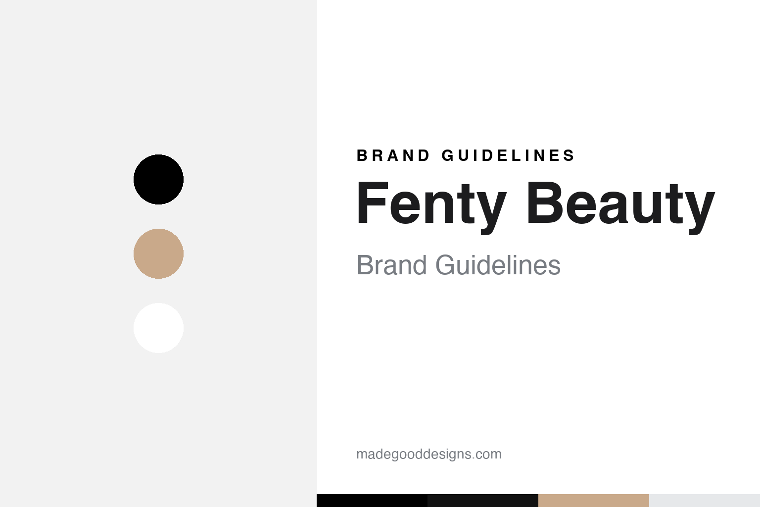
Fenty Beauty Brand Guidelines
Minimal black-and-white and a clear industrial look — the brand that made ‘40 shades’ the new baseline.
Aa
Two constants: a minimal black-and-white system with nude tones, and a condensed sans. Abstract homage — not the Fenty Beauty wordmark.
The launch that changed the industry
Fenty Beauty’s biggest design decision wasn’t visual — it was 40 foundation shades.
When Fenty Beauty launched on 8 September 2017 — created by Rihanna (the brand name is her real surname, Robyn Rihanna Fenty) in partnership with LVMH’s Kendo beauty incubator — it did something the industry had long avoided: it debuted with 40 foundation shades (later expanded to 50), at a time deeper skin tones were routinely underserved. The rollout, in roughly 1,600 stores across 17 countries at once, forced competitors to broaden their own ranges almost overnight — a shift the press dubbed “the Fenty Effect.” The brand’s most important identity decision was inclusion itself, backed by real product rather than just a slogan.
The visual identity supports that positioning with restraint: a spaced-out, condensed “FENTY BEAUTY” wordmark (usually with a lighter “by Rihanna” line), the occasional serif “FB” monogram, and minimal, industrial, unisex packaging — clear/frosted acrylic, matte black caps, neutral product tones. The look is deliberately gender-neutral and accessible-luxury, engineered to read cleanly at small sizes on a phone screen: this is a digital-first, everyone-welcome beauty brand, and it looks like one.
Colour
Fenty Beauty runs a minimal, unisex palette — black, white, nudes. Click a swatch to copy the hex.
The scheme is essentially black and white — black wordmark on white, freely inverted — with neutral/nude product tones and clear or frosted packaging rather than a bright brand colour. Fenty Beauty doesn’t publish official brand hex values, so treat any sampled colours as approximate. The restraint is deliberate and strategic: a clean, industrial, colour-light identity reads as modern, luxury-adjacent and, crucially, gender-neutral — it doesn’t code “feminine” the way pinks and pastels do, which widens the audience.
The lesson is using minimalism to signal inclusivity and modernity. By stripping colour out and leaning on black, white and nude, Fenty avoids the gendered, decorative conventions of legacy beauty branding and reads as clean, unisex and contemporary — the visual equivalent of “beauty for all.” Clear packaging also puts the product (the actual shade range) front and centre, which is exactly where a brand built on inclusivity wants the focus. The takeaway: a restrained, neutral palette isn’t just an aesthetic choice — it can be a strategic signal about who your brand is for.
Typography
The type is clean and condensed — modern, unisex, screen-first.
Fenty Beauty’s wordmark is a spaced-out, condensed sans-serif (widely reported as an adaptation of GT America Compressed — though that attribution is firmly primary-sourced to the separate FENTY fashion house, not Fenty Beauty, so treat the exact face as reported rather than confirmed), paired with a lighter “by Rihanna” line and an occasional serif “FB” monogram. Condensed, modern capitals read as fashion-forward and unisex, and stay crisp at small sizes — right for a digital-first brand. The type, like the palette, is engineered to feel contemporary and gender-neutral, letting the product range and the mission carry the personality.
Aa 17
Condensed, spaced, modern — fashion-forward and unisex. (Specimen set in Archivo; the wordmark is reported to adapt GT America Compressed.)
Beauty for all
Every design choice reinforces one idea — this brand is for everyone.
Fenty Beauty’s whole identity — the 40-then-50 shade range, the gender-neutral black-and-white look, the clear industrial packaging, Rihanna’s global credibility — points at a single message: “Beauty for All.” And it was backed by results (roughly $100M in first-weeks sales and a genuine, lasting shift in industry shade ranges), which is why the inclusivity reads as real rather than performative. It’s worth keeping the Fenty ventures distinct: Fenty Beauty (cosmetics, 2017), Savage X Fenty (lingerie, 2018), the FENTY fashion maison (2019–21, now paused) and Fenty Skin (2020) are separate businesses.
For designers, Fenty Beauty is a case study in identity in service of a mission. The minimal, unisex, screen-first visual language isn’t decoration — it encodes the brand’s inclusive, modern, everyone-welcome positioning, and it lets the real differentiator (the shade range) be the star. The takeaway is that the strongest design choices are the ones aligned with a genuine strategy: strip out the gendered conventions, keep the look clean and neutral, and put the substance — here, unprecedented inclusivity — at the centre. Get the product and the positioning right, and a restrained identity becomes exactly powerful enough.
Explore & save
Keep Fenty Beauty’s identity on hand — save it to a board in the Made Good inspiration library.
Fenty Beauty identity set
Pin the minimal black-and-white palette and the type spirit to your own board.


