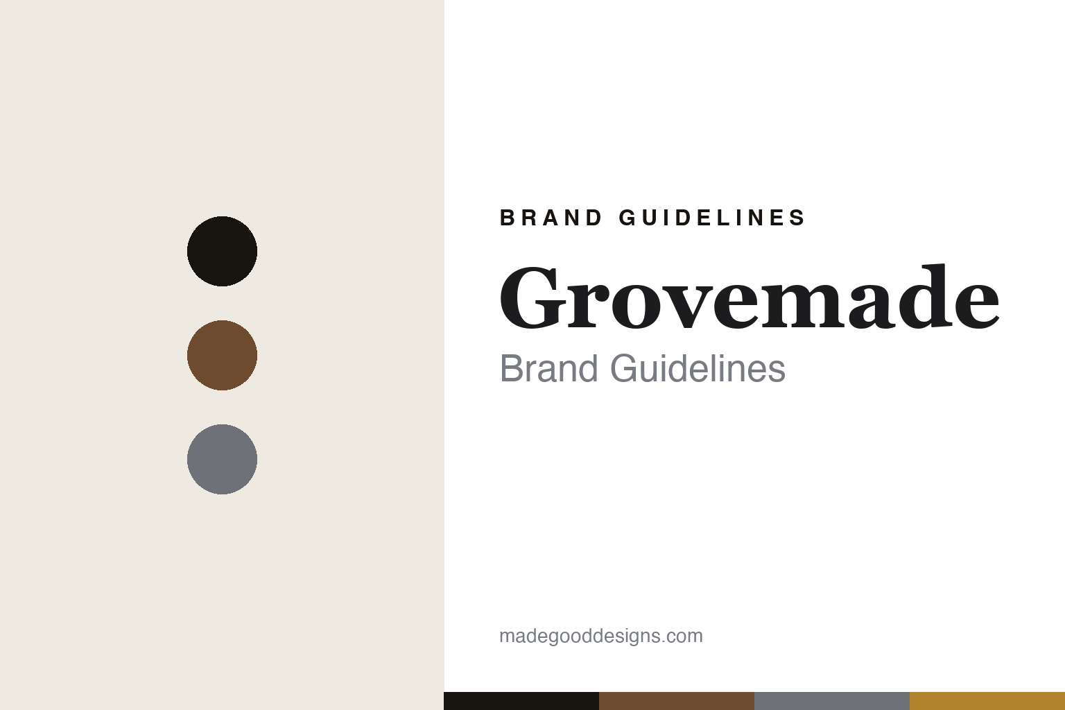
Grovemade Brand Guidelines
The desk object.
Aa
Two constants: a walnut-and-aluminium palette and a material slab register. Abstract homage — not the Grovemade objects or packaging.
The desk object
Grovemade makes the desk into objects.
Grovemade is a lesson in the material as the design. Founded in 2009 in Portland, Oregon by Ken Tomita and Joe Mansfield — starting with wooden phone cases — it makes warm-minimalist desk objects in wood and metal, designed and made in its own workshop.
Its identity is the desk object. Grovemade makes desk shelves, machined pens, pen cups, wool-felt desk pads, wrist rests, monitor stands and lamps in walnut, maple, aluminium, leather and cork — objects where the material and the making are the point. Nothing hidden, nothing lacquered over. A desk, considered object by object.
(Honest notes: Grovemade was founded in 2009 in Portland, Oregon by Ken Tomita and Joe Mansfield, and grew from wooden phone cases; it is founder-led, independent and unfunded, with Ken Tomita as its chief executive. The load-bearing fact is that it is designed and made in-house in its own Portland workshop, which is well documented — so we can say that plainly. We describe its materials (Oregon walnut, maple, aluminium, leather, cork, wool felt) and its “sustainably sourced” language in its own terms; we don’t assert an FSC or other certification, a design award, or an over-specified account of its machinery. There’s no official brand hex, and we reproduce no logo, product or packaging — these tones are an unofficial interpretation. This is design commentary and does not promote any product.)
Colour
Grovemade lives in a walnut-and-aluminium palette. Click a swatch to copy the hex.
Grovemade’s identity is warm, material and American — a walnut, an ink, an aluminium, an ochre, and an oat. The palette pairs a walnut with an aluminium — the register of wood-and-metal desk objects. It signals material and craft rather than novelty. The honest caveat: with no published brand hex, these tones are an original, unofficial interpretation, not first-party values.
The lesson is a walnut with an aluminium signals a desk-object house. Grovemade’s world is a warm, made thing. For designers, it is a reminder that honest materials and visible making — not decoration — can be a whole identity. Because a mid walnut can fail as small text, keep type dark and let the colour live in the accents, palette and band. The takeaways: lead with material; show the making; keep it warm; and treat any single hex as unofficial.
Typography
The register is a material slab — warm, sturdy, honest.
Grovemade’s identity carries a warm, sturdy, honest spirit — a made, material object. A robust slab serif captures the mood: it is solid and grounded, the register of a workshop. Set in a walnut-and-aluminium palette, the material slab feels warm and sturdy — exactly the personality Grovemade carries. It is workmanlike rather than delicate, mirroring a wood-and-metal object. (Grovemade’s real objects and wordmark are works we describe but do not reproduce, and the exact typeface is not ours to use.) Because it is not ours to use, the honest description is “a material slab spirit,” shown here in a stand-in. The type behaves like the brand: warm, sturdy and honest.
Aa
A material slab spirit — warm and sturdy. (Specimen set in Roboto Slab, a robust slab serif STAND-IN; NOT the Grovemade packaging.)
The material as the design
Grovemade stands for the desk object.
Grovemade is a lesson in making material the identity. A walnut-and-aluminium palette, a material slab and a made object make the desk object the whole brand — warm, material, American. The material is the differentiator. The differentiator is honest wood and metal, designed and made in one Portland workshop.
Put to work, the identity is a discipline of material. A designer building in this spirit would let the substance lead — a real grain, a machined edge, a felt surface — and keep type and layout quiet so the object reads as the subject; imagery would show the making, not just the product. The lesson Grovemade teaches is that owning the whole process, from design to workshop, turns provenance into identity: when the maker and the made are the same, the brand is the material and the hand behind it, and restraint everywhere else lets that speak. There is a commercial lesson underneath the craft, too: because Grovemade designs and makes in the same building, it controls quality and pace in a way outsourced brands cannot, and that control itself becomes part of what it sells. For a studio, the takeaway is that vertical integration is not only an operations choice but an identity — the story of how a thing is made can be as compelling as the thing, provided the making is genuinely yours to show.
For designers and brand-builders, Grovemade offers a clear takeaway: let material and making lead. The lessons: lead with material; show the making; keep it warm; and be honest about the story. It is also a reminder to stay accurate: it was founded in 2009 by Ken Tomita and Joe Mansfield, it is designed and made in-house in Portland, and it is independent and unfunded — the palette here is an unofficial interpretation. Grovemade made material the brand — proof that the making can be the difference.
Explore & save
Keep Grovemade’s identity on hand — save it to a board in the Made Good inspiration library.
Grovemade identity set
Pin the walnut-and-aluminium palette and the material-slab register to your own board.