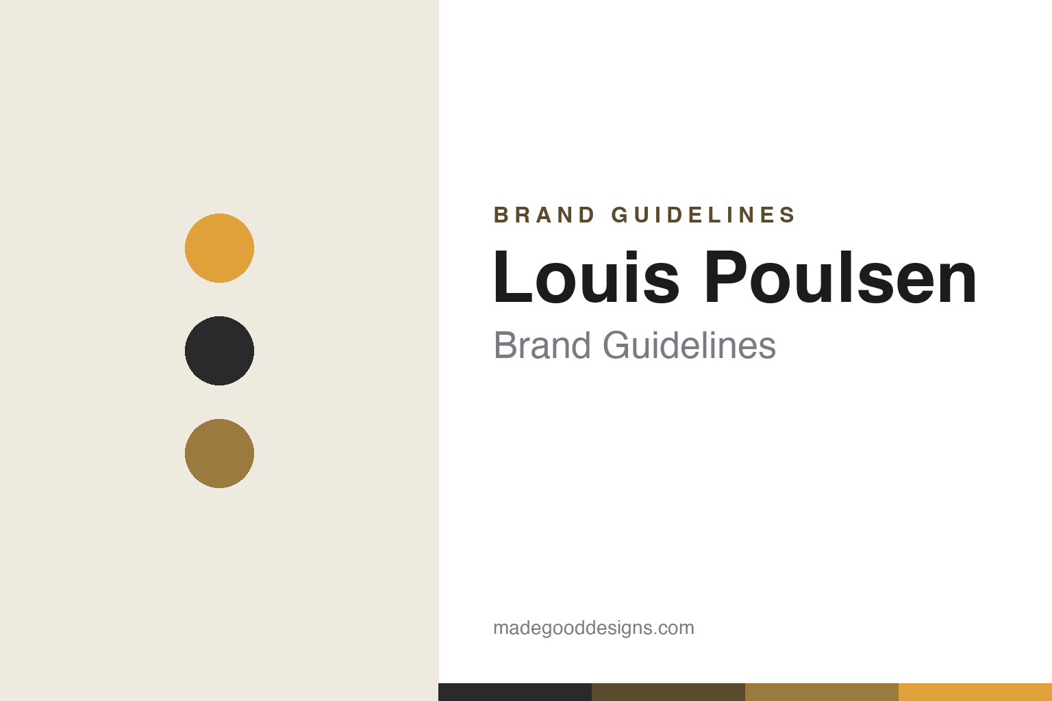
Louis Poulsen Brand Guidelines
Shaping light, not the lamp — Poul Henningsen’s glare-free system, and Danish functionalism.
Aa
Two constants: a warm amber-and-brass glow palette and a clean, functional sans. Abstract homage — not the Louis Poulsen wordmark.
Shaping the light
Louis Poulsen designs glare away.
Louis Poulsen is a lesson in designing light, not just the lamp. The Danish company was founded in 1874 in Copenhagen by Ludvig R. Poulsen — and two honest, often-missed facts: it is named after Ludvig’s nephew, Louis Poulsen (who only joined in 1896), and it did not start in lighting. It began as a wine-import business, then sold tools and electrical supplies; it distributed Poul Henningsen’s PH lamps from the mid-1920s and became an in-house lighting manufacturer around 1941. (Two more honest notes: no official brand hex is published, and the wordmark typeface is undocumented.)
Everything changed with the designer Poul Henningsen (“PH”), whose collaboration began in 1924. His PH lamp — built on a three-shade system whose concentric shades follow a mathematical shade-curve so light is directed and the bulb is hidden to eliminate glare — debuted at the 1925 Paris Exposition (the “Paris lamp”), where it won a gold medal. It made Louis Poulsen’s guiding principle physical: shape the light so the source never dazzles the eye. Henningsen’s masterpiece, the sculptural PH Artichoke (Koglen), was designed in 1958 for the Langelinie Pavillonen restaurant in Copenhagen — 72 copper leaves in 12 rows, glare-free from every angle.
Louis Poulsen became the house of Danish functionalist lighting, producing icons by more than one master: Arne Jacobsen’s AJ lamp (designed 1957, created for the SAS Royal Hotel that opened in 1960) and Verner Panton’s Panthella (1971), among others. On ownership, a precise fact: after private-equity owners (Polaris, then Investindustrial in 2018), Louis Poulsen has sat within Italy’s Flos B&B Italia Group alongside Flos and B&B Italia — and in June 2026 the group agreed to sell it back to the Danish, foundation-owned Chr. Augustinus Fabrikker (pending completion). Its philosophy stays constant: “Design to Shape Light.”
Colour
Louis Poulsen lives in a warm amber-and-brass glow palette. Click a swatch to copy the hex.
Louis Poulsen’s identity is inseparable from the quality of the light itself — a warm, glare-free glow, the amber of a shaded bulb, the brass and copper of the shades, set against calm Danish greys and charcoal. The palette reads as warm, functional and human: the colours of comfortable light rather than a graphic brand scheme, exactly what you’d expect from a company whose whole purpose is the experience of illumination. It’s a warm, glowing palette that signals comfort, craft and functionalism. The honest caveat: Louis Poulsen publishes no official brand hex, so the amber, brass and charcoal here are an original, unofficial interpretation of its light and materials, not first-party values.
The lesson is a warm glow palette signals comfort and function. Louis Poulsen’s amber-and-brass world reads as human and calm. For designers, it’s a reminder that a lighting brand’s truest “colour” is the light it makes — warm, soft and glare-free — and that materials (brass, copper, opal) can carry the identity. The takeaways: let the light and its materials lead the palette; favour warm, functional tones; and treat specific hexes as unofficial when there’s no published spec.
Typography
The wordmark is a clean functional sans — calm and modern.
Louis Poulsen’s identity carries a calm, functional, modern spirit — a restrained “Louis Poulsen” wordmark whose clean, even letterforms read as understated and Danish. A functional sans captures the mood: it’s clear and unshowy, matching a company whose genius is invisible engineering — the hidden geometry that makes light glare-free. Set against a warm amber-and-brass glow palette, the type feels calm and human — exactly the functionalist, “design to shape light” personality Louis Poulsen has cultivated from the PH lamp onward. It’s clean and modern rather than decorative or loud, mirroring lamps whose beauty is in how they perform, not how they shout. Because the exact wordmark face isn’t publicly documented, the honest description is “a functional sans spirit,” not a named font. The type behaves like the brand: calm, functional and human.
Aa
A functional sans spirit — calm and modern. (Specimen set in Jost, a clean functional sans in the spirit of the Louis Poulsen identity; the real face is undocumented.)
Light as the difference
Louis Poulsen designed the glare out.
Louis Poulsen is a lesson in designing the experience, not the object. Most lamps are drawn as shapes; Poul Henningsen’s radical move — and the company’s enduring differentiator — was to start from how light meets the eye. The PH system’s multiple shades follow a logarithmic spiral so that, from any normal viewing angle, you see softly lit surfaces and never the naked bulb: glare is engineered away. That principle — “design to shape light” — turned a lamp into a piece of applied optics, and it is why a PH lamp still feels comfortable in a way a bare fixture never can. Extended by Jacobsen’s AJ and Panton’s Panthella, it made Louis Poulsen the definitive house of Danish functionalist lighting, its icons as much about human comfort as about form. The lesson is that the deepest design can be invisible — solving the experience (no glare, warm light) rather than styling the thing. Anyone can draw a pretty lamp; Henningsen designed the light itself. Shape the light, and comfort becomes the brand. Design what the eye feels.
For designers and brand-builders, Louis Poulsen offers a clear takeaway: solving the underlying experience can define a category. The lessons: design the function first (glare-free light) and let form follow; commit to a clear principle (“design to shape light”) across every product and designer; and keep the story precise — Louis Poulsen dates to 1874 (founded by Ludvig R. Poulsen, and named after his nephew Louis) but only became a lighting manufacturer around 1941, and its icons are Henningsen’s PH lamp (Paris 1925) and PH Artichoke (1958), Jacobsen’s AJ (designed 1957) and Panton’s Panthella (1971). It’s also a reminder to keep the facts honest: ownership has changed hands more than once — it now sits within Italy’s Flos B&B Italia Group, with a June-2026 sale to Denmark’s Chr. Augustinus Fabrikker pending — and no official brand hex or typeface is published, so the palette and type here are an interpretation. Louis Poulsen designed the glare out — proof that shaping the experience can be the difference.
Explore & save
Keep Louis Poulsen’s identity on hand — save it to a board in the Made Good inspiration library.
Louis Poulsen identity set
Pin the warm glow palette and the functional-sans spirit to your own board.


