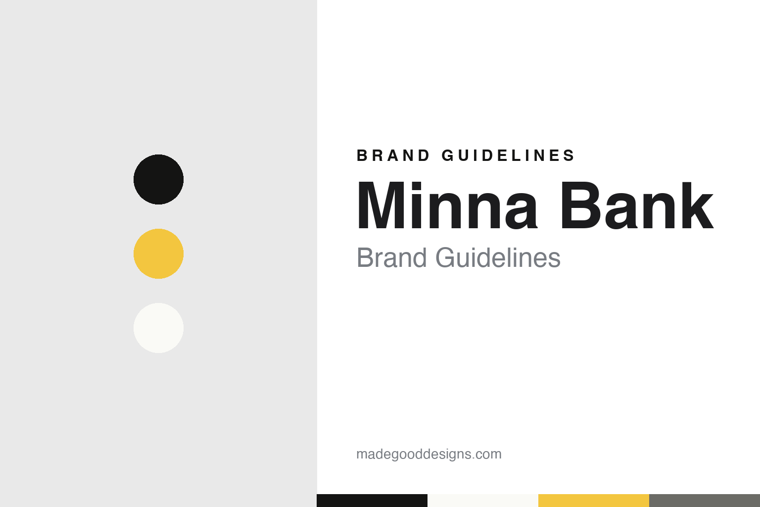
Minna Bank Brand Guidelines
Fukuoka’s phone-only bank, drawn in black, white and a flash of yellow.
Aa
Two constants: a black, white and yellow palette and a geometric sans register. Abstract homage — not a Minna Bank product or mark; no app screen, logo or character is reproduced.
A bank for everyone
A regional group builds a bank for the phone.
Minna Bank — みんなの銀行, Minna no Ginko, in Japanese — is the digital bank of Fukuoka Financial Group (FFG), the Kyushu banking group formed in 2007 from the merger of Fukuoka Bank and Kumamoto Bank, according to English Wikipedia. “Minna” means “everyone,” and the bank presents itself as “a bank for everyone,” the Red Dot Design Award’s 2021 project page explains.
Japanese Wikipedia sets out the dates. FFG announced its plan for a new internet bank on 7 August 2019 and set up a preparatory company in Fukuoka on 15 August 2019. In October 2019 it said the bank’s core system would run on Google Cloud. It applied to Japan’s Financial Services Agency for a preliminary review in November 2020, renamed the company Minna Bank on 10 December 2020 and received its banking licence on 22 December 2020. The systems went live on 4 January 2021, and the bank opened to customers on 28 May 2021.
Japanese Wikipedia describes the thinking behind it: regional banks in Japan faced shrinking local populations and new fintech rivals, and FFG wanted a new business model aimed at young, “digital native” customers across the whole country rather than in its home region. The Red Dot page calls Minna Bank “Japan’s first fully digital bank,” and the bank called itself “Japan’s first digital bank” in a June 2025 release. Everything, from opening an account to transfers and loan applications, is handled on a smartphone; Japanese Wikipedia notes that personal accounts cannot be used from a computer browser and that no cash card is issued — cash goes in and out at Seven Bank ATMs, using the phone.
Colour
Three strokes, black and white, and a cast of characters.
Minna Bank’s identity is unusually well documented, because it won an award. In 2021 the Red Dot Design Award gave the bank its Brand of the Year title in the Brands & Communication Design competition. The project page credits Fjord Tokyo, part of what was then Accenture Interactive, as the lead agency, and lists the claim “Create Valuable Connections to Everyone.”
The page explains the parts. The logo is a monogram of three Roman numeral ones — “III” — that stand for the individual and the community and together form an M; Red Dot says these simple strokes recall the traditional iconography of banks while reinterpreting it. The app, website and other material centre on black and white for a monochrome effect, and a vivid yellow is used as an accent to draw the eye to important information.
Type follows the same idea. The bank has a corporate typeface called Pillar, based, like the logo, on the Roman numeral one, used to pick out key information; alongside it the standard typefaces are Avenir Next for English and AXIS for Japanese, Red Dot says. What softens the strict black and white is drawing: the page describes extensive use of playful illustrations and animations, with original characters and scenes that explain each digital service. The jury singled out those illustrations, saying they give the identity a playful, non-conformist side next to the clean logo, type and black-and-white contrasts.
Other awards followed. Japanese Wikipedia lists a Good Design Award for the app in 2021 and iF Design Awards in 2022 for the app and for product and service branding.
Small naming choices carry the theme into the product. Japanese Wikipedia says customers can pick from eight “original” branches named after bridges around the world — among them Harbour Bridge, Pont Neuf, Ponte Vecchio and Togetsukyo — and that accounts are split into a spending Wallet, a Saving account and up to twenty goal-based Boxes, moved between with a flick.
Typography
Apps, ATMs and disclosure.
Japan’s internet and retail-group banks present themselves mostly through screens rather than branches. Sony Bank opened in 2001 with a service website, MONEYKit, instead of a branch network, and Rakuten Bank, which began in 2000 as eBANK Corporation, calls itself an internet-only bank. Their pages are organised around everyday tasks: deposits in yen and foreign currencies, card and home loans, investment trusts and, more and more, apps and account opening by smartphone.
Many carry the name of a larger consumer group. Rakuten Bank took its parent’s name in 2010, and Sony Bank belongs to Sony Financial Group. The banks set a Japanese name beside a Latin one — 楽天銀行 with Rakuten Bank, ソニー銀行 with Sony Bank — so the same name has to work in two scripts on cards, apps and statements.
Cash is still part of the picture, and it is reached through other companies’ machines. Rather than building large ATM networks of their own, these banks connect to machines in convenience stores and other banks: Rakuten Bank’s 2010 tie-ups with E-net and Lawson put its cards into FamilyMart, Ministop and Lawson stores, and Sony Bank’s history lists connections with Seven Bank, Lawson, E-net and Aeon Bank. Card faces have become a place for character illustration, as with Sony Bank’s PlayStation and PEANUTS designs.
Behind the consumer pages sits a more formal layer of disclosure sections, press releases and investor documents. This guide sets out what can be checked about each bank — who set it up, who owns it and when its name changed — and marks clearly what rests on the bank’s own word.
Aa
A clean geometric sans for a phone-first bank. (Specimen set in Mulish, a sans STAND-IN; NOT the Minna Bank logo or its Pillar typeface.)
Minna Bank
Partner branches and a system for other banks.
Minna Bank also sells its banking to other companies. From September 2021 it opened “partner branches” — banking services offered inside other firms’ apps and communities — starting with one for the illustration platform pixiv, Japanese Wikipedia says; later partners include the bookshop chain Maruzen Junkudo in 2025 and the marketplace app Mercari, whose payments arm Merpay agreed a tie-up with the bank in August 2025.
The technology itself became a product. The core system, built with Accenture on Google Cloud, is run by Zerobank Design Factory, another FFG subsidiary, which began offering it to other institutions in November 2022, according to Japanese Wikipedia. In a release dated June 2025, Minna Bank announced that MUFG Bank had chosen the system for its newly established digital bank — the first time it had been supplied outside the group — and said it served 1.3 million accounts. A physical JCB debit card followed in May 2025, accounts for companies in April 2026, and, from June 2026, the option of holding accounts at up to five partner branches.
For a design guide, Minna Bank shows how a strict monochrome system, one accent colour and a cast of drawn characters can make a bank feel new without a single branch. Compare MUFG, whose new digital bank runs on Minna Bank’s system, and Seven Bank, whose ATMs its customers use for cash. For this guide we use black, white, a warm yellow and a pencil grey with a sans, an unofficial interpretation; no product or logo is reproduced.
Explore & save
Keep Minna Bank’s identity on hand — save it to a board in the Made Good inspiration library.
Minna Bank identity set
Pin the Minna Bank black, white and yellow palette and the geometric sans register to your own board.