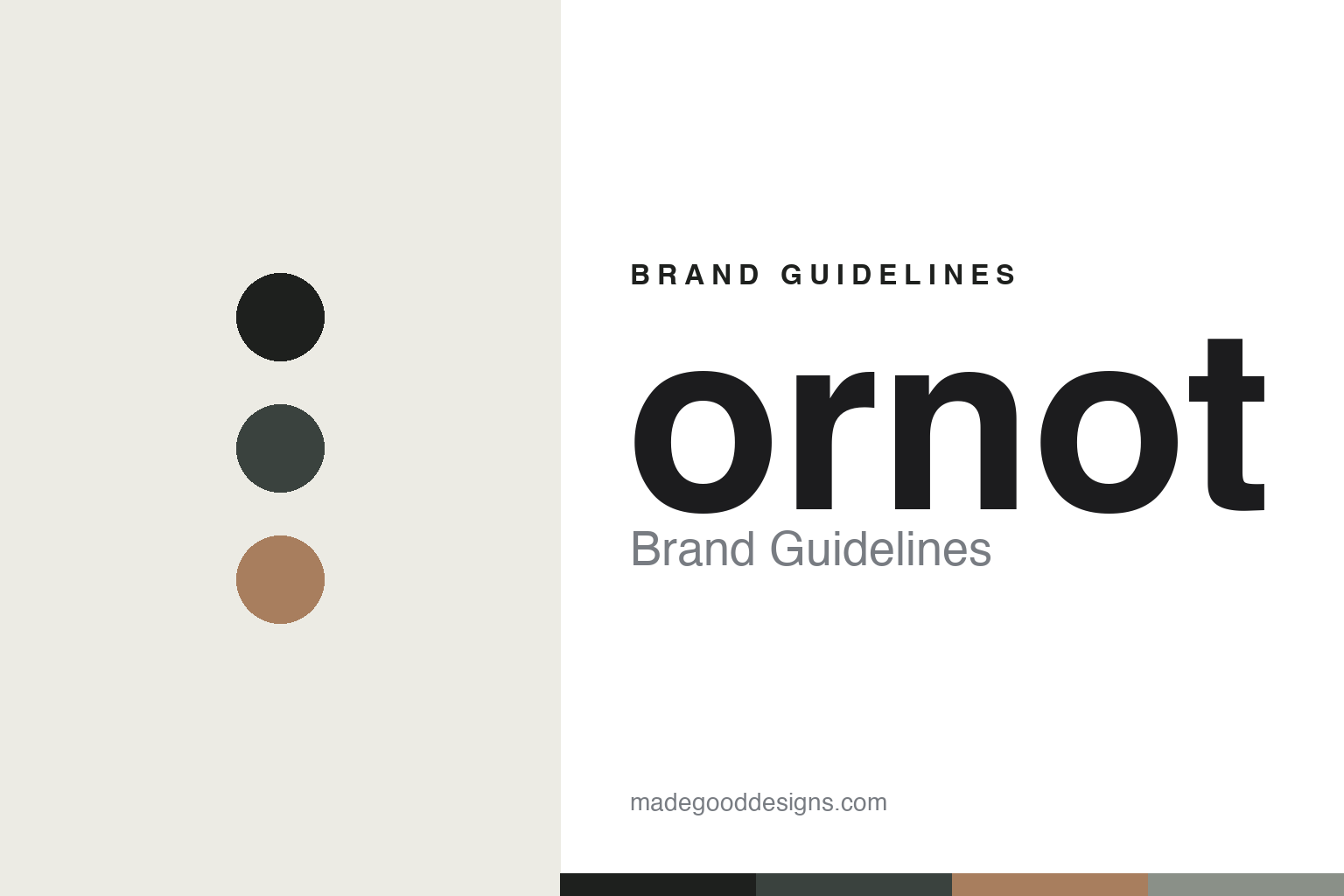
Ornot Brand Guidelines
Make the logo smaller.
Aa
Two constants: a muted, understated palette and a quiet sans register. Abstract homage — not the Ornot wordmark or logo.
Make the logo smaller
Ornot dresses cycling in quiet restraint.
Ornot is a lesson in restraint as a design language. Founded in October 2013 by Matt Quann — a graphic designer — in San Francisco, the independent brand set out to make “minimally branded cycling clothing,” a direct response to logo-plastered team kit. Its name is the whole thesis: after years of clients demanding “make the logo bigger,” Quann could make it smaller — or not (omit it entirely).
Its brand identity is understated, minimal and logo-light — quiet, timeless design across road, gravel and everyday riding, made in the USA with deadstock and recycled fabrics.
(Honest notes: the founder is Matt Quann. Sustainability is a core pillar — 1% for the Planet, Climate Neutral Certified, RWS-certified merino, PFAS-free finishes. The restraint is the identity, so there’s no bold logo to describe. And there’s no official brand hex, so the tones here are an unofficial interpretation.)
Colour
Ornot lives in a muted, understated palette. Click a swatch to copy the hex.
Ornot’s identity is muted, understated and earthy — an ink, a slate, a clay, a sage grey, and a bone. The palette leans on quiet, earthy, utilitarian tones — ink, slate and clay — the register of understated, logo-light kit. It signals restraint, quality and sustainability rather than loud branding. The honest caveat: with no published brand hex, these tones are an original, unofficial interpretation, not first-party values.
The lesson is muted, earthy tones signal quiet restraint. Ornot’s world is a piece of kit you’d wear anywhere. For designers, it is a reminder that ink, slate and clay read as understated and timeless — right for a brand whose whole point is minimal branding. The takeaways: use quiet, earthy tones; keep the branding small (or absent); and treat any single hex as unofficial — using ink for small text so the palette stays quiet.
Typography
The register is a quiet sans — plain and restrained.
Ornot’s identity carries a quiet, restrained, understated spirit — minimal branding and timeless design. A plain, quiet sans captures the mood: it is unobtrusive and clean, the register of a deliberately low-key label. Set in a muted palette, the quiet sans feels plain and restrained — exactly the personality Ornot carries. It is unobtrusive rather than loud, mirroring logo-light kit. (Ornot’s real wordmark is a trademark we describe but do not reproduce, and the exact brand typeface is not ours to use.) Because the mark is not ours to use, the honest description is “a quiet sans spirit,” shown here in a stand-in. The type behaves like the brand: quiet, restrained and understated.
Aa
A quiet sans spirit — plain and restrained. (Specimen set in Public Sans, a quiet sans STAND-IN; NOT the Ornot wordmark, which is a trademark.)
Restraint as identity
Ornot stands for quiet, sustainable restraint.
Ornot is a lesson in making restraint the identity. A muted palette, logo-light design and a made-in-USA, deadstock-and-recycled ethos make quiet sustainability the whole brand — understated, timeless, responsible. The restraint is the differentiator. The differentiator is a muted, understated, sustainable identity.
For designers and brand-builders, Ornot offers a clear takeaway: less branding can be the brand. The lessons: strip the branding back (or off); use quiet, earthy colour; and make sustainability real (deadstock, recycled, made in USA). It is also a reminder to stay accurate: the founder is Matt Quann, its certifications include Climate Neutral, and the palette here is an unofficial interpretation. Ornot made restraint the brand — proof that quiet can be the difference.
Explore & save
Keep Ornot’s identity on hand — save it to a board in the Made Good inspiration library.
Ornot identity set
Pin the muted understated palette and the quiet-sans register to your own board.


