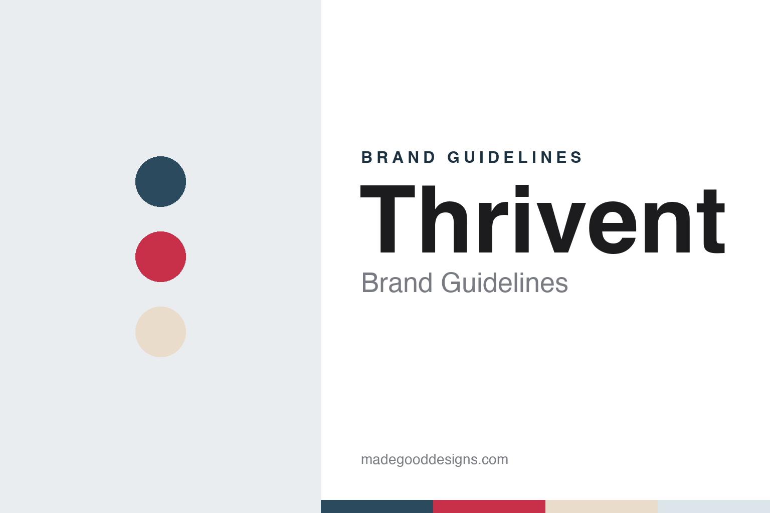
Thrivent Brand Guidelines
Two Lutheran benefit societies, one merger and a heart that stayed.
Aa
Two constants: a Thrivent slate, red and sand palette and a warm book serif register. Abstract homage — not a Thrivent product or mark; no logo, heart symbol or document is reproduced.
Two societies
A common bond of Lutheranism.
Thrivent grew out of two Lutheran fraternal benefit societies. According to the company’s 2026 fact sheet, the Aid Association for Lutherans (AAL) was chartered in 1902 and Lutheran Brotherhood in 1917, each as a fraternal benefit society offering life insurance to church members “under the common bond of Lutheranism.” The company describes its origins more simply: it says it was founded more than a century ago “when neighbors came together to insure each other.”
That structure still shapes the organisation. Thrivent says it is member-owned, and Twin Cities Business reported in June 2013 that, as a tax-exempt fraternal benefit society, it was legally required to serve members who share a common bond, which at that time was religion. The magazine put the membership at about 2.5 million at the end of 2012, and said most of the organisation’s customers counted as members. Its corporate centre is in Minneapolis and its operations centre in Appleton, Wisconsin, a city the company says “has been central to Thrivent’s story for generations.”
In 2002, the company says, AAL and Lutheran Brotherhood merged to become Thrivent Financial for Lutherans. The two older society names gave way to one new name, and that legal name has stayed in place: the 2026 fact sheet states that Thrivent is the marketing name for Thrivent Financial for Lutherans.
Colour
A wider membership and a new heart.
The largest change to the brand came with a change to the membership. In 2013 Thrivent’s members voted to extend eligibility, until then reserved for Lutherans, to all Christians. Twin Cities Business reported in June 2013 that the vote ran in March and April, that 72 per cent of those voting favoured the change, and that about 425,000 members took part, or 21 per cent of the membership, against the roughly 10 per cent that the organisation said usually voted. The board approved the change unanimously in May, and Thrivent defined Christian faith by reference to the Apostles’ Creed, the magazine reported.
The name and the mark followed. The company’s fact sheet says the name changed to Thrivent Financial in 2013; Twin Cities Business reported at the time that the shorter form would be used in marketing while the legal name was kept. In March 2014 the magazine reported that Thrivent had dropped the “for Lutherans” tag from its logo. The same report described the symbol change: a twisting, heart-shaped ribbon gave way to a more solid heart with a dynamic cross sweeping over one side, alongside a new slogan, “connecting faith and finances for good.” The new branding was to appear on stationery, signs and marketing material through 2014.
A volunteering program, Thrivent Action Teams, also began in 2014. The company says that since then Thrivent and its clients have contributed nearly 200 million hours of community service.
Typography
How the category presents itself.
American life insurers and annuity firms sell promises that run for decades, and their identities tend to say so. Many lean on steady colours, most often blues, greens and navies, set against white, with wordmarks drawn to look calm rather than playful. Symbols carry much of the meaning: shields, lighthouses, arrows, letterforms built into monograms, and in Pacific Life’s case a humpback whale, which the company has used since 1997.
The photography follows a pattern too. Consumer pages show families, couples planning retirement and people at work, while a second set of pages speaks to the financial professionals, brokers and advisers who sell most of these products. Websites are usually divided by audience, into individuals, employers, institutions and financial professionals, with sections on life cover, annuities, retirement plans and workplace benefits.
Much of the visual language is regulatory as well as decorative. Product pages carry long disclosure notes naming the issuing company and the states where a contract is offered, and many companies give a page to financial-strength ratings from agencies such as S&P Global Ratings and Moody’s, each quoted as of a stated date. Annual reports, statutory filings and investor presentations sit alongside the consumer site, and for listed groups they are often where the corporate identity is most fully set out.
The companies in this guide come from different structures: mutuals owned by their policyholders, demutualised and listed groups, spin-offs from larger insurers and businesses owned by investment firms. This guide sets out what can be checked about each one, from its founding and ownership to the symbols and lines it uses today, and gives the company’s own statements as its claims.
Aa
A warm book serif, in the spirit of the headings on the company’s recent documents. (Specimen set in Source Serif 4, a serif STAND-IN; NOT the Thrivent logo.)
Thrivent
A heart formed by two arches.
The heart has stayed. On 17 March 2025 Thrivent announced a refreshed brand and a new tagline, “Where Money Means More.” Its announcement says the logo, which features a red heart, remains the centrepiece of the brand, and that the heart is formed by two arches of the kind commonly seen in churches, standing for financial strength and the company’s roots in faith. The new elements it lists are modernised fonts, authentic photography of Thrivent clients and warm colour tones, rolled out in phases through the year. The company says it worked on the refresh with its creative agency, MONO, and with Assembly on media buying, and that it created a marketing toolkit for its financial advisors.
On the company’s 2026 fact sheet the name appears as a lowercase wordmark with a small red heart at its end, set beside slate-blue serif headings, pale blue-grey panels and a timeline marked with red dots.
The business has widened at the same time. Thrivent describes itself as a financial services company offering advice, investments, insurance, banking and generosity programs, and says it serves all Christians while offering investment products to all people. In February 2025, the company announced, members of Thrivent Credit Union voted to merge with a new Thrivent Bank; on 2 June 2025 it announced that the bank, headquartered in Salt Lake City, had begun operations, completing that merger. The step reversed an earlier one: in the autumn of 2012, Twin Cities Business noted, Thrivent had announced plans to turn its bank into a credit union. In September 2026 it broke ground in Appleton on the Evergreen Operations Center, the first major project in a planned mixed-use development around its campus there. Its fact sheet lists more than 4,500 employees, more than 3,300 financial professionals and about 2.4 million clients, and says it is rated by agencies including Moody’s Investors Service and S&P Global Ratings.
For a design guide, Thrivent shows how a membership organisation can keep one symbol, a heart, through a merger, a wider membership and two rounds of rebranding. Compare Securian Financial and Northwestern Mutual, two other American life insurers. For this guide we use a slate blue, a red, a warm sand and a pale blue-grey with a serif, an unofficial interpretation; no product or logo is reproduced.
Explore & save
Keep Thrivent’s identity on hand — save it to a board in the Made Good inspiration library.
Thrivent identity set
Save the Thrivent slate, red and sand palette and the warm book serif register to your own board.