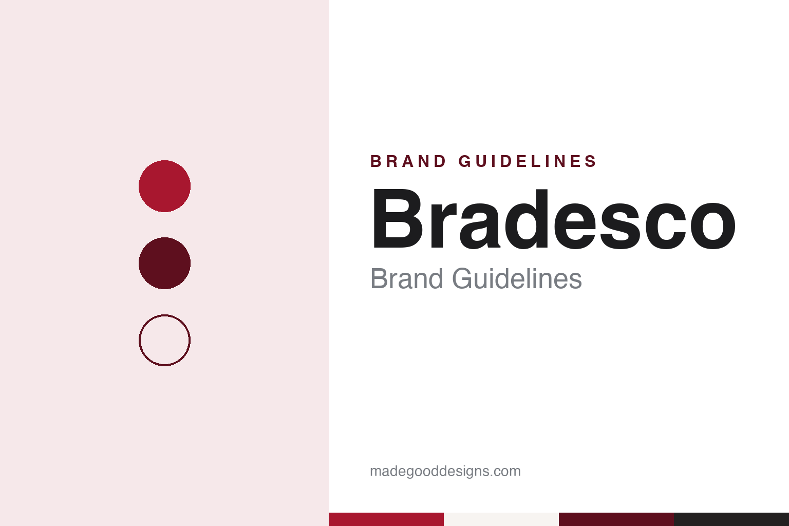
Bradesco Brand Guidelines
The Marília bank that kept one red and redrew the details.
Aa
Two constants: a red, wine and warm grey palette and a diagonal-cut sans register. Abstract homage — not a Bradesco asset; no logo, card or branch sign is reproduced.
Banco Brasileiro de Descontos
A Marília bank that went looking for small customers.
Bradesco began as Banco Brasileiro de Descontos S.A. in Marília, a town in the interior of São Paulo state, on 10 March 1943. English and Portuguese Wikipedia both name Amador Aguiar as its founder. Portuguese Wikipedia adds the longer story: the bank grew out of a local banking house, Casa Bancária Almeida & Cia., which was turned into a bank under its then controlling shareholder, with Aguiar setting its values and strategy.
That strategy was its first point of difference. At a time when other banks courted large landowners, Portuguese Wikipedia says, Banco Brasileiro de Descontos went after small traders and public employees, and was one of the early banks to encourage customers to use cheques, which staff helped them fill in at the branch. English Wikipedia describes the same market: small landowners, retailers and government workers.
Growth was quick. The head office moved to the city of São Paulo in 1946, and by 1951, both Wikipedias say, it had become the largest private bank in Brazil. In March 1953 it opened Cidade de Deus (“City of God”), a purpose-built complex in Osasco, west of the city, which Portuguese Wikipedia says became the head office four years later; the Prédio Azul, or Blue Building, which housed the board, opened there in 1959. In 1956 Aguiar set up the Fundação Bradesco, an education foundation that is still part of the group’s public face.
The bank also built a name for early technology. Portuguese Wikipedia credits it with bringing computer automation into daily operations in 1962, launching what it calls the country’s first credit card in 1968, creating a self-service machine called SOS Bradesco in the 1970s and opening its 1,000th location at Chuí, at Brazil’s southern tip, in 1978. Aguiar stepped down as president in 1990.
Colour
From a 1997 mark to Bradesco Sans.
The identity in use today goes back to 1997, when, according to Portuguese Wikipedia, the bank introduced a new corporate mark, the same year it bought Banco de Crédito Nacional. The mark was adjusted slightly in 2012, and at the end of 2018 the bank presented a redesigned visual identity with a more contemporary look and references to digital media, Portuguese Wikipedia says.
Typography followed. In February 2020 the Brazilian site B9 reported that Bradesco had launched its first proprietary typeface, Bradesco Sans. The type designer Fábio Haag drew it, with Epigram Superunion coordinating the work alongside the bank’s own design team and its agency Publicis. According to B9, the bank’s design brief asked for a face that was functional, legible, timeless and minimal; the process took about seven months, more than twenty options were shown and two reached the final round. Its details refer to the diagonal cuts in the redesigned logo, and the bank planned to roll it out gradually across all materials and channels, including forms and internal systems.
Advertising has leaned on national themes. During the 2012 Olympic Games the bank began playing on the acronym “BRA”, the first three letters of Brasil seen on athletes’ uniforms, and in 2014 it adopted the line “Tudo de BRA”, Portuguese Wikipedia says; both led up to the Rio 2016 Games, for which Bradesco had been chosen in December 2010 as the official sponsor for banking and insurance services. In 2017 it moved to the line “Pra Frente” (“Forward”). The slogan English Wikipedia cites, “Entre nós, você vem primeiro”, translates as “Between us, you come first.”
Sport remains a channel. On 5 November 2026, during media day for the São Paulo Grand Prix at Interlagos, the Haas Formula 1 team named Bradesco its “Official Banking Partner”, Grande Prêmio reported, the bank’s first move into Formula 1; the same report notes its existing backing for the Stock Car and F4 Brasil series.
Typography
How Latin American banks present themselves.
Latin American banks tend to present themselves through a few strong signals rather than many small ones. A bold wordmark or a simple symbol, set in one dominant colour, does most of the work: reds, blues, oranges and yellows recur across the region, sometimes chosen to echo a national flag, as English Wikipedia says of Banco do Brasil’s blue and yellow. Some banks go further and commission their own typefaces, as Bradesco did with Bradesco Sans in 2020, according to the Brazilian site B9.
The copy is written in Spanish or Portuguese first, and the photography is local: branches, city streets, customers at work and families at home. Product pages are built around the same practical headings almost everywhere — accounts, cards, credit, insurance and the bank’s own digital apps.
Banks in the region also present a public side that goes beyond banking products. Financial-inclusion programmes, foundations and cultural institutes appear alongside the commercial pages; Fundação Bradesco has worked in education since 1956, and the Centro Cultural Banco do Brasil runs cultural centres in several Brazilian cities. Sport sponsorship, from national teams to motor racing, carries the colours further still.
Many of these banks are listed companies, so annual and integrated reports are part of the identity too, setting out history, ownership and governance in a consistent house style. This guide sets out what can be checked about each bank — when and where it was founded, who owns it and how it presents itself — and treats its palette as our own interpretation rather than an official specification.
Aa
A clean sans with diagonal cuts, in the spirit of Bradesco Sans. (Specimen set in Figtree, a sans STAND-IN; NOT the Bradesco logo or the Bradesco Sans typeface.)
Bradesco today
Acquisitions, a digital bank and a US arm.
Bradesco is headquartered in Osasco and listed on the B3 exchange in São Paulo, the New York Stock Exchange and Madrid’s Latibex market; Portuguese Wikipedia dates the New York and Madrid listings to 2001. English Wikipedia describes it as the third-largest banking institution by assets in Brazil and Latin America.
Much of its scale came through acquisitions. In 1983 it bought the insurer Atlântica Boavista and merged it into what became Bradesco Seguros. From 1997 it bought state banks put up for privatisation in Minas Gerais, Bahia, Amazonas, Maranhão and Ceará, as well as BBVA’s Brazilian business in 2003 and the Brazilian operations of American Express in 2006, Portuguese Wikipedia says. The largest step was the Brazilian unit of HSBC, agreed in August 2015 and completed in July 2016, when HSBC Brasil accounts moved to Bradesco.
It has also built new brands alongside the red one. Next, a digital bank aimed at young customers, launched in June 2017; the digital wallet Bitz followed in September 2020; and the purchase of the digital bank Digio, announced in 2021, was completed in 2022. In the United States it agreed to buy BAC Florida Bank in May 2019, completed the purchase two years later and renamed it Bradesco Bank in 2022. With Banco do Brasil and Caixa Econômica Federal it created the Elo card brand in 2011.
Its public programmes sit beside the bank. Fundação Bradesco, created in 1956, works in education; in 2007 the bank launched “Banco do Planeta” for its environmental and social projects and co-founded the Fundação Amazônia Sustentável with the Amazonas state government, Portuguese Wikipedia says. In 2009 it opened a branch aboard a boat, the Voyager III, serving riverside communities along the Solimões.
For a design guide, Bradesco shows how a bank can keep one colour and one mark for nearly three decades while redrawing the details — a 1997 mark, refreshed in 2012 and 2018, then a custom typeface in 2020 built on the logo’s diagonal cuts. Compare Itaú, another large São Paulo bank, and Banco do Brasil, its partner in the Elo card brand. For this guide we use a strong red, a deep wine and warm greys with a sans, an unofficial interpretation; no product or logo is reproduced.
Explore & save
Keep Bradesco’s identity on hand — save it to a board in the Made Good inspiration library.
Bradesco identity set
Pin the red, wine and warm grey palette and the diagonal-cut sans register to your own board.