mBank Brand Guidelines
From BRE Bank’s online arm to one Warsaw brand.
Aa
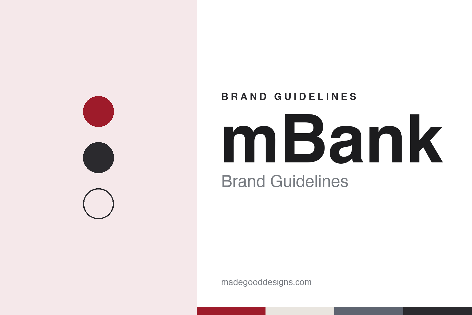
Two constants: a crimson, charcoal and grey palette and a geometric sans register. Abstract homage — not an mBank product or mark; no logo or card is reproduced.
Bank Rozwoju Eksportu
An export bank, an early privatisation and an online offshoot.
mBank’s story starts in 1986 in Warsaw, with a bank that did not yet carry the name. Polish Wikipedia says Bank Rozwoju Eksportu, the Export Development Bank, was set up that year by a resolution of the Council of Ministers to support foreign trade, with the foreign-trade minister as its largest shareholder alongside the finance minister, the National Bank of Poland and other state banks. It began operating in 1987, and the bank’s own timeline dates its founding to 1986.
Privatisation came early. Polish Wikipedia describes the process that started in 1990 through a public offering as the first privatisation of a bank in Poland; the shares debuted on the Warsaw Stock Exchange in 1992 under the ticker BRE. In 1994 the bank signed a strategic partnership with Germany’s Commerzbank, which built its stake step by step: 21 per cent in 1995, half in 2000 and just over 72 per cent in 2003, according to Polish Wikipedia; English Wikipedia also dates Commerzbank’s majority control to 2003. A merger with Polski Bank Rozwoju followed in 1998, and in 1999 the company took the shorter name BRE Bank.
The name now on the door arrived in 2000. BRE Bank launched mBank as a direct, internet-only retail service for individual customers; Polish Wikipedia calls it the first internet-only retail bank in Poland, and mBank describes it the same way. At first it had no traditional branches, only financial centres and kiosks, with cash handled through cash machines. A second retail brand, MultiBank, followed in 2001 for individuals and small firms, and in 2007 mBank opened in the Czech Republic and Slovakia, English and Polish Wikipedia say.
Colour
Three names folded into one, by BNA.
For more than a decade BRE Bank ran three names side by side: BRE Bank for corporate clients, MultiBank and mBank. In 2013 it folded them into one. Wirtualnemedia reported on 4 June 2013 that a new mBank logo, designed by the agency BNA, had gone live with a rebuilt online banking service and would replace the group’s other brands that year; the BRE and MultiBank names were to run until November 2013, when subsidiaries would change their marks too. Polish Wikipedia says the company itself took the name mBank in that rebranding, with a new logo and visual identity, and that the Czech and Slovak business followed a year later.
The 2013 system was built as a family rather than a single badge. According to Wirtualnemedia, BNA drew five colour versions of the logotype — a main “umbrella” mark, an affluent version for the Premium offer that was to replace MultiBank, a corporate version that was to replace BRE Bank, one for entrepreneurs and one for private banking — each with its own colour but all following one construction rule. The same report credits Artegence and Intercon Systems with the new information site and says the transaction service was built from scratch by a 200-person bank team with partners including Accenture, Artegence and Meniga.
The mark has been adjusted since. Polish Wikipedia records a further refresh of the logo in 2020, the year the head office moved to the mBank tower in the Mennica Legacy Tower complex in Warsaw. The bank’s timeline lists its mobile app and a marketplace called mOkazje, and says mKanon, its set of rules for plain communication with customers, was introduced in 2014. Its 2026–2030 strategy carries the motto “Full speed ahead!” and the line “Simplifying finances, helping bring goals to life,” and it names five values: authenticity, empathy, responsibility, courage and cooperation.
Typography
How the region’s banks present themselves.
Banks in Central and Eastern Europe often carry long national-language names with diacritics, such as Powszechna Kasa Oszczędności, Česká spořitelna or Komerční banka, and shorten them to initials or a single word for everyday use. Many of today’s large banks also descend from state institutions of the communist period, so their identities can show several layers of history: a mark kept for decades, a new owner’s colours, or a symbol brought back. PKO Bank Polski still uses a logo drawn in the late 1960s, English Wikipedia says, while Bank Pekao made a bison its group logo in 1997, moved to its parent UniCredit’s style in 2012 and restored the bison after its change of owners in 2017.
Colour does much of the work. Blue, green, red and yellow appear again and again on the region’s bank signs, cards and apps, usually in a bold wordmark or a simple symbol that has to read clearly on a branch fascia, a cash machine and a phone screen. Ownership by international groups adds another layer, when a local bank takes on a parent’s colours or a shared mark, and sometimes sheds them again.
The banks’ websites follow a familiar pattern: pages on everyday accounts and cards, mortgages, savings and business banking, with prominent space for mobile apps and for the industry awards those apps win. Photography tends to show cities, branches and customers rather than abstract imagery, and sponsorship, from national football leagues to international championships, gives several of these brands a large public stage.
Annual reports, investor pages and a growing number of sustainability reports, often published in the home language and in English, complete the public record. This guide sets out what can be checked about each bank — when it was founded, who owns it and how its identity has changed — and marks clearly what rests only on the bank’s own word.
Aa
A geometric sans for a lower-case brand name. (Specimen set in Poppins, a sans STAND-IN; NOT the mBank logo.)
mBank today
A Commerzbank subsidiary in three countries.
Commerzbank has stayed the main shareholder. Polish Wikipedia gives its holding as 69.21 per cent at 30 June 2022, and in April 2026 Börsen-Zeitung, carrying a Reuters report, described mBank as Commerzbank’s Polish subsidiary, with 30.9 per cent of its shares in free float. In September 2019 Commerzbank said it would put its stake up for sale, then dropped the plan in May 2020, according to Polish Wikipedia. The group includes leasing and factoring businesses and a specialist mortgage bank, mBank Hipoteczny, and serves customers in Poland, the Czech Republic and Slovakia. Polish Wikipedia notes that mBank is the longest-standing member of the Warsaw exchange’s WIG20 index.
The bank’s Swiss-franc mortgages have been the subject of long litigation. In January 2010 a ruling by Poland’s court for competition and consumer cases placed the conversion clause used in those contracts on the consumer office’s register of prohibited clauses, and in December 2010 a group of 1,247 borrowers filed a class action, Polish Wikipedia says. An appeal court in Łódź found interest clauses abusive in 2014, a ruling later sent back for re-examination after a cassation appeal; in September 2016 the Supreme Court dismissed the bank’s cassation appeal in a separate case decided by the Szczecin appeal court in 2015. Many contracts have since ended in settlements: of about 85,500 franc-indexed loans the bank granted in total, about 3,700 were still active at the end of September 2026 and about 34,600 had ended in settlements, chf24.pl reported in October 2026 from the bank’s quarterly figures.
For a design guide, mBank shows how a bank can retire its corporate name in favour of a product brand and turn one mark into a family of coloured versions. Compare PKO Bank Polski, another Warsaw bank, and ING Bank Śląski, a Polish bank within a foreign group. For this guide we use a deep crimson, charcoal and warm grey with a geometric sans, an unofficial interpretation; no product or logo is reproduced.
Explore & save
Keep mBank’s identity on hand — save it to a board in the Made Good inspiration library.
mBank identity set
Pin the mBank crimson, charcoal and grey palette and the geometric sans register to your own board.