Guardian Brand Guidelines
The New York mutual that began as Germania Life and took a new name in 1918.
Aa
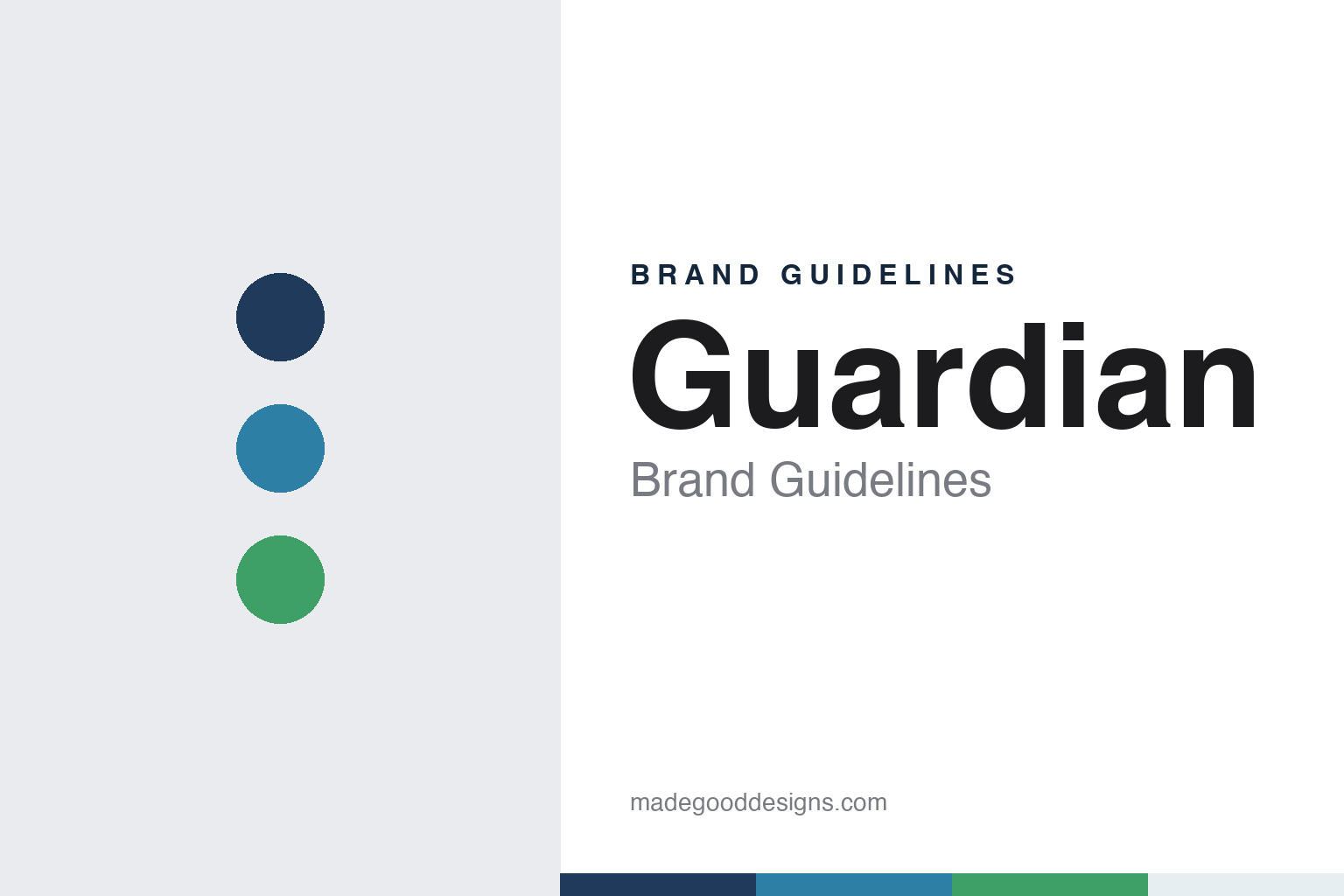
Two constants: a Guardian navy, blue and green palette and a rounded geometric sans register. Abstract homage — not a Guardian product or mark; no logo, symbol or policy document is reproduced.
Germania Life
A Wall Street insurer for German immigrants.
Guardian began in New York in 1860 as the Germania Life Insurance Company of America. The company says it was created at Delmonico’s restaurant by a group of 21 German American businessmen led by the lawyer Hugo Wesendonck, and that its founders raised twice the equity capital that New York State law then required. English Wikipedia adds that Wesendonck had taken part in the German revolution of 1848–49 before settling in the United States, and that the new company opened on Wall Street to insure the growing number of German immigrants arriving in the country.
The business spread quickly. A San Francisco branch followed two years after the founding, English Wikipedia says, and agencies later reached territories such as Colorado, New Mexico and the Dakotas. In 1868, by the same account, Germania became the first American insurance company to open an agency in Europe, and by the early twentieth century almost half of its business was written outside North America.
In 1911 the company moved into the Germania Life Insurance Company Building on Union Square in Manhattan, which English Wikipedia says served as its headquarters for more than 85 years. The building carried the founding name into a period when the company itself would no longer use it.
Colour
A wartime rename, then a mutual.
The First World War changed both the company’s name and its map. English Wikipedia says the pressures of the war forced Germania to stop its business in Europe, and that in 1918, in response to anti-German sentiment in the United States, it became The Guardian Life Insurance Company of America. The company’s own timeline gives the same year for the new name. That legal name is still in use; the company’s website uses the shorter Guardian as its brand and states that Guardian® is a registered trademark of the company, of New York.
The next change was to ownership. In 1925, the company says, it converted from a mixed stock and mutual company into one wholly owned by its policyholders. It describes itself today as a mutual company owned by its customers and accountable to them, rather than to investors, and calls itself one of the largest mutual insurance companies in the United States; English Wikipedia describes it as one of the largest mutual life insurers in the world.
Product lines widened through the twentieth century and after. The company dates its entry into the employee benefits market to 1957. English Wikipedia says Guardian acquired the dental business First Commonwealth in 1999, the year it also set up the broker-dealer Park Avenue Securities and moved its headquarters to the Financial District. In July 2001 it merged with Berkshire Life Insurance Company; as Berkshire Life Insurance Company of America, that business administered Guardian’s income-replacement cover as of 2015, by English Wikipedia’s account. Later purchases included the absence-management firm ReedGroup (2012 in English Wikipedia, 2013 in the company’s timeline), Premier Access in 2014 and Avēsis, a vision and dental provider, in 2016. In 2006 Guardian bought a majority of RS Investments, which Victory Capital acquired in 2016, and in September 2016 it sold its 401(k) business to Ameritas, English Wikipedia says.
Typography
How the category presents itself.
American life insurers and annuity firms sell promises that run for decades, and their identities tend to say so. Many lean on steady colours, most often blues, greens and navies, set against white, with wordmarks drawn to look calm rather than playful. Symbols carry much of the meaning: shields, lighthouses, arrows, letterforms built into monograms, and in Pacific Life’s case a humpback whale, which the company has used since 1997.
The photography follows a pattern too. Consumer pages show families, couples planning retirement and people at work, while a second set of pages speaks to the financial professionals, brokers and advisers who sell most of these products. Websites are usually divided by audience, into individuals, employers, institutions and financial professionals, with sections on life cover, annuities, retirement plans and workplace benefits.
Much of the visual language is regulatory as well as decorative. Product pages carry long disclosure notes naming the issuing company and the states where a contract is offered, and many companies give a page to financial-strength ratings from agencies such as S&P Global Ratings and Moody’s, each quoted as of a stated date. Annual reports, statutory filings and investor presentations sit alongside the consumer site, and for listed groups they are often where the corporate identity is most fully set out.
The companies in this guide come from different structures: mutuals owned by their policyholders, demutualised and listed groups, spin-offs from larger insurers and businesses owned by investment firms. This guide sets out what can be checked about each one, from its founding and ownership to the symbols and lines it uses today, and gives the company’s own statements as its claims.
Aa
A rounded geometric sans, in the spirit of a short modern wordmark. (Specimen set in Manrope, a sans STAND-IN; NOT the Guardian logo.)
Guardian
Two linked loops and a short name.
The company’s recent steps are set out in its own timeline. It set up operations in India in 2017 to provide information-technology and business services; in 2018 it launched Guardian Direct, a digital way for consumers to research and buy dental and vision cover; in 2022 it opened a hub office at Bell Works, the former Bell Labs complex in Holmdel, New Jersey, a move English Wikipedia says was announced in April 2017; and in 2024 it launched GuardianWell, a digital hub for workplace benefits. It marked its 165th anniversary in 2025. English Wikipedia also lists regional offices in Bethlehem, Pennsylvania; Appleton, Wisconsin; Spokane, Washington; and Norwell, Massachusetts, set up from 1979.
Today the company states its purpose as “to inspire well-being” and publishes a yearly report, the Guardian Annual. Its pages cover life cover, income-replacement cover, dental and vision cover, workplace benefits, absence management, annuities and investment accounts, offered through financial professionals and brokers. The company gives its size as about 7,700 employees and more than 2,500 financial professionals; English Wikipedia gives about 8,000 employees and more than 3,000 financial representatives in more than 70 agencies.
The current mark on the company’s website pairs a symbol of two linked loops, the upper one green and the lower one blue, with a dark navy sans-serif wordmark reading “Guardian.” The loops read as a single continuous figure, and the wordmark carries no reference to the 1860 name.
For a design guide, Guardian shows how a nineteenth-century company can carry a wartime rename for more than a century while presenting a short brand name and a simple linked symbol. Compare MassMutual and New York Life, two other American life insurers. For this guide we use navy, a blue, a green and a pale mist with a sans, an unofficial interpretation; no product or logo is reproduced.
Explore & save
Keep Guardian’s identity on hand — save it to a board in the Made Good inspiration library.
Guardian identity set
Save the Guardian navy, blue and green palette and the rounded geometric sans register to your own board.