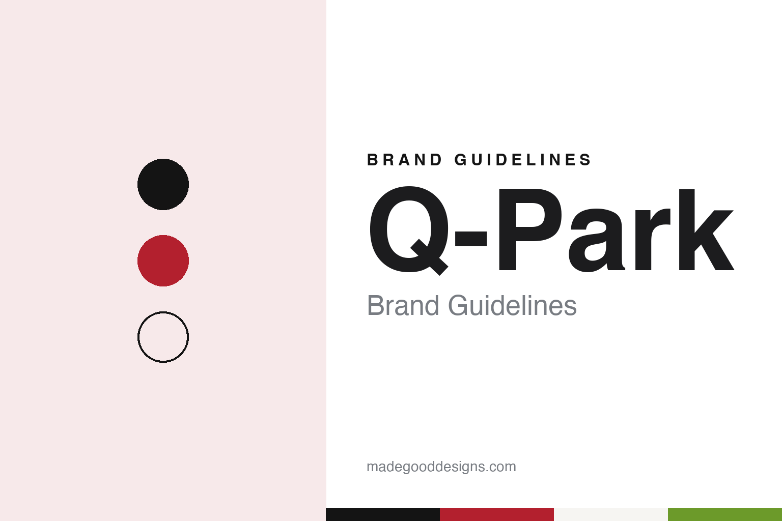
Q-Park Brand Guidelines
A Maastricht car-park operator built on black, red, white and a lot of space.
Aa
Two constants: a black, red and white palette and a geometric sans register. Abstract homage — not a Q-Park sign or mark; no logo, payoff or signage is reproduced.
From Limburg
A property developer’s car parks and a bank’s property arm.
Q-Park is a car-park operator with its head office in Maastricht, in the Dutch province of Limburg. Dutch Wikipedia dates the company to 1998, when the car parks of Ruijters Parking were combined with parking assets of ING Vastgoed, the property arm of the ING banking group. Ruijters Parking itself went back to 1972, when it was set up by the Limburg property developer Ger Ruijters. Its garages ran first in Limburg and then across the Netherlands before the business moved abroad.
The name is older than the company in its current form. Q-Park’s own Brand Identity Manual says the Q-Park name was introduced in 1995, that the logo dates from 1996 and that the wider set of brand identity elements dates from 2004. The head office now sits in the De Colonel office complex beside Maastricht station, Dutch Wikipedia says.
English Wikipedia says Q-Park bought the French operator Epolia in June 2008. In the Netherlands, Dutch Wikipedia says, Q-Park runs or manages more than 230 public car parks and more than 80 P+R (park-and-ride) sites at railway stations. The same article puts the group at about 5,800 facilities and roughly 800,000 spaces across seven countries: the Netherlands, Germany, Belgium, the United Kingdom, France, Ireland and Denmark. Those seven are the countries the brand manual lists, in a fixed order, whenever staff write about the company.
Dutch Wikipedia, citing a Q-Park press release of November 2016, says the first charging point went into a Q-Park car park in 2012, that there were 136 by the end of 2016, and that the company then planned to add 88 more with the charging firm The New Motion.
Colour
A logo drawn from the parking bay itself.
Q-Park’s Brand Identity Manual is an interactive public site, and it describes the logo plainly: a stylised name with three illustrative angled parking spaces, used with black, red and white “always in the same way”. In the master version the logo is held to two colours, black (or white when reversed) and red. Where colour is not possible, the manual allows the red to be replaced by a mid grey.
Space is treated as part of the brand. The manual says “Q-Park sells space and space is part of the Q-Park Brand”, and it sets a safe zone around the logo equal to the height of one of the angled bays. It names three measures for all layouts: Q, the size of the large Q; x, the height of a bay; and y, the width of the logo with its payoff. That payoff is “Quality in parking”, and the preferred place for the logo with payoff is the bottom right of a page.
Colour is ranked. Red is the primary accent and, the manual says, stands for energy, passion and speed; it may fill a background only on certain clothing items and on Q-Park litter bins. Black is the second primary colour, and white is described as the most dominant colour in Q-Park material, standing for space and clarity. A bright green guides customers inside the car parks and marks clickable items on the websites; the manual notes it changed in late 2022 when the signage film supplier changed. A deep blue is kept for on-street signs that point drivers to entrances, and a light blue marks electric charging.
Type is just as fixed. The manual names Futura T as the brand typeface for all communication, with Futura T Demi for emphasis instead of a bold, which it says does not space evenly in tables; Arial is the fallback and the face for documents sent to outside readers. It calls Futura T “business-like, easy to read” and “no-nonsense”, and adds: “parking space supports the motorist, well-spaced copy supports the reader.”
Inside the garages, a separate house-style manual keeps floors white, grey or anthracite and columns, walls and ceilings white, grey or bare concrete, so that equipment and signage stand out against calm surfaces.
Typography
How parking brands present themselves.
Toll-road and parking operators sell access to something the customer can already see: a stretch of motorway, a tunnel, a multi-storey car park. Their visual identity therefore lives in two places at once. On the road it appears on gantries, toll plazas, barrier arms, ticket machines and the signs at a car-park entrance; online it appears on corporate websites, annual reports and investor presentations, where the same company explains its concessions to shareholders and lenders.
Network maps and road photography carry much of the corporate side. Operators publish maps of the routes or sites they run, usually as simple lines and dots over a pale base, together with photographs of interchanges, viaducts, tunnels and car parks, often taken from above. Concession pages and investor sections list each asset with its length or number of spaces, its concession dates and its ownership structure, and many groups give each road or site its own page or its own website under its own name.
Parking brands meet a shared visual language at the kerb. The blue and white “P” sign is the common shorthand for parking across much of the world, and operators place their own name and colours beside it on entrance signs, pay stations and barrier arms. Customer apps have become a second front door: their screenshots, as the companies publish them, typically show a map of nearby sites, a booking or payment screen and a digital ticket or account page.
Toll operators increasingly present themselves through electronic tolling, with transponder tags, licence-plate accounts and apps that show trips and statements, so their customer materials lean on clear numbers, simple icons and plain instructions. Across the category the tone is practical and reassuring rather than playful: a name that needs to be read at speed, a limited palette and a sans-serif that stays legible on a sign, a phone and a results page alike.
Aa
A geometric sans, after the Futura T named in the brand manual. (Specimen set in Jost, a sans STAND-IN; NOT the Q-Park logo.)
Q-Park
Dutch institutions, then KKR.
In 2017 Q-Park was still held largely by Dutch institutional investors such as pension funds and insurers. In May 2017 NU.nl, carrying an ANP report on 24 May 2017, said the investment firm KKR would take over the company, a deal Q-Park confirmed that day. The same report described Q-Park as running several thousand parking facilities in ten European countries at the time. Q-Park’s corporate investor-relations page now points readers to the KKR Infrastructure fund.
The customer side of the brand has moved towards cameras and apps. Q-Park’s UK site describes its PaSS number-plate system, which raises the barrier on entry and exit without a ticket, and a Q-Park App for pre-booking and digital receipts. In September 2026 Q-Park UK said its Q-Park The Forum car park in Gloucester, with nearly 400 spaces, 44 charging points and a planted living wall, had won the new-car-park category at the British Parking Awards, a scheme set up in 2002 by Parking Review.
The brand manual even governs the name on the page. It asks writers to treat the company as singular (“Q-Park is”), to write “we” when speaking for it, and never to let the name break across two lines, using a non-breaking hyphen where needed.
For a design guide, Q-Park shows how a parking brand can turn the bay itself into a logo and treat empty space as a visual rule. Compare APCOA, another European car-park operator, and Indigo, the French group that began as Vinci Park. For this guide we use near-black, a deep red, warm white, concrete grey and a muted green with a geometric sans, an unofficial interpretation; no product or logo is reproduced.
Explore & save
Keep Q-Park’s identity on hand — save it to a board in the Made Good inspiration library.
Q-Park identity set
Pin the black, red and white palette and the geometric sans register to your own board.