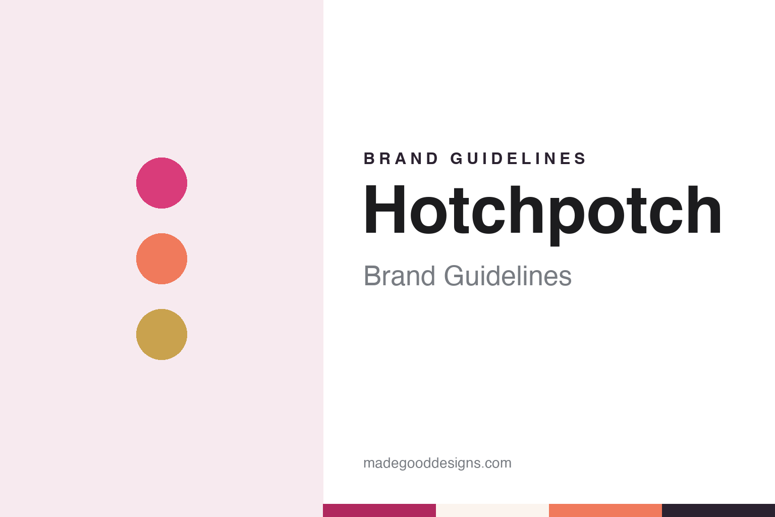
Hotchpotch Brand Guidelines
A Hampton card publisher of the 1990s, later part of Carte Blanche.
Aa
Two constants: a pink, coral and gold palette and a rounded geometric sans register. Abstract homage — not a Hotchpotch product or mark; no card, design or logo is reproduced.
Hampton, Middlesex
A contemporary card publisher on London’s south-western edge.
Hotchpotch was a British greeting card publisher. Home & Giftware Magazine reported in June 2011 that it was founded in the mid-1990s and based in Hampton, Middlesex, and that it had built a portfolio of contemporary cards sold to independent shops and selected chains at home, and abroad through a network of distributors. Its founder, managing director and owner at that time was Paul Steele, the magazine said.
The public register adds dates. Companies House records the company, Hotchpotch Publishing Limited, as incorporated in October 1995. It was registered under an earlier name, Touchtone Southern Limited, until November 2010, when it took the Hotchpotch name, and its listed business activity was the manufacture of paper and paperboard articles.
In June 2011 Carte Blanche Greetings, the company behind the Me to You range and its Tatty Teddy character, announced that it had bought all the shares in Hotchpotch Publishing, Home & Giftware Magazine reported. Carte Blanche said Hotchpotch would sit beside its other card brands, among them Me to You and My Blue Nose Friends, and the recently acquired Wishing Well and Lello. Paul Steele said he looked forward to working with the Carte Blanche team to grow Hotchpotch sales, describing a differentiated range of contemporary cards.
The new parent had a long history of its own. Carte Blanche says it was formed in 1987 by Stephen Haines, who had worked for large card companies before setting up on his own, and that Tatty Teddy began as a character in a range drawn by the illustrator Mike Payne. From 2011, trade reports describe Hotchpotch as a Carte Blanche Group brand, with its own in-house designers.
Colour
Designers, Henries and licensing.
Under Carte Blanche, Hotchpotch became known in the trade for its designers. At The Henries, the greeting card awards that Home & Giftware Magazine calls the trade’s “Oscars,” Hotchpotch designer Helen John won the Most Promising Young Designer or Artist award in October 2013. The magazine said she had joined Hotchpotch in May 2011, and described a graphic, colourful, nostalgic and quirky style that combined digital work, collage, mark-making and drawing, with ideas taken from retro posters and wallpaper samples.
Two years later the same award came back. In October 2015 Cathryn Jones of Hotchpotch Publishing was named Most Promising Young Designer or Artist at the Henries, which the magazine called the second time in recent years that a Hotchpotch designer had won it. At the Henries of December 2020, held online, Hotchpotch designer Rachel Burt was a finalist for the same award, and the brand’s Spec-tacular and Popcorn ranges were finalists in the children’s and cute categories.
Recognition came from outside the card awards too. In July 2014 Hotchpotch’s Pickle Parade stationery range, based on illustrations by Gemma Correll, was shortlisted at the Licensing Awards in the category for licensed paper products and stationery, the magazine reported; Carte Blanche described Pickle Parade as the lead of its fun and contemporary group. In January 2018 Hotchpotch won the “exciting use of colour” prize in the PaperAwards at the Top Drawer trade show in London, judged by a panel of retail buyers and paper specialists.
The brand’s designers also spoke for its friendship and birthday cards. In December 2021 Home & Giftware Magazine showed a birthday card for a close friend from the Butterscotch range, with neon inks and gold foil, alongside comments from Rachel Burt on the quotes the team chose for friendship cards.
Typography
Cards as a publishing trade.
Greeting card brands sell something small and personal, and the way they present themselves follows from that. Card shops lean on the card wall: rows of designs grouped by occasion, from birthdays and anniversaries to weddings and Christmas, with signage that sets the tone before a shopper reaches the shelves. When The Guardian compared two British card chains on the same London afternoon in January 2012, it judged them on range, pricing, staff and the feel of the shop as much as on the cards themselves.
Online card services present the same product through photographs and screens. Each card appears as the company chooses to photograph it, and the design often matters more than the brand around it. Some services credit the illustrators and photographers behind their cards, and a marketplace such as Thortful builds its whole offer around independent creators, presenting the range by maker as well as by occasion.
Personalisation is the shared interface. Websites, apps and in-store kiosks let buyers add names, photos and messages, choose whether a card goes straight to the recipient or to themselves, and see a posting cut-off for same-day dispatch. Several companies describe these steps plainly on their own sites and app listings, together with how and where cards are printed, which paper they use and whether cards are sold wrapped.
Behind the shop fronts sit corporate pages and public records. Company registers show who owns a card business, when it was incorporated and what it was once called, and they can tell a quieter story than the brand voice: a cheeky high-street name may be a founder-held family company, and a young app may sit on a company formed a year before its public launch. This guide sets out what can be checked about each brand and marks what rests on the company’s own word.
Aa
A rounded geometric sans for bright, foiled cards. (Specimen set in DM Sans, a sans STAND-IN; NOT the Hotchpotch logo.)
Hotchpotch
Pink ink, gold foil and pins.
Colour and finish defined the later ranges. In December 2020 Carte Blanche showed new Hotchpotch card ranges for spring 2021, Home & Giftware Magazine reported: Butterscotch, with neon rainbows and bold brush strokes printed in what the company called the Hotchpotch signature pink ink and finished with gold foil; Rosette, with a paper rosette badge that could be taken off the card and worn on the day; Parasol, with gold foil, hand lettering and neon coral ink; and a reworked Raspberry range in which glitter was replaced with rose gold foil and seventeen designs were added. A pop-up range for children, Playground, came with them. Designer Anna Price said the brand’s original enamel pin cards were still among its strongest sellers, and that the designs were designed, printed and hand assembled in the UK without glue, plastic or cello wrap; that is the company’s own description.
The company’s end came in 2026. Companies House records an application to strike Hotchpotch Publishing Limited off the register in April 2026; at the end of May 2026 Carte Blanche Group ceased to be its controlling shareholder, and the company was dissolved by voluntary strike-off on 14 July 2026. In the same weeks the register shows Tj Morris Group Limited, of Liverpool, taking control of Carte Blanche Greetings Limited from 29 May 2026. Hotchpotch Publishing no longer exists as a company.
For a design guide, Hotchpotch shows how a mid-market card publisher can build a look from finish rather than from a mascot: neon and pink inks, gold and rose gold foil, and small objects such as pins and rosettes fixed to the card. Compare Card Factory, the British card retailer, and Ohh Deer, another British stationery name. For this guide we use a hot pink, a neon coral, a soft gold, a plum ink and a pale paper with a sans, an unofficial interpretation; no product or logo is reproduced.
Explore & save
Keep Hotchpotch’s identity on hand — save it to a board in the Made Good inspiration library.
Hotchpotch identity set
Pin the Hotchpotch pink, coral and gold palette and the rounded geometric sans register to your own board.