No Frills Brand Guidelines
Cut-open boxes, overhead price boards and a chain of Haulers.
Aa
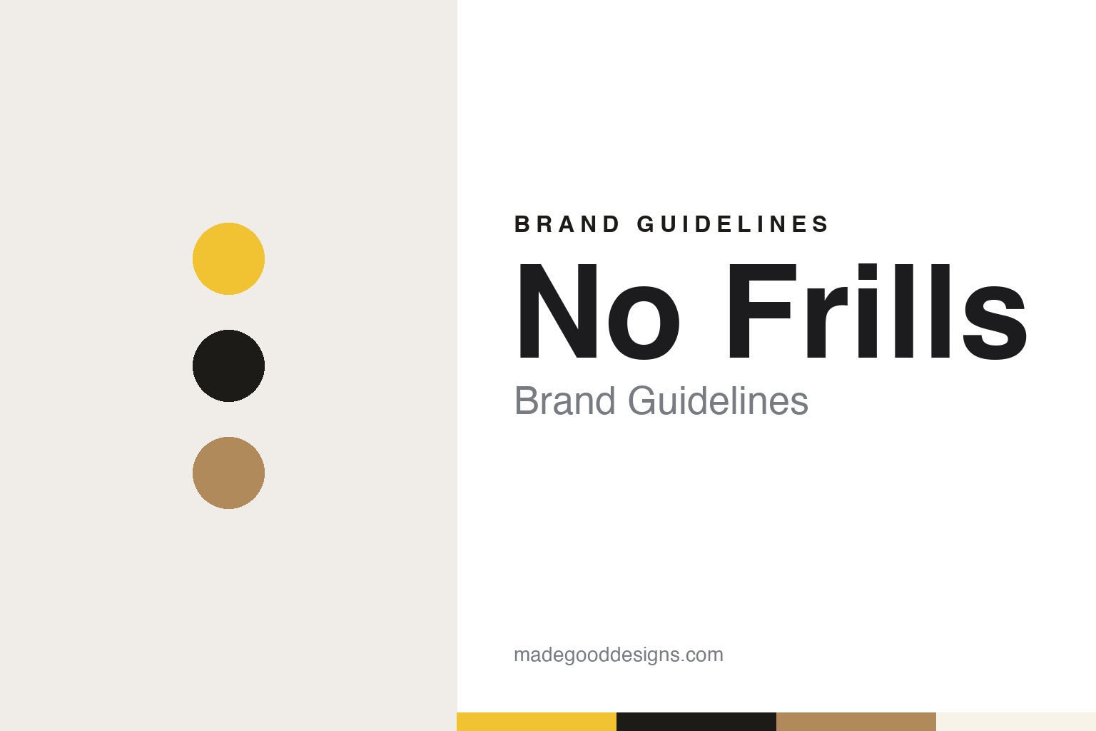
Two constants: a No Frills yellow, near-black and cardboard palette and a heavy discount sans register. Abstract homage — not a No Frills product or mark; no logo, sign or package is reproduced.
We took all the frills out
A closing Loblaws store, stripped back.
No Frills opened on 5 July 1978 in a converted Loblaws supermarket in East York, Toronto, that had been due to close, English Wikipedia says. It was Loblaw’s answer to a period of rising inflation and complaints about food prices, and it followed by a few months the launch of the company’s yellow-packed No Name generic line, which the International Directory of Company Histories dates to March 1978. Loblaw’s own timeline says the no name brand featured in the first no frills store in Toronto; English Wikipedia adds that most of the goods on the shelves were still national brands, and that the European limited-range stores that inspired the format usually stuck to dry goods, while Loblaw promoted fresh produce.
The format took the supermarket apart. English Wikipedia describes a store with only four checkouts and a “low labour” principle of minimal staffing; about 500 items instead of the 8,000 or so in an average supermarket, usually one brand in one size; goods left in their cardboard shipping boxes with the fronts cut away; produce left unwashed in its cartons; and no fresh meat, because refrigeration had been removed. Prices were posted overhead rather than marked on each item, customers received a printed price list, and cashiers were trained to memorise the prices. Shoppers packed their own groceries and brought their own bags or paid for one. Loblaws president Dave Nichol summed up the idea: “We took all the frills out.” The Directory says the stores sold Loblaw’s private labels and the main national brands.
Opening day drew more shoppers than the store could handle, English Wikipedia says, and within a few months there were three No Frills stores in Toronto. Loblaw went on to convert more of its older, more marginal outlets to the format through the 1980s.
Colour
Owners’ names on the sign.
The business model changed in 1987, when Loblaw began converting the company-owned stores into franchises, English Wikipedia says. By its count there were 19 stores in Ontario in 1988, 48 by 1994 and 79 by the late 1990s. The franchise stores often carried the owner’s first name on the fascia, in forms such as “Joe’s nofrills,” which put a local grocer’s name into the chain’s sign. Most stores were former Loblaws sites, though some were bought, including three former Knob Hill Farms supermarkets in Toronto after that chain closed all its stores in 2001. Expansion beyond Ontario began in 2007, first into Western Canada and later into Atlantic Canada.
The name itself has been written several ways. English Wikipedia says the chain was originally branded “no frills,” was later styled “nofrills” and is now styled NOFRILLS; Loblaw’s own timeline still writes “no frills” in lower case. In 2013 Loblaw tested a smaller hard-discount format, Box by No Frills, of around 10,000 square feet against roughly 25,000 for a standard store; by 2017 the pilot had been phased out and some of its sites had become ordinary No Frills stores.
The chain’s advertising found a character in its customers. In May 2018 No Frills launched a campaign called Hauler, with a television spot and a song of the same name and a limited run of No Frills-themed T-shirts and hoodies, English Wikipedia says; the songs were later posted on streaming services and gathered into an album. Canadian Grocer reported in November 2020 that shoppers had been known as “Haulers” since 2018, and that the agency John St. had followed with a 2019 video game, Hauler: Aisles of Glory, a summer 2020 album, Haulin’ State of Mind, and an animated, comics-inspired campaign called “The Haulerverse,” built around four characters — three shopper types and a store employee armed with a laser-firing price gun — with stickers, GIFs and filters on a campaign site.
Typography
Banners, own labels and flyers.
Canadian retail identities are often built in layers: a parent group, a set of store banners, and the own-label ranges that sit on their shelves. Loblaw Companies is a clear example. English Wikipedia describes it as running corporate and franchise supermarkets under 22 regional and market-segment banners, from the full-service Loblaws to the discount No Frills and Maxi, each with its own sign, store format and tone of voice.
Own labels carry much of the visual identity. Loblaw’s No Name range arrived in 1978 in plain yellow packaging, and its President’s Choice line followed in the mid-1980s with photography-led packs, according to the International Directory of Company Histories. Loblaw’s apparel label, Joe Fresh, began in 2006, English Wikipedia says. Loyalty schemes and flyers do similar work: Loblaw’s PC Optimum points programme runs across its grocery and pharmacy banners, and when No Frills built a 2020 campaign around shopper types, Canadian Grocer reported, one of them was a deal hunter who searches the weekly digital flyer before she shops.
Quebec adds a language layer. Some national chains trade under French names there: Shoppers Drug Mart has used the Pharmaprix banner in the province since its first Quebec store in 1972, Loblaw’s own history says, and Loblaw entered the Quebec grocery market in 1998 by buying the Quebec-based chain Provigo, whose name it kept.
Corporate pages tell the rest of the story. Groups such as Loblaw publish timelines of founders and acquisitions, investor pages and lists of banners, and these are useful for dates and ownership; this guide presents them as the company’s own account, alongside encyclopaedias, trade press and regulators. The brands that follow range from century-old grocers to fashion chains, and each is described by what the sources show about its names, formats and labels.
Aa
A heavy, compact sans — the register of an overhead price board. (Specimen set in Archivo Black, a sans STAND-IN; NOT the No Frills logo.)
No Frills
The discount end of Loblaw.
No Frills today looks more like a conventional supermarket than the 1978 prototype. English Wikipedia says items still often sit in cut-down shipping boxes but are arranged on shelves; produce is displayed conventionally; frozen food sections, left out of the original stores, are now standard; and some outlets have fresh meat and fish counters. No Name, which began with 16 items, has grown to more than 2,900, and President’s Choice goods are stocked alongside it. Shoppers still pack their own groceries. By English Wikipedia’s count, read in November 2026, there are more than 300 franchise stores in nine provinces, under Loblaw Companies Limited, itself a subsidiary of George Weston Limited.
Within Loblaw, No Frills sits at the discount end, while Loblaws, English Wikipedia says, has been moved upmarket with in-store bakeries, delis and prepared-food counters that No Frills stores largely leave out. In early 2024 the company created a hard-discount division grouping NOFRILLS with Maxi, the Quebec discount banner, according to English Wikipedia. In February 2026 blogTO reported that Loblaw had shared concept images of new No Frills and Shoppers Drug Mart store designs, and that many online commenters answered with jokes, one of them reading “No Frills: now with more frills.”
For a design guide, No Frills shows how a brand can be built from what it leaves out — cut boxes, overhead price boards, a lower-case name — and then given a personality by recasting its customers as heroes of their own shopping trip. Compare the full-service banner whose closing store became the first No Frills in Loblaws Brand Guidelines and another Canadian discount chain in Giant Tiger Brand Guidelines. For this guide we use a bright yellow, a near-black, a cardboard brown and an off-white with a heavy sans, an unofficial interpretation; no product or logo is reproduced.
Explore & save
Keep No Frills’s identity on hand — save it to a board in the Made Good inspiration library.
No Frills identity set
Pin the No Frills yellow, near-black and cardboard palette and the heavy discount sans register to your own board.