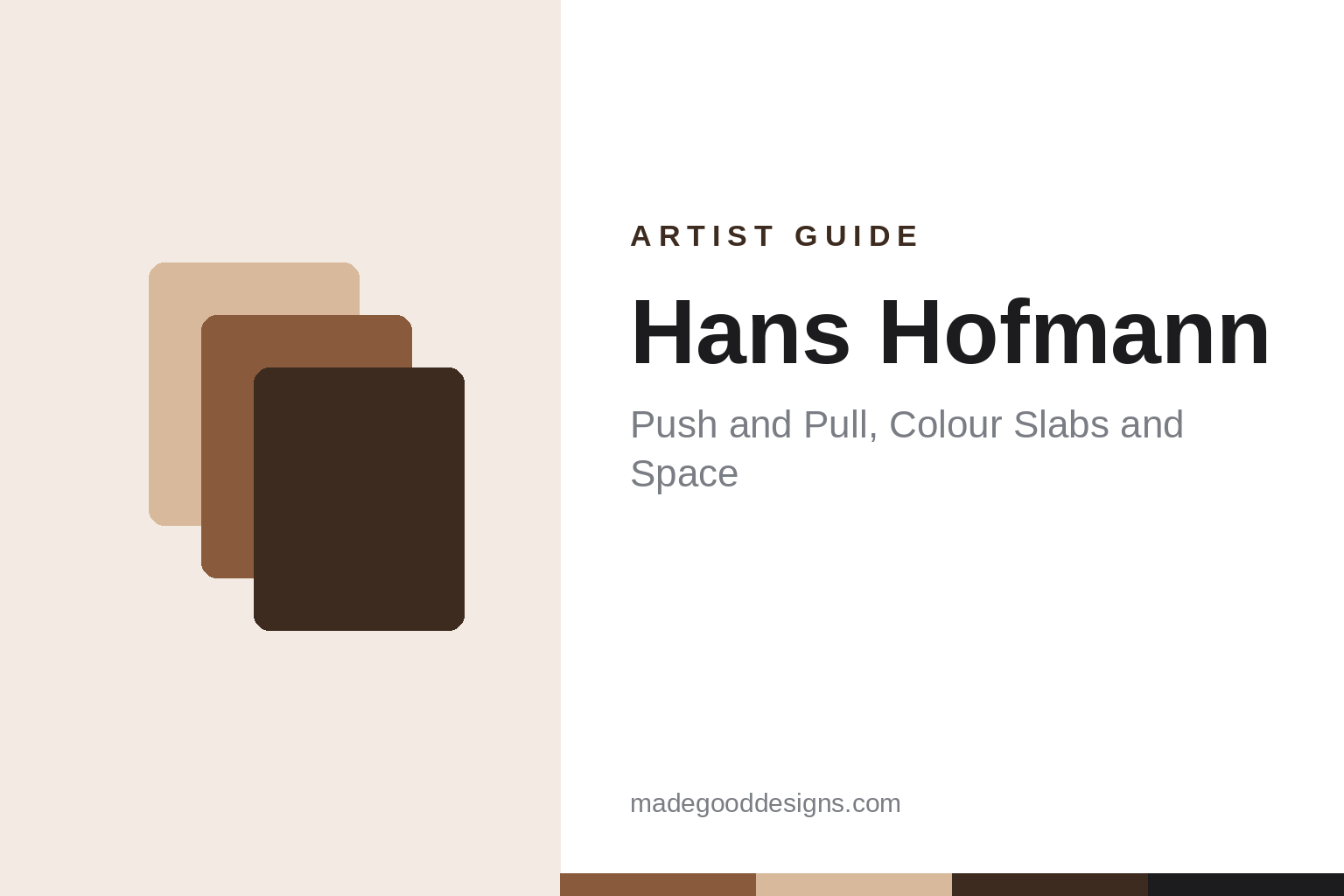
Hans Hofmann spent much of his life explaining one problem to students: how to make a flat surface feel deep without drawing a single vanishing line. His answer was colour. A hot, dense rectangle seems to step forward; a cooler, thinner field seems to sink back. Set the two against each other and the picture starts to breathe, a habit of treating colour as a spatial tool that translates directly to layouts, interfaces and posters.
Hofmann died in 1966, so his paintings remain in copyright. The Metropolitan Museum of Art, the Art Institute of Chicago and the Cleveland Museum of Art all hold his work, but none of the three flags it as public domain or CC0, so this guide describes the paintings in text only. Treat them as protected and license any reproduction. For historic images cleared for reuse, browse the MGD museum inspiration collection.
Who was Hans Hofmann?
The Met, the Art Institute of Chicago and the Cleveland Museum of Art all record him as American, born in Germany in 1880, and dead in 1966; the Met gives New York as the place of death. PBS’s American Masters biography places his birth in Weissenburg, Bavaria, and records that the family moved to Munich when he was a boy. He studied in Munich from 1898 and then lived in Paris from 1904 to 1914, where he attended classes at the Académie de la Grande Chaumière, according to PBS and the National Gallery of Australia’s artist biography.
The outbreak of war kept him in Germany, and in 1915 he opened a school of modern art in Munich, which drew many foreign students, Americans among them. In 1930 a former student, Worth Ryder, invited him to teach the summer session at the University of California, Berkeley, and he returned for a second summer in 1931. He settled in the United States in the early 1930s; sources give 1932 or 1933 for the move. He opened the Hans Hofmann School of Fine Arts in New York (dated 1933 or 1934) and a summer school in Provincetown, Massachusetts (dated 1934 or 1935), and taught at both until 1958, according to PBS.
A dated outline of key works
- 1940, The Poet. Oil on canvas, 115 by 150.2 cm, Art Institute of Chicago.
- Around 1942, Untitled (lecture demonstration drawing). Charcoal on paper, the Met: a rare record of the teacher drawing in front of a class.
- 1944, solo show at Art of This Century. Peggy Guggenheim’s New York gallery showed his paintings from 7 March to 8 April 1944, according to the National Gallery of Australia’s exhibition chronology.
- 1948, Search for the Real. His book of essays, where the phrase “push and pull” appeared in print, according to Tate and the Berkeley Art Museum and Pacific Film Archive.
- 1959, Smaragd Red and Germinating Yellow. Oil on canvas, 139.7 by 101.6 cm, Cleveland Museum of Art.
- 1959, Pompeii. Oil on canvas, 214 by 132.7 cm, Tate, London. Tate records that it was shown at the Kootz Gallery in New York in January 1960 and then at the 30th Venice Biennale, where Hofmann was one of four American artists alongside Philip Guston, Franz Kline and Theodore Roszak.
- 1961–62, The Golden Wall, Mecca and Veluti in Speculum. Oil on canvas; the first is at the Art Institute of Chicago, the other two at the Met.
- 1965, the Renate Series. Paintings made as a tribute to his wife, Renate. The Met’s 2014 exhibition text counts nine; a 1999 Met publication refers to ten. Rhapsody, Lonely Journey and Heraldic Call, all 1965, are at the Met.
What to look at in a Hans Hofmann painting
Rectangles that hover. In the slab paintings, of which Pompeii is the standard example, thick, sharp-edged rectangles of colour sit over looser, brushed grounds. Tate describes them as built-up blocks against fluid fields. Some rectangles seem to float in front of the canvas, others seem cut into it. Nothing has a shadow or a horizon; the depth comes from colour, edge and paint thickness.
Hard edge against soft field. A crisp slab next to a scrubbed or dripped passage is a contrast of handling as much as of hue. The hard edge reads as near and solid, the soft field as atmosphere.
Saturated, clashing colour. Titles such as Smaragd Red and Germinating Yellow (smaragd is German for emerald) tell you what he was thinking about: named colours in tension. He often set reds, yellows and blues at full strength against each other, then tempered them with greens, browns or white.
A balanced, never centred, layout. Large paintings such as Mecca and Veluti in Speculum stack rectangles off the central axis, with big and small blocks counterweighted rather than aligned to a grid.
Push and pull, in plain terms
Hofmann described push and pull as the way movement, felt in nature or created on the picture surface, reads as moving in and out of depth; the Berkeley Art Museum and Pacific Film Archive quotes his line that push answers with pull and pull with push. The point is relational. A colour does not advance or recede on its own; it does so against its neighbours. A red slab on a blue field comes forward; the same red on an orange field may sink.
For designers, the useful idea is that hierarchy can be built from colour relationships rather than from size or position alone.
Technique: paper rectangles, paint and revision
Tate notes that Hofmann often planned slab paintings by pinning rectangles of coloured paper to the canvas, moving them until the relationships worked, then painting them in. It is a collage method: decide the composition with movable parts, then commit.
His surfaces mix approaches. Earlier works of the 1940s, such as The Poet, are looser and more gestural, with dripped and poured passages; the late slab paintings combine that freedom with knife-edged blocks. The Met’s demonstration drawing of around 1942 shows the teaching side: charcoal lines testing how planes overlap and turn in space.
Hans Hofmann the teacher
For more than four decades, from Munich in 1915 to New York and Provincetown until 1958, Hofmann taught. His students included Lee Krasner, who studied with him from 1937 to 1940 according to the Museum of Modern Art’s chronology, and Helen Frankenthaler, who attended his Provincetown classes in 1950 according to The Art Story. He also formed a link between European modernism, which he had seen at first hand in Paris before 1914, and the American painters who became known as abstract expressionists. For the wider movement around colour and feeling that preceded them, see our guide to expressionism in art.
His own painting career gathered pace late. He was in his sixties at the time of the 1944 Art of This Century show and nearly eighty when Pompeii was painted. The large slab paintings date from the years around and after the closing of his schools in 1958.
How designers can borrow from Hans Hofmann
- Build hierarchy with colour, not only size. Before enlarging a key element, try changing its saturation or temperature against its background. A warm, dense call-to-action on a cool, quiet field will step forward without growing.
- Test relationships, not swatches. A colour chosen in isolation behaves differently on the page. Build palettes in pairs and triads and check each colour against the ones it will touch. The colour palette generator is a quick way to try contrasting sets.
- Use hard edges for near, soft for far. Sharp shapes over blurred or textured grounds create depth without drop shadows, a useful alternative in flat interface styles.
- Plan with movable rectangles. Hofmann’s pinned paper is a low-fidelity layout method. Cut coloured blocks, physical or digital, and move them until the balance works before you add detail.
- Counterweight instead of centring. Balance one large block with two small ones on the opposite side. Asymmetric balance keeps posters and hero images alive.
Frequently asked questions
Who was Hans Hofmann?
Hans Hofmann (1880–1966) was a German-born American painter and teacher. He ran art schools in Munich from 1915 and later in New York and Provincetown, and is known for colourful abstract paintings and for his theory of push and pull.
What does push and pull mean in Hans Hofmann’s work?
It is his term for the way colours, shapes and textures seem to move forward and back against each other on a flat surface, creating depth without perspective. He wrote about it in Search for the Real (1948).
Is Hans Hofmann’s work public domain?
No. He died in 1966, and the Met, the Art Institute of Chicago and the Cleveland Museum of Art do not flag any of his works as public domain or CC0. Treat his paintings as protected and license them for reproduction.
What can designers learn from Hans Hofmann?
How to use colour relationships to create hierarchy and depth, how hard and soft edges change perceived distance, and how planning with movable coloured rectangles leads to balanced, asymmetric layouts.