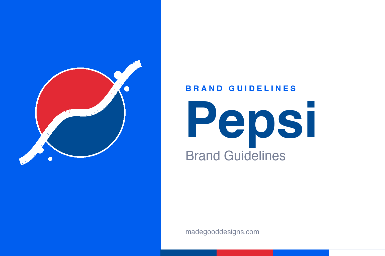
Pepsi Brand Guidelines
A red-white-and-blue circle that has been redrawn more often, and more expensively, than almost any logo alive.
An abstract circle split by a diagonal wavy band with a little fizz — the tricolor heritage, not the mark. Deliberately not the Pepsi globe (no horizontal band, no 3D sphere, no wordmark).
From Brad’s Drink to Pepsi
The world’s great cola underdog started at a small-town pharmacy soda fountain.
In 1893, a New Bern, North Carolina pharmacist named Caleb Bradham began serving a carbonated drink he called ‘Brad’s Drink’ from the fountain in his drugstore. In 1898 he renamed it Pepsi-Cola — a blend of dyspepsia (indigestion, which the tonic was said to soothe) and cola — and incorporated the company in 1902. A note for accuracy: the popular claim that the early recipe actually contained the enzyme pepsin is disputed, so the name is best read as evoking digestion rather than a confirmed ingredient. From those fountain origins grew a challenger brand whose entire identity would be shaped by a single, decades-long rivalry.
The red, white & blue globe
Pepsi’s icon began as a patriotic bottle cap and slowly became a sphere.
The original 1898 logo was an ornate red script. The red-white-blue identity arrived in the 1940s, when Pepsi wrapped its wordmark in a waving tricolor bottle cap — a look widely tied to wartime patriotism. In 1962 the script gave way to a modern sans-serif, and by 1973 the literal cap was retired for the simplified ‘globe’: a red/white/blue circle divided by a wavy white band, the wordmark tucked inside. In 1991 the wordmark moved out above the globe; by the late 1990s the disc turned glossy and three-dimensional. The globe is the through-line — but as we’ll see, it has never stopped being fiddled with.
BREATHTAKING
The 2008 rebrand produced the most famously overwrought design document ever leaked.
In 2008, the Arnell Group reworked the globe for a reported ~$1 million, reframing the white band as a ‘smile / grin / laugh’ that supposedly revealed itself as the logo rotated. The work is remembered less for the (very subtle) visual change than for a leaked 27-page strategy deck titled ‘BREATHTAKING’, which justified the tweak with the golden ratio, Pythagoras, the Mona Lisa and Earth’s gravitational field. The document’s cosmic ambition so far outstripped the actual redraw that it became an industry punchline — a cautionary tale about mistaking mystique for meaning. It is, in its way, the most Pepsi thing that ever happened: enormous effort spent to move a wavy line a few degrees.
Meet the 2023 Pepsi
For its 125th year, Pepsi brought the wordmark home and plugged in.
Pepsi’s first identity change in 14 years landed in 2023 (globally through 2024), timed to the brand’s 125th anniversary. The headline move: the wordmark returns to the centre of the globe, a yin-yang of red and blue. The palette gains an electric blue and, tellingly, black — a nod to Pepsi Zero Sugar and a bid to look more premium next to its rival. A ‘pulse’ motion device evokes ripple, pop and fizz. It’s a confident, contemporary system, and it quietly settles the Arnell era: after chasing profundity, Pepsi’s smartest recent move was simply to make its familiar circle read cleanly on a phone screen.
Type: a custom wordmark
Bespoke lettering, not a font you can download.
Pepsi has run through a custom script (1898–1950s) and then a series of custom sans-serif wordmarks from 1962 on. For 2023, PepsiCo describes only a ‘modern, custom typeface’ — it has not publicly named the face or foundry, so the ‘Pepsi fonts’ sold online are fan replicas, not the brand asset. The specimen below is set in a bold sans in that confident, contemporary spirit.
That’s what I like
Bold, rounded, energetic — a wordmark built to look modern on a chilled can. (Specimen set in Archivo; Pepsi’s actual wordmark is bespoke lettering.)
Red, white & blue
A patriotic trio, refreshed for 2023. Click a swatch to copy the hex.
The classic Pepsi Blue is commonly cited as #004B93, with a bright red around #E32934 and white. The 2023 system adds an electric blue (~#005EEF) and black. One honesty note: PepsiCo does not publish official hex values, so every code here is a third-party reconstruction — treat them as close approximations, not brand-exact. Copy the working values below.
Explore & save
Keep the tricolor-circle idea on hand — save it to a board in the Made Good inspiration library.
Pepsi identity set
Pin the wave-circle idea, the red-white-and-blue and the bold type to your own board.


