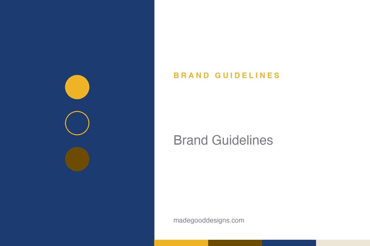
Breitling Brand Guidelines
Wings, an anchor and a slide-rule bezel — instruments for pilots, dressed in gold and navy.
Aa
Two constants: an aviation gold-and-navy palette and glyphic caps. Abstract homage — not the Breitling winged “B” or anchor.
Instruments for professionals
Breitling didn’t make jewellery for pilots — it made tools, and the identity says so.
Breitling’s heritage mark is a script “B” over an anchor, flanked by two spread wings — an aviator’s emblem for a brand that positioned itself as “instruments for professionals.” Founded in 1884 by Léon Breitling in Saint-Imier, Switzerland, it specialised in chronographs and cockpit instruments, building tools pilots actually flew with. The element history (widely reported, dates approximate): the script “B” from the 1940s, the wings added in the 1950s (the Navitimer era), the anchor around the 1980s — accreting into the winged emblem watch enthusiasts know.
Then came a notable modern change. Under CEO Georges Kern (after CVC Capital’s 2017 investment), the 2018 rebrand simplified the mark to a cursive “B” above a clean sans-serif “BREITLING” wordmark — dropping the wings, referencing a 1950s script logo. But the winged “B” was never fully retired: it persists on models like the Aerospace, Avenger and Superocean, so the rollout has been gradual and inconsistent across collections. The tension between the streamlined new wordmark and the beloved winged emblem is itself part of Breitling’s recent story.
Colour
Breitling’s classic palette is aviation gold and navy. Click a swatch to copy the hex.
Historically the brand leaned on yellow/gold (the winged emblem) with dark navy/blue (dials, packaging). Breitling keeps its guidelines private, so no official hex exists — treat cited golds (around #FCBC04/#F0B429) and navy/blue (around #4F79A0–#1B3B6F) as approximate. Note a recent shift: the Kern-era rebrand moved marketing toward warmer, retro-casual, earthy neutrals (creams, browns, muted tones) as part of an “Air, Land, Sea” repositioning beyond the traditional male-pilot base.
The lesson is that a palette can be a deliberate lever for repositioning. Breitling’s classic gold-and-navy read as serious, technical, aviator — perfect for “instruments for professionals.” When the brand wanted to broaden its appeal (more lifestyle, more inclusive), it warmed the palette toward retro, earthy tones, softening the hard-tool image. For designers, it’s a clear example that colour isn’t just decoration — shifting from cool technical gold-and-navy to warm retro neutrals visibly changes who a brand seems to be for, and can accompany a genuine strategic turn.
Typography
The type has shifted from glyphic heritage to a clean modern sans.
Breitling’s historic wordmark closely resembles Copperplate Gothic (a glyphic face with tiny flared serifs — an unofficial identification), reading as authoritative and instrument-like. The 2018 rebrand replaced it with a clean, all-caps sans-serif, part of the streamlined new identity. The exact brand font isn’t published, so both are best described by character rather than name. The move from glyphic-heritage type to a modern sans mirrors the whole rebrand: from hard-edged professional tool toward a broader, more contemporary lifestyle brand — the type doing the repositioning alongside the logo and palette.
Aa 1884
Authoritative glyphic caps, now a cleaner modern sans. (Specimen set in Cinzel, a glyphic Roman face in the spirit of Breitling’s Copperplate-style heritage wordmark.)
The Navitimer’s slide rule
Breitling’s soul is a bezel that does maths.
Breitling’s defining product tells you everything about the brand. The Navitimer (1952), developed with the AOPA (Aircraft Owners and Pilots Association), carries a circular slide-rule bezel that lets pilots compute airspeed, fuel burn and rate of climb on the wrist — a genuine flight instrument, not a decoration (adapted from the 1942 Chronomat’s slide rule). That functional, tools-for-professionals ethos is the historic core of the brand, and the winged “B” is its badge. The recent Kern-era rebrand — retro-casual, “Air, Land, Sea,” inclusive — softens that hard image for a wider audience without abandoning the pilot heritage.
For designers, Breitling is a lesson in an identity in transition. Its classic system (winged emblem, glyphic type, gold-and-navy) perfectly expressed “instruments for professionals”; its 2018 rebrand (simplified “B,” clean sans, warmer neutrals) expresses a broader lifestyle ambition — and the two coexist, sometimes uneasily, across the range. The takeaway is that visual identity is strategy made visible: change the logo, type and palette together and you change who the brand is for. Breitling shows both the power and the difficulty of that move — modernising a heritage mark is a balance between reaching new customers and keeping the enthusiasts who loved the wings.
Explore & save
Keep Breitling’s identity on hand — save it to a board in the Made Good inspiration library.
Breitling identity set
Pin the gold-and-navy palette and the type spirit to your own board.