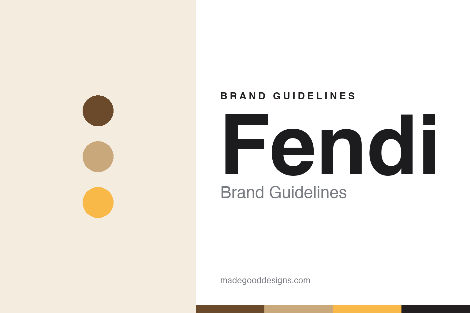
Fendi Brand Guidelines
Two mirrored F’s Karl Lagerfeld drew in seconds — a Roman fur workshop’s monogram that means ‘Fun Furs’.
Aa
Two constants: a brown-and-tan heritage with black and yellow, and a bold rounded sans. Abstract homage — not the Fendi double-F or wordmark.
A monogram drawn in seconds
Fendi’s famous double-F is a Karl Lagerfeld sketch — and it stands for ‘Fun Furs’.
Fendi’s signature is the “double-F” Zucca monogram: two interlocking, mirrored F’s (one inverted). It was designed by Karl Lagerfeld in 1965 — reportedly sketched in seconds — and it stands for “Fun Fur(s),” Lagerfeld’s playful reinvention of fur as light and modern (the “Fun Furs” meaning is house lore he popularised, rather than a formal trademark rationale). Alongside it sit the block-capital “FENDI” wordmark and the Pequin stripe (a fine brown-and-tan repp stripe). The Zucca print — the large-scale FF pattern (“zucca” means pumpkin) — launched in the late 1960s and peaked in the 1980s–90s logomania era.
The house was founded in Rome on 18 August 1925 by Edoardo Fendi and Adele Casagrande (who took the Fendi name on marriage), as a fur and leather workshop. Lagerfeld’s tenure — from 1965 until his death in 2019 — is the longest of any designer at a fashion house, and the double-F is his enduring gift to it. One ownership correction: Fendi was not LVMH-founded; Prada and LVMH bought 51% in 1999, and LVMH took control in 2001.
Colour
Fendi’s heritage palette is warm brown and tan. Click a swatch to copy the hex.
The classic Fendi palette is brown/tan/beige — the Zucca monogram is traditionally rendered in tobacco brown on tan — with black as the primary logotype colour and a signature golden yellow on packaging and accents. Fendi publishes no public brand palette, so treat cited values (a near-black around #231F20, a brand yellow around #F9B949) as third-party approximations, and read the browns qualitatively. The warm, earthy tones tie directly to the house’s origins in fur and leather — the colours of the craft itself.
The lesson is a heritage palette rooted in the material. Fendi’s browns and tans aren’t arbitrary; they’re the colours of leather and fur, so the palette is the craft, made visual. The golden yellow adds warmth and a touch of Roman opulence; black keeps the logotype grounded. For designers, it’s a reminder that the most authentic palettes often come straight from the product — Fendi’s tobacco-brown monogram on tan reads as luxurious precisely because it looks like the leather it’s stamped on. Let the material suggest the colours, and the identity will feel true.
Typography
The wordmark is a bold, softened sans — Roman confidence in letterform.
The “FENDI” wordmark is a custom extra-bold sans-serif with softened, rounded capitals — bespoke, not a licensed retail font (comparisons online are approximations). Bold, confident, evenly weighted letters give the house a modern, graphic presence that pairs well with the geometric double-F monogram. It’s a smart combination: a strong wordmark for the name, and the interlocking FF for pattern and hardware (and the logomania revival). The type reads as assured and contemporary while the browns and the Zucca carry the Roman-craft heritage.
Aa FF
Bold, softened capitals — modern and assured. (Specimen set in Archivo; the Fendi wordmark is a bespoke extra-bold sans.)
Fun furs, forever
Lagerfeld’s playful monogram outlasted him — and defines the house.
Fendi’s identity is inseparable from Karl Lagerfeld. His 1965 double-F, his reinvention of fur as “fun,” and his half-century of creative direction shaped the house’s whole visual language — the Zucca, the Pequin stripe, the logomania that made the FF a status symbol in the 1980s–90s and again in the recent revival. The Baguette bag (Silvia Venturini Fendi, 1997) added an accessory icon; the hand-stitched “Selleria” craft carried the Roman heritage. But the beating heart is that pair of mirrored F’s, sketched in seconds and still working sixty years later.
For designers, Fendi is a lesson in the power of a great monogram — and in how much meaning a simple, well-drawn mark can hold. Two interlocking letters, a warm heritage palette drawn from leather, and a playful idea (“fun furs”) combined into a logo that has anchored a global house across every trend cycle. The takeaways: a monogram built on the founder’s (or house’s) initials, executed with real geometric care, can outlast its designer and become the brand’s most valuable asset; and rooting the palette in the material keeps even the loudest logomania feeling authentic. Fendi’s double-F proves a few seconds of the right sketch can last generations.
Explore & save
Keep Fendi’s identity on hand — save it to a board in the Made Good inspiration library.
Fendi identity set
Pin the brown-and-tan palette and the type spirit to your own board.


