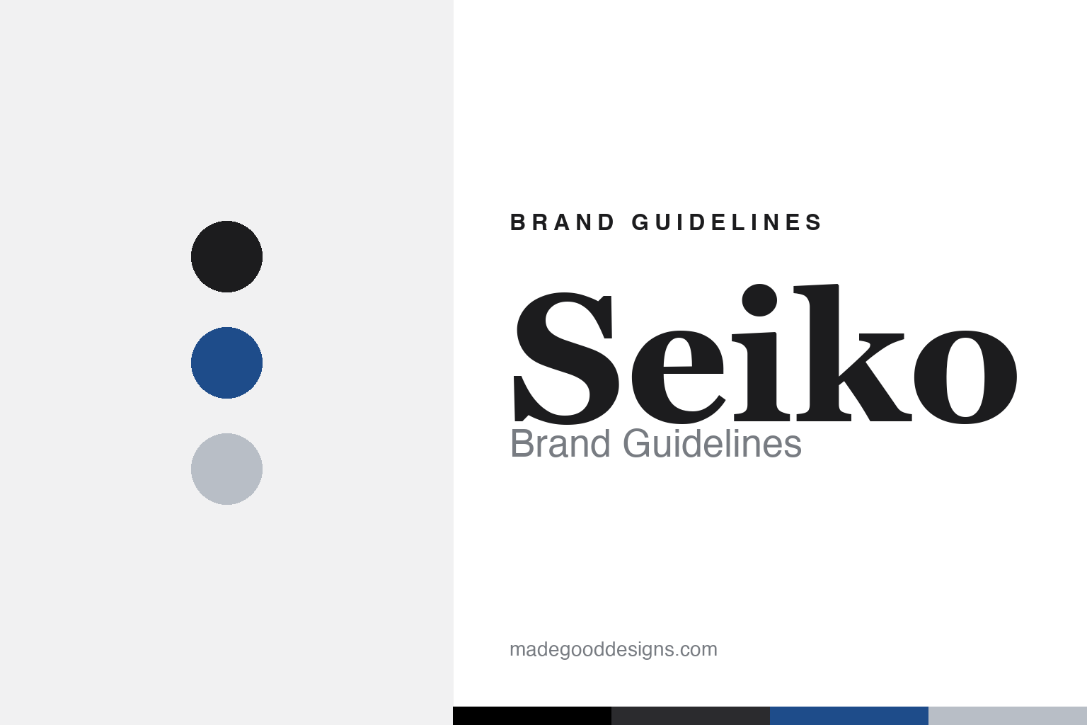
Seiko Brand Guidelines
A plain black wordmark and a quiet revolution — the company that put the world’s first quartz watch on your wrist.
Aa
Two constants: a plain black wordmark and a solid, precise slab-adjacent letterform. Abstract homage — not the Seiko wordmark.
Exquisite, precise, successful
Seiko’s plain wordmark hides a name — and a history — full of ambition.
Seiko’s identity is disarmingly simple: a clean, all-caps “SEIKO” wordmark, black on white, no symbol. But the name carries weight. “Seiko” means, roughly, “exquisite,” “minute/precise” — and, as a homophone, “success.” The company was founded in 1881 by Kintaro Hattori as a watch and clock sales-and-repair shop in Ginza, Tokyo; it opened a factory named Seikosha (“house of exquisite/precision craftsmanship”) in 1892, making clocks first, and the “Seiko” name appeared on a wristwatch for the first time in 1924. So the plain wordmark is really a statement of intent — precision and success, promised in a word.
Seiko’s defining moment is one of the most consequential in watchmaking. On 25 December 1969 it launched the Seiko Astron — the world’s first quartz wristwatch (accurate to ±5 seconds a month), triggering the “Quartz Revolution” (or “Quartz Crisis”) that upended Swiss mechanical dominance and made accurate timekeeping cheap and universal. A brand whose wordmark looks so modest was, in fact, the great disruptor of the entire industry.
Colour
Seiko’s palette is as understated as its wordmark. Click a swatch to copy the hex.
The identity is essentially a black wordmark on white — Seiko’s guidelines don’t publish explicit brand hex, so treat it as effectively #000000 and #FFFFFF (a blue you may associate with the name usually belongs to Seiko Epson, the printer/tech sibling, whose corporate cobalt is documented separately — don’t conflate the two). Silver and steel tones live on the watches themselves. The restraint fits Seiko’s character: a precision-engineering brand that spans from very affordable to very fine, and doesn’t need a loud colour to say “accurate.”
The lesson is letting the products, not the palette, carry the brand. Seiko covers an enormous range — from the accessible Seiko 5 to the haute-craft of Grand Seiko — and a neutral black-and-white identity flexes across all of it without pre-coding a price. As with any minimalist mark, the wordmark just needs to be clean, legible and confident. The takeaway: when a brand’s value is engineering breadth rather than a single lifestyle, an understated, colour-light identity is an asset — it stays credible from a £100 diver to a five-figure Grand Seiko, letting the watches speak.
Typography
The wordmark is a solid, custom letterform — precise and unfussy.
The “SEIKO” wordmark is a custom, bold, slab-adjacent letterform — enthusiasts compare it to faces like American Typewriter, but it’s proprietary, not an exact commercial match. The solid, even letters read as dependable and precise — appropriate for a company built on accuracy — without any flourish that would tie it to a single era or price point. It’s type as engineering: functional, confident, quietly built to last. When your whole identity is a wordmark, getting those letterforms exactly right — solid, legible, timeless — is the entire design job, and Seiko’s has aged well.
Aa 1881
Solid, precise, unfussy — a slab-adjacent custom letterform. (Specimen set in Zilla Slab, a slab serif in the spirit of the Seiko wordmark.)
The quiet disruptor
Seiko’s modest look belies its outsized impact on how the world keeps time.
There’s a lovely mismatch at the heart of Seiko’s brand: a modest, plain wordmark attached to a company that changed timekeeping forever. The 1969 Astron and the Quartz Revolution democratised accuracy, and Seiko has since built a range spanning value to haute horology — the Seiko 5 (from 1963) at the accessible end, Grand Seiko (made an autonomous brand in 2017, though still under Seiko Watch Corporation) at the craft summit. The understated identity fits a brand whose pride is engineering substance rather than status signalling.
For designers, Seiko is a lesson in confidence through restraint. It never needed a flashy logo because its differentiator was precision and innovation — so a clean wordmark, black on white, was exactly right, and it flexes across a huge price range without contradiction. The takeaway: match your identity to your real value. If your brand’s substance is engineering, breadth and accuracy, a quiet, disciplined mark communicates that better than a loud one — and, like Seiko’s, it can carry everything from an everyday quartz watch to a hand-finished Grand Seiko under one modest, trustworthy name.
Explore & save
Keep Seiko’s identity on hand — save it to a board in the Made Good inspiration library.
Seiko identity set
Pin the understated palette and the type spirit to your own board.