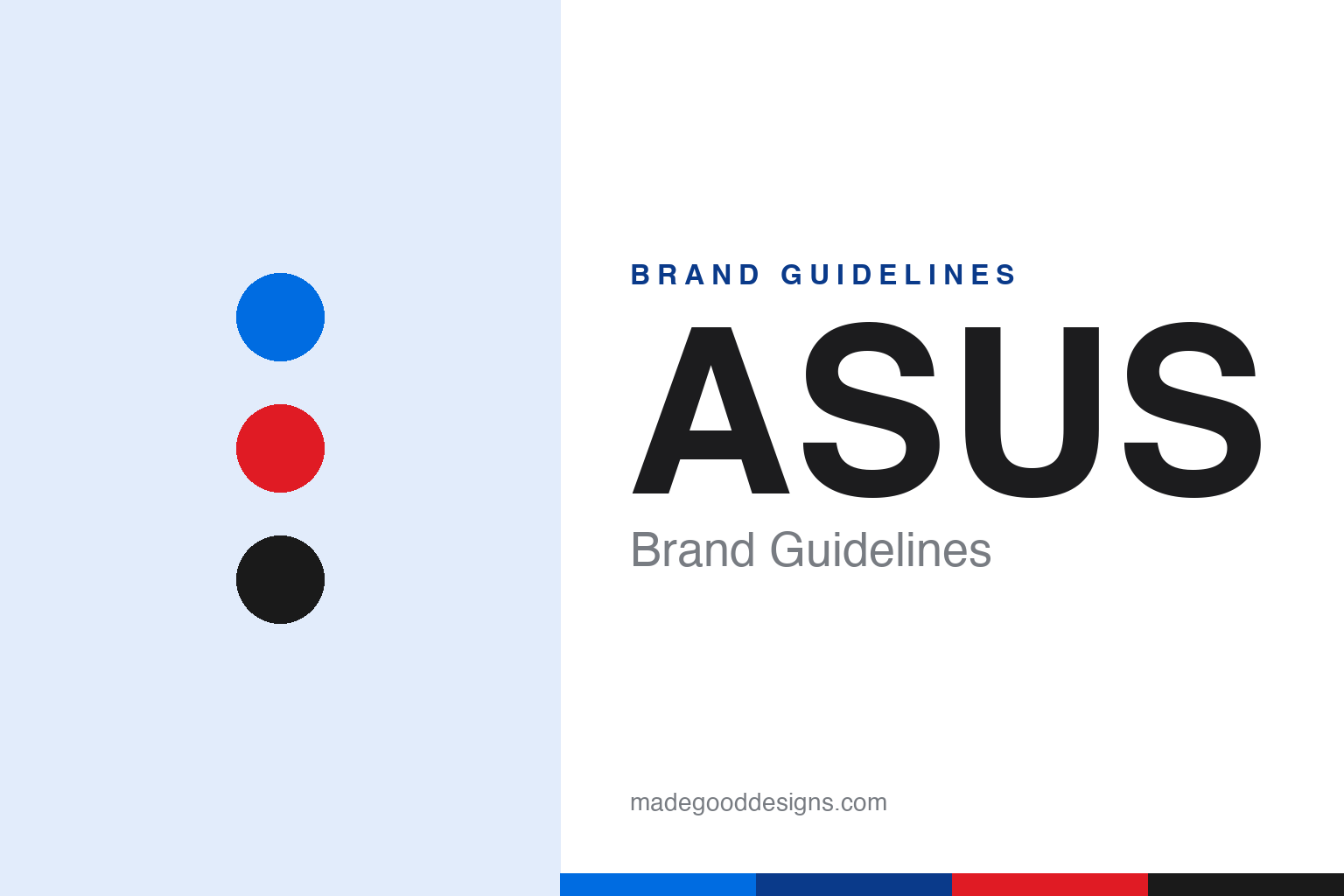
ASUS Brand Guidelines
Named for a winged horse, king of the motherboard — and home to the Republic of Gamers.
Aa
Two constants: a blue palette (with ROG red) and a techy sans. Abstract homage — not the ASUS or ROG mark.
Named for a winged horse
ASUS built the parts inside your PC.
ASUS is a lesson in owning a category from the inside out. ASUSTeK Computer was founded in 1989 in Taipei, Taiwan, by four former Acer engineers (Ted Hsu, M.T. Liao, Wayne Hsieh and T.H. Tung). The name comes from “Peg-ASUS” — the last four letters of Pegasus, the winged horse of Greek myth — chosen for its symbolism of strength, purity and adventurous spirit (and to sit near the top of alphabetical listings). (Honest caveats: no officially published brand hex exists, so the colours below are approximate, and the wordmark typeface is proprietary/undocumented.)
ASUS became the world’s #1 motherboard maker (leading by shipments since the early 2000s, hundreds of millions of units) and a major maker of laptops, graphics cards, monitors and routers. It also launched the Eee PC in 2007, which created and ignited the whole “netbook” category — cheap, tiny, ultra-portable laptops. From the board inside your desktop to a global PC brand, ASUS built its reputation on engineering the components enthusiasts trust.
Its gaming sub-brand is a force of its own: Republic of Gamers (ROG), launched in 2006, spans gaming laptops, motherboards, peripherals and phones, with a distinct aggressive/futuristic identity — the “Fearless Eye” logo and the “ROG Slash” graphic, in red and black, under the slogan “For Those Who Dare.” (The main ASUS brand’s slogan is “In Search of Incredible.”) The corporate identity is an angular “ASUS” wordmark, essentially black with blue in wider marketing, and the ZenBook’s concentric-circle “Zen” spun-metal motif. Two identities — mainstream ASUS and hardcore ROG.
Colour
ASUS lives in blue, with ROG red. Click a swatch to copy the hex.
ASUS’s identity leans on black with a blue used across marketing, while its ROG gaming sub-brand owns an aggressive red-and-black. The black-and-blue reads as technical, premium and trustworthy — fitting for the components and PCs enthusiasts rely on — while ROG’s red-and-black signals performance, intensity and gamer energy. Running two palettes lets ASUS speak to both mainstream buyers (calm, credible) and hardcore gamers (bold, fierce) without confusing either. It’s a smart split that matches the brand’s dual audiences. The honest caveat: ASUS publishes no official brand hex — the blue and ROG red here are observed approximations, not first-party values.
The lesson is two palettes for two audiences. ASUS’s calm black-and-blue serves mainstream buyers; ROG’s red-and-black fires up gamers. For designers, it’s a case study in sub-brand colour strategy. The takeaways: use a credible, technical palette for the mainstream brand (black-and-blue); give a gaming/performance sub-brand its own bold palette (ROG red-and-black); and treat specific hexes as approximate when no official spec is published.
Typography
The wordmark is an angular tech sans — precise and modern.
ASUS’s angular tech sans wordmark — the uppercase “ASUS,” with its slightly slanted, geometric forms — is precise and modern. The engineered letterforms read as technical, premium and forward-leaning, matching a company built on motherboards, components and performance hardware, and the angularity gives it a subtle sense of speed and precision. The ROG sub-brand pushes this further into aggressive, futuristic territory (the Fearless Eye, the Slash), while the main ASUS wordmark stays cleaner for a broader audience. Together they cover the spectrum from enthusiast to mainstream. (Because the exact face is proprietary and undocumented, the honest description is “an angular tech sans,” not a named font.) The type behaves like the brand: precise, modern and performance-minded.
Aa
An angular tech sans — precise and modern. (Specimen set in Michroma, a wide techy sans in the spirit of the ASUS wordmark; the real face is undocumented.)
Two brands, two audiences
ASUS serves both mainstream and hardcore.
ASUS is a lesson in running distinct brands for distinct audiences. The core ASUS brand — calm, credible, blue — speaks to mainstream buyers of laptops, motherboards and everyday PCs, while Republic of Gamers — fierce, futuristic, red-and-black — speaks to hardcore gamers who want performance and attitude. By giving each its own identity, palette and slogan (“In Search of Incredible” vs “For Those Who Dare”), ASUS avoids diluting either: the mainstream brand doesn’t alienate normal buyers with aggressive gamer aesthetics, and ROG doesn’t feel watered down by corporate calm. It’s a textbook sub-brand strategy — one company, two clearly-tuned identities, each maximised for its audience.
For designers and brand-builders, ASUS offers a clear takeaway: distinct sub-brands, each with its own identity and voice, can serve very different audiences without conflict. The lessons: keep the mainstream brand credible and broad (ASUS blue, “In Search of Incredible”); give a performance sub-brand its own bold world (ROG red-and-black, “For Those Who Dare”); and let each identity be tuned to its buyer. It’s also a reminder to keep the facts precise — ASUS was founded in 1989 in Taiwan by ex-Acer engineers, is named after Pegasus, became the #1 motherboard maker and launched the netbook-defining Eee PC (2007), and runs the Republic of Gamers sub-brand (2006). ASUS serves two audiences — proof that distinct sub-brands can maximise each without diluting the other.
Explore & save
Keep ASUS’s identity on hand — save it to a board in the Made Good inspiration library.
ASUS identity set
Pin the blue-and-red palette and the tech-sans spirit to your own board.