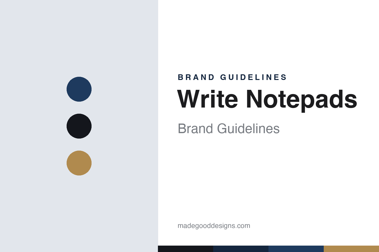
Write Notepads & Co. Brand Guidelines
A Baltimore bindery making letterpress notebooks — and giving supplies to schools.
Aa
Two constants: a navy-and-kraft palette and an American industrial sans. Abstract homage — not the Write Notepads wordmark or logo.
A Baltimore bindery
Write Notepads makes notebooks the old way.
Write Notepads & Co. is a lesson in craft manufacturing as a brand. It’s an American notebook and notepad maker in Baltimore, Maryland, founded in 2011 (we hedge the exact year) by Chris Rothe, a third-generation bookbinder who runs it within his family’s bookbinding plant. Everything is designed, printed and assembled by hand in the USA.
Its identity is traditional American craft: covers letterpressed on antique presses, spiral wire-binding drawn from the family bindery’s heritage, and US-made vegetable-based inks. The range runs from pocket memo books (Field-Notes-style 3-packs) to larger notebooks, planners and writing accessories — with regular limited and regional editions (Edgar Allan Poe and Baltimore-themed lines among them) that give the community something to collect.
The second half of the brand is giving back: Write Notepads runs a school-donation program, giving thousands of notebooks and school supplies to classrooms in need, with a special focus on its Baltimore hometown, funded by product sales. So it’s two things at once — a genuine made-in-USA craft manufacturer and a community-minded local business. (Honest notes: the founding year is hedged (2011 per the company; 2012 elsewhere); the founder’s bio beyond his bookbinding lineage is held loosely; the donation program is described generally rather than by a fixed current ratio; it’s distinct from Field Notes and Word Notebooks; and no official brand hex is published.)
Colour
Write Notepads lives in a navy-and-kraft palette. Click a swatch to copy the hex.
Write Notepads’ identity is sturdy, American and crafted — a workwear navy, ink black, and a kraft tan. The palette reads as the workshop: the navy of a bindery apron, the black of letterpress ink, and the kraft of a memo-book cover. It’s a made-by-hand world that signals craft, heritage and honest manufacturing. It’s a navy-and-kraft palette that signals American letterpress craft. The honest caveat: Write Notepads publishes no official brand hex, so the navy, ink and kraft here are an original, unofficial interpretation, not first-party values.
The lesson is a navy-and-kraft palette signals honest American craft. Write Notepads’ world reads as sturdy and hand-made. For designers, it’s a reminder that workwear neutrals (navy, kraft) express craft and honesty better than gloss. The takeaways: use workwear neutrals for a hand-made, honest feel; let the manufacturing be the story; and treat any single hex as unofficial when there’s no published spec.
Typography
The wordmark spirit is an American industrial sans — sturdy and honest.
Write Notepads’ identity carries a sturdy, honest, American spirit — a “Write Notepads” wordmark whose solid forms match a hands-on bindery. An American industrial sans captures the mood: it’s sturdy and plainspoken, matching a maker that letterpresses covers on antique machines. Set against a navy palette, the industrial sans feels crafted and honest — exactly the letterpress, made-in-USA personality Write Notepads carries. It’s solid rather than delicate, mirroring a spiral-bound memo book. (Write Notepads’ real wordmark is a trademark we describe but don’t reproduce.) Because the exact mark isn’t ours to use, the honest description is “an American industrial sans spirit,” not the Write Notepads logo. The type behaves like the brand: sturdy, honest and American.
Aa
An American industrial sans spirit — sturdy and honest. (Specimen set in Oswald, an industrial sans; NOT the Write Notepads logo, which is a trademark.)
Craft plus community as the difference
Write Notepads makes and gives.
Write Notepads & Co. is a lesson in pairing genuine craft with genuine community. Its manufacturing story is real: a third-generation bookbinder, antique letterpresses, spiral binding, everything made by hand in Baltimore. That alone would be a solid craft brand. But it adds a second, aligned commitment — a school-supply donation program focused on its own city — so the brand isn’t just “made in the USA,” it’s “made here, and giving back here.” The two halves reinforce each other: the craft earns the trust, the giving earns the loyalty, and both are rooted in the same place. It’s a reminder that a small maker can compete with bigger brands by being unmistakably from somewhere and for someone.
For designers and brand-builders, Write Notepads offers a clear takeaway: local craft and local giving reinforce each other into a stronger identity than either alone. The lessons: make the manufacturing visible and real (letterpress, family bindery) so the craft is credible; pair it with an aligned community commitment (school supplies) rooted in the same place; and keep the facts precise — Write Notepads is a Baltimore letterpress notebook maker founded around 2011 by Chris Rothe. It’s also a reminder to keep it honest: the founding year is hedged; the donation program is described generally, not by a fixed current ratio; it’s a separate brand from Field Notes and Word Notebooks; and no official brand hex is published, so the palette here is an interpretation. Write Notepads makes and gives — proof that craft plus community can be the difference.
Explore & save
Keep Write Notepads & Co.’s identity on hand — save it to a board in the Made Good inspiration library.
Write Notepads identity set
Pin the navy-and-kraft palette and the industrial-sans spirit to your own board.


