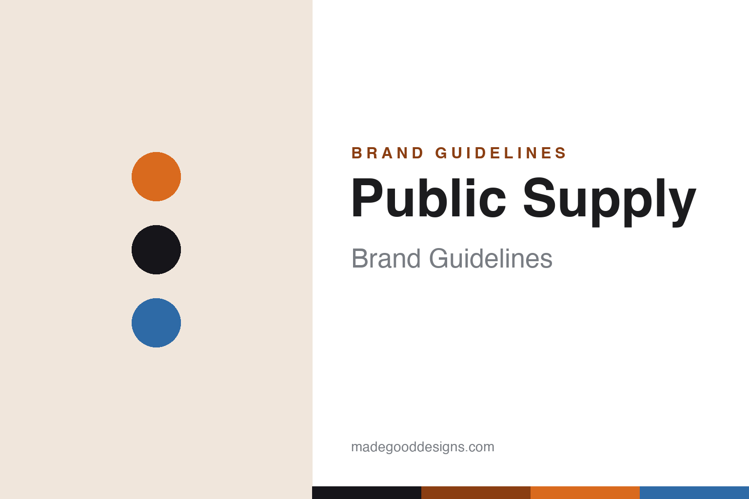
Public Supply Brand Guidelines
Minimal notebooks with a mission — a quarter of profits funds public-school classrooms.
Aa
Two constants: an orange-and-ink palette and a clean modern sans. Abstract homage — not the Public Supply wordmark or logo.
Notebooks with a mission
Public Supply funds classrooms with every sale.
Public Supply is a lesson in a mission as the brand. It’s an American stationery brand based in Brooklyn, New York, founded around 2012 (we hedge the year, and treat its founder list as reported rather than first-party). Its identity isn’t a product feature — it’s a purpose.
That purpose is education. Public Supply donates 25% of its profits to fund arts programs and high-need public-school classrooms, historically partnering with DonorsChoose to match sales to specific classroom needs — and each product carries a tracking code so a buyer can see which classroom their purchase helped fund. The “public” in the name is literal: public-school support. It’s a for-profit business built as a social enterprise, where buying a notebook is also a small act of giving.
The products match the ethos: minimalist, well-designed notebooks, notepads and pencils — embossed soft- and hard-cover books in dot-grid and ruled, in a clean modern aesthetic, sustainably sourced (FSC-certified, acid-free, recycled content) and printed in the USA. The design is deliberately quiet, because the point isn’t to out-design rivals; it’s to make a good, unfussy notebook whose real distinction is where the money goes. (Honest notes: the founding year and founders are hedged/secondary-sourced; the donation is 25% of profits, not revenue, with DonorsChoose as the historical partner; it makes pencils for certain, “pens” less confirmed; it’s distinct from Field Notes, Baron Fig and Write Notepads; and no official brand hex is published.)
Colour
Public Supply lives in an orange-and-ink palette. Click a swatch to copy the hex.
Public Supply’s identity is clean, optimistic and purposeful — a warm orange, ink black, and a sky blue. The palette reads as a bright, civic-minded brand: the optimism of orange, the clarity of black, a friendly blue. It’s a modern, do-good world that signals design, clarity and mission. It’s an orange-and-ink palette that signals a purposeful notebook brand. The honest caveat: Public Supply publishes no official brand hex, so the orange, ink and blue here are an original, unofficial interpretation, not first-party values.
The lesson is a warm-orange-and-ink palette signals optimistic purpose. Public Supply’s world reads as clean and civic-minded. For designers, it’s a reminder that a warm, optimistic accent (orange) with a clear neutral can express a mission-driven, modern brand. The takeaways: use a warm optimistic accent for a purpose-led brand; keep the design clean so the mission leads; and treat any single hex as unofficial when there’s no published spec.
Typography
The wordmark spirit is a clean modern sans — friendly and purposeful.
Public Supply’s identity carries a clean, friendly, purposeful spirit — a “Public Supply” wordmark whose modern forms match a minimalist notebook with a civic mission. A clean modern sans captures the mood: it’s friendly and unfussy, matching a brand whose distinction is where its profits go, not visual noise. Set against an orange palette, the modern sans feels optimistic and purposeful — exactly the give-back, minimalist personality Public Supply carries. It’s clean rather than decorative, mirroring an unfussy dot-grid notebook. (Public Supply’s real wordmark is a trademark we describe but don’t reproduce.) Because the exact mark isn’t ours to use, the honest description is “a clean modern sans spirit,” not the Public Supply logo. The type behaves like the brand: clean, friendly and purposeful.
Aa
A clean modern sans spirit — friendly and purposeful. (Specimen set in Sora, a clean modern sans; NOT the Public Supply logo, which is a trademark.)
A mission as the difference
Public Supply competes on purpose.
Public Supply is a lesson in making purpose the primary differentiator. In a market where indie notebook brands compete hard on design (Baron Fig), collectibility (Field Notes) or craft (Write Notepads), Public Supply chose a different axis entirely: where the money goes. By donating 25% of profits to public-school classrooms and letting buyers track the exact classroom they funded, it turned an ordinary purchase into a transparent act of giving — and made that, not any product feature, the reason to choose it. The minimalist design is deliberate: it keeps the notebook good and unobtrusive so the mission is the story. It’s a clear example of how a values-first brand can carve out space against better-funded, design-led rivals — by competing on something they’re not.
For designers and brand-builders, Public Supply offers a clear takeaway: a genuine, transparent mission can be a brand’s primary differentiator. The lessons: pick an axis competitors aren’t playing on (here, funding public education) and commit to it concretely and transparently (25% of profits, a per-product tracking code); keep the product clean so the mission leads; and keep the facts precise — Public Supply is a Brooklyn brand that funds public-school classrooms. It’s also a reminder to keep it honest: the founding year and founders are hedged/secondary-sourced; the donation is 25% of profits (not revenue), with DonorsChoose as the historical partner; it makes pencils (pens less confirmed); and no official brand hex is published, so the palette here is an interpretation. Public Supply competes on purpose — proof that a mission can be the difference.
Explore & save
Keep Public Supply’s identity on hand — save it to a board in the Made Good inspiration library.
Public Supply identity set
Pin the orange-and-ink palette and the modern-sans spirit to your own board.


