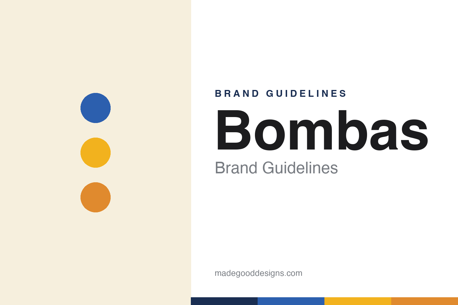
Bombas Brand Guidelines
Bee Better.
Aa
Two constants: a blue-and-honey palette and a rounded, friendly wordmark. Abstract homage — not the Bombas bee, honeycomb or wordmark.
A sock with a mission
Bombas built a brand on giving.
Bombas is a lesson in a mission as the core of a brand. Founded in 2013 by David Heath and Randy Goldberg in New York, it started from one fact — socks are the most-requested item at homeless shelters — and built a company around it. Its name comes from “Bombus,” the Latin word for bumblebee, and the bee (small creatures, big collective impact) is the whole metaphor.
The engine is a “one purchased, one donated” model — every item bought donates a specially-designed item to people experiencing homelessness (socks first, then underwear, T-shirts and more; over 150 million items donated by 2025). The product is engineered too — honeycomb arch support, a seamless toe — and the mantra “Bee Better” is stitched into every pair.
(Honest notes: Bombas is private, independent and founder-led — it famously became the most successful product in Shark Tank history after Daymond John’s investment — and while it is large and growing, exact revenue and “profitable” claims vary by source, so we describe it as thriving rather than citing a single figure. The donated-items count is a moving number, quoted here as of 2025. No official brand hex is published.)
Colour
Bombas lives in blue and honey. Click a swatch to copy the hex.
Bombas’ identity is warm, playful and hive-like — a Bombas blue, a honey gold, an amber, a cream, and an ink. The palette pairs a signature blue bee with warm honey and amber tones and a honeycomb motif. It signals a friendly, optimistic, mission-driven brand rather than a technical sportswear one. The honest caveat: with no published brand hex, these tones are an original, unofficial interpretation, not first-party values.
The lesson is an ownable icon plus a modular motif builds a world. Bombas turned a bee and a honeycomb into a whole system. For designers, it is a reminder that a distinctive mascot (a blue bee, deliberately not the expected yellow) and a repeatable graphic device (the hexagon hive) can carry a brand across every product and touchpoint. The takeaways: pick a surprising, ownable icon; build a modular motif around it; and treat any single hex as unofficial — using a deep navy for small text so the honey tones stay warm.
Typography
The wordmark spirit is a rounded, friendly sans — warm and optimistic.
Bombas’ identity carries a warm, playful, optimistic spirit — a bold “BOMBAS” wordmark layered over a blue crowned-bee and a honeycomb. A rounded, friendly sans captures the mood: it is upbeat and human, the register of a brand whose mantra is “Bee Better.” Set against blue and honey, the rounded type feels cheerful and generous — exactly the mission-driven personality Bombas carries. It is warm rather than corporate, mirroring a company built on giving. (Bombas’ real wordmark, the crowned bee and the honeycomb system — created in a rebrand by studio &Walsh — are trademarks and trade dress we describe but do not reproduce, and the exact typeface is not published, so we don’t assert it.) Because the specific mark is not ours to use, the honest description is “a rounded sans spirit,” not the Bombas logo. The type behaves like the brand: warm, playful and optimistic.
Aa
A rounded sans spirit — warm and optimistic. (Specimen set in Fredoka, a rounded sans; NOT the Bombas logo, which is a trademark.)
When the mission is the design
Bombas stands for Bee Better.
Bombas is a lesson in designing a mission into every layer. The giving model isn’t a footnote — it is the reason the company exists, and the identity carries it: the bee (collective impact), the honeycomb (a hive of small contributions), the “Bee Better” stitched into the product itself. Purpose and design reinforce each other. The differentiator is a genuine mission expressed through a coherent visual world.
For designers and brand-builders, Bombas offers a clear takeaway: when the mission is real, let it drive the design. The lessons: find the metaphor that carries your purpose (the bee/hive); make it ownable by breaking convention (a blue bee, not yellow); and thread the message through the product, not just the marketing. It is also a reminder to stay accurate: Bombas is private and founder-led, its donation count is a moving number (150M+ by 2025), and its name is Latin for bumblebee — with the palette here an unofficial interpretation. Bombas asked everyone to Bee Better — proof that a mission can be the design.
Explore & save
Keep Bombas’s identity on hand — save it to a board in the Made Good inspiration library.
Bombas identity set
Pin the blue-and-honey palette and the rounded-sans spirit to your own board.