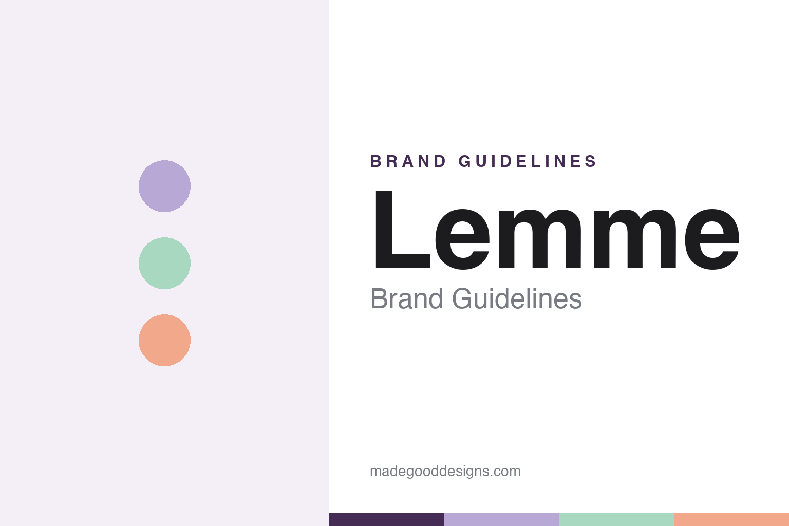
Lemme Brand Guidelines
Vanity table, not medicine cabinet.
Aa
Two constants: a lavender-led pastel palette and a rounded lowercase wordmark. Abstract homage — not the Lemme wordmark or bottle.
Supplements, made cute
Lemme made vitamins look like candy.
Lemme is a lesson in redesigning a clinical category as fun. Launched in 2022 by Kourtney Kardashian Barker and Simon Huck, it sells functional vitamin and supplement gummies — Lemme Sleep, Lemme Matcha, Lemme Purr and more — aimed at a younger audience who’d never buy a beige supplement bottle.
The design, by agency DE-YAN, is deliberately anti-clinical: a soft lavender-led pastel palette (with mint, coral and pink), translucent candy-jar bottles inspired by vintage sweets, and a friendly lowercase “lemme” logotype that snaps onto every product (“Lemme Glow,” “Lemme Purr”). The idea: supplements that live on a vanity table, not in a medicine cabinet.
(Honest notes: Lemme is private and growing (reported figures — a #1 beauty-ingestible spot at Target, a projected nine-figure revenue — should be attributed, not stated as fact). And its GLP-1 product faces class-action lawsuits (2025) alleging its weight-management claims are misleading — allegations, not proven findings; the product was later rebranded. Supplement “functional” benefits are wellness marketing, not drug effects. No official brand hex is published.)
Colour
Lemme lives in a lavender-led pastel palette. Click a swatch to copy the hex.
Lemme’s identity is soft, playful and candy-like — a lavender, a mint, a coral, a pink, and an ink. The palette is a lavender-led pastel set (lilac hero, plus mint, coral and pink), inspired by vintage candy jars. It signals fun, approachable, Instagrammable wellness rather than clinical supplementation. The honest caveat: with no published brand hex, these tones are an original, unofficial interpretation, not first-party values.
The lesson is pastel candy colour reframes a clinical category. Lemme’s world is a translucent candy jar. For designers, it is a reminder that a soft, lavender-led pastel palette (plus friendly type and candy-like bottles) can move a product from the medicine cabinet to the vanity — the colour does the repositioning. The takeaways: pick a soft hero colour (lavender) with sweet accents; borrow codes from an appealing category (candy); and treat any single hex as unofficial — using a deep purple for small text so the pastels stay soft.
Typography
The wordmark spirit is a rounded lowercase sans — friendly and cute.
Lemme’s identity carries a friendly, cute, playful spirit — a lowercase “lemme” logotype that clicks onto each product name. A soft rounded sans captures the mood: it is warm and approachable, the register of a supplement brand that wants to feel like candy, not medicine. Set against lavender-led pastels, the rounded type feels sweet and modern — exactly the vanity-table personality Lemme carries. It is cute rather than clinical, mirroring a translucent candy jar. (Lemme’s real wordmark and packaging — by agency DE-YAN — are trademarks and trade dress we describe but do not reproduce, and the exact typeface is not ours to assert.) Because the specific mark is not ours to use, the honest description is “a rounded lowercase spirit,” not the Lemme logo. The type behaves like the brand: friendly, cute and playful.
Aa
A rounded lowercase spirit — friendly and cute. (Specimen set in Quicksand, a rounded sans; NOT the Lemme logo, which is a trademark.)
Anti-clinical as strategy
Lemme stands for the vanity table.
Lemme is a lesson in winning a category by refusing its look. Supplements are clinical, beige, medicinal; Lemme made them cute, pastel and candy-like — a lavender vanity object you’d want to display — and that anti-clinical design is the whole pitch. The look moved the product from a cabinet to a countertop. The differentiator is deliberately un-clinical, candy-coded design.
For designers and brand-builders, Lemme offers a clear takeaway: rejecting a category’s visual language can be the strategy. The lessons: identify the category cliché (clinical beige) and invert it (candy pastel); make the object displayable; and let a friendly logotype flex across a growing line. It is also a reminder to report fairly: Lemme is private with attributed growth figures, and its GLP-1 product faces class-action allegations that its claims mislead — with the palette here an unofficial interpretation. Lemme made supplements cute — proof that rejecting a look can be the difference.
Explore & save
Keep Lemme’s identity on hand — save it to a board in the Made Good inspiration library.
Lemme identity set
Pin the lavender-pastel palette and the rounded-lowercase spirit to your own board.