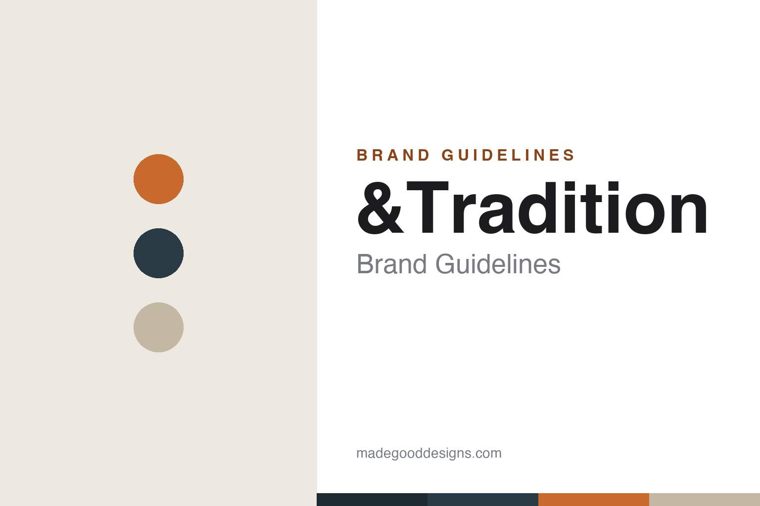
&Tradition Brand Guidelines
Designing the classics of tomorrow — Danish re-editions and contemporary design, joined by an ampersand.
Aa
Two constants: a warm Flowerpot-orange-and-greige palette and a modern sans anchored by the &. Abstract homage — not the &Tradition wordmark.
The classics of tomorrow
&Tradition bridges eras.
&Tradition is a lesson in joining heritage and the present. It was founded in 2010 in Copenhagen, Denmark by Martin Kornbek Hansen (then in his mid-twenties). Its whole idea lives in the ampersand: &Tradition bridges tradition and innovation, producing both re-editions of 20th-century design icons and new contemporary designs — in its own words, “designing the classics of tomorrow.” The founding brief was specifically to reintroduce the work of Verner Panton. (Two honest notes: no official brand hex is published, and the wordmark typeface is undocumented.)
The signature reissue is the Flowerpot lamp (VP3, designed by Verner Panton in 1968) — a joyful, two-hemisphere pendant that is effectively &Tradition’s origin story. (An honest note: Panton designed it in 1968 and it was first produced by Louis Poulsen; &Tradition is the modern reissuer, not the originator.) Another signature is the Little Petra chair (VB1, a 1938 design by Viggo Boesen) — which &Tradition produced at scale for the first time ever, reconstructed from original sketches.
The contemporary side is just as real: &Tradition works with designers like Jaime Hayon (the Setago lamp), Space Copenhagen, Sami Kallio (the In Between chair) and Anderssen & Voll, and reissues classics like the Arne Jacobsen & Flemming Lassen Mayor sofa. (Two honest notes: the “Bellhop” lamp people sometimes associate with the brand is actually a Flos product by Barber & Osgerby — not &Tradition; and on ownership, &Tradition isn’t wholly independent — since 2016 a 50% stake has been held by the founders of fellow Danish brand HAY and the Holch Povlsen family, with founder Hansen leading it until 2023.) It’s a certified B Corp. The classics of tomorrow.
Colour
&Tradition lives in a warm Flowerpot-orange-and-greige palette. Click a swatch to copy the hex.
&Tradition’s identity leans on a warm, sophisticated, contemporary palette — muted greiges, sands and warm neutrals, deep teals and greens, and the joyful bold hues of its icons (the orange, coral and red of Panton’s Flowerpot). The palette bridges eras just as the brand does: refined, muted contemporary tones that let considered re-editions and new designs sit together, warmed by the occasional bold pop from a Flowerpot lamp. It reads as tasteful, warm and design-literate. The honest caveat: &Tradition publishes no official brand hex, so the Flowerpot orange, teal and greige here are an original, unofficial interpretation, not first-party values.
The lesson is a warm, muted palette (with bold pops) bridges heritage and now. &Tradition’s greige-and-Flowerpot world reads as tasteful and design-literate. For designers, it’s a reminder that muted contemporary tones plus occasional bold accents can unite eras. The takeaways: use warm, muted neutrals to bridge old and new; add bold accents from icons (Flowerpot); and treat specific hexes as unofficial when there’s no published spec.
Typography
The wordmark is a modern sans anchored by the ampersand — heritage-meets-now.
&Tradition’s identity carries a heritage-meets-now spirit — the “&Tradition” wordmark whose defining glyph is the ampersand itself, a literal symbol of “tradition and innovation.” A clean modern sans captures the mood: it’s refined and contemporary, letting the ampersand carry the concept, matching a brand that unites re-editions and new design. Set against a warm greige-and-Flowerpot palette, the type feels tasteful and design-literate — exactly the “classics of tomorrow” personality &Tradition cultivates. It’s modern and clean rather than heritage-serif or loud, letting the ampersand and the palette do the storytelling. Because the exact wordmark face isn’t publicly documented, the honest description is “a modern sans spirit (anchored by the ampersand),” not a named font. The type behaves like the brand: refined, contemporary and concept-led.
Aa
A modern sans spirit — heritage-meets-now, anchored by the ampersand. (Specimen set in Epilogue, a modern sans in the spirit of the &Tradition identity; the real face is undocumented.)
The ampersand as the difference
&Tradition unites old and new.
&Tradition is a lesson in a single concept — “and” — as the brand’s whole identity. The differentiator is right there in the name and its ampersand: this is a house built on the union of tradition and innovation, producing forgotten and famous 20th-century icons (Panton’s Flowerpot, Boesen’s Little Petra) alongside fresh contemporary designs, all under one coherent, tasteful roof. That “and” is a genuinely useful position: it lets the brand offer both the reassurance of proven classics and the freshness of new design, and it frames each side as enriching the other — the heritage lends credibility to the new, the new keeps the heritage alive. Backed by real reissue work (reconstructing pieces from original sketches, producing some at scale for the first time) and genuine contemporary collaborations, the concept holds up. The lesson is that a clear, single organising idea — here, the literal “and” of heritage plus innovation — can unify a diverse catalogue into a coherent, differentiated brand. Find your “and,” and let it define you. Old and new, together.
For designers and brand-builders, &Tradition offers a clear takeaway: a single organising concept can unify a diverse catalogue. The lessons: pick a clear idea and put it in the name (tradition & innovation, the ampersand); back both sides with real work (faithful reissues and genuine new design); and let each side enrich the other. It’s also a reminder to keep the facts precise — &Tradition was founded in 2010 in Copenhagen by Martin Kornbek Hansen, reissues the Panton Flowerpot and Boesen’s Little Petra alongside contemporary design, and has been 50% owned by HAY’s founders and the Holch Povlsen family since 2016. &Tradition unites old and new — proof that an organising concept can be the difference.
Explore & save
Keep &Tradition’s identity on hand — save it to a board in the Made Good inspiration library.
&Tradition identity set
Pin the warm palette and the modern-sans spirit to your own board.


