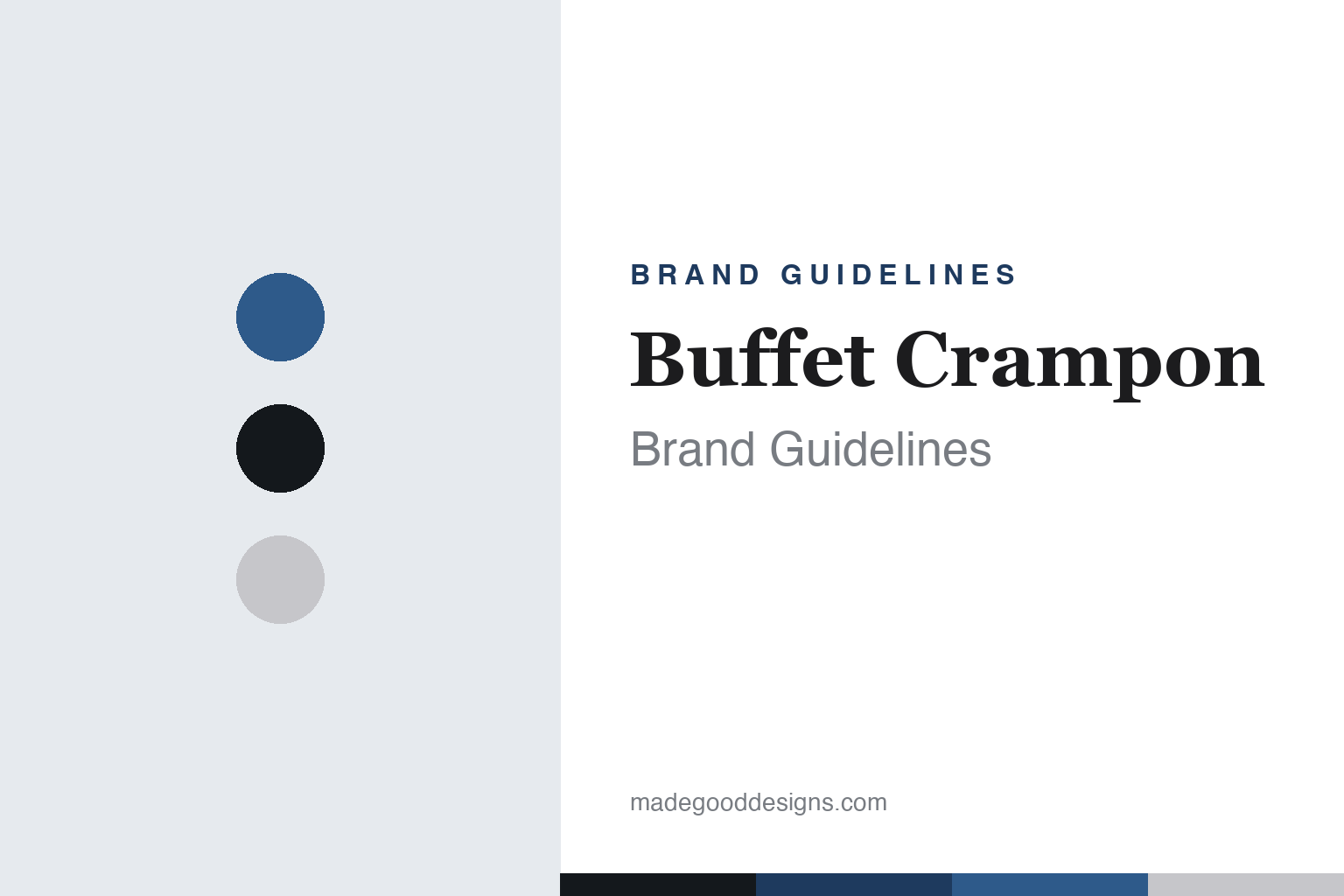
Buffet Crampon Brand Guidelines
The clarinet standard — the R13, grenadilla and silver, and a pan-European wind group.
Aa
Two constants: a grenadilla-and-silver palette and a classic serif. Abstract homage — not the Buffet Crampon wordmark or logo.
The clarinet standard
Buffet perfected the clarinet.
Buffet Crampon is a lesson in a single perfected product that standardizes a discipline. It was founded in 1825 in Paris by Denis Buffet-Auger, a woodwind maker; the “Crampon” came when his successor Jean-Louis Buffet married Zoé Crampon (⚠️ a marriage, not a business partner — the detail most histories garble), and the firm became Buffet Crampon. It moved to Mantes-la-Ville in 1850, still its manufacturing home.
Its icon is the R13 clarinet — the world-standard professional Boehm-system clarinet, designed by Robert Carrée in the mid-1950s (commonly cited as 1955, though some sources say 1950 — we hedge the year). Its polycylindrical bore shaped modern orchestral clarinet tone, especially in the US, and the R13 remains a benchmark alongside flagships like the Tosca, Divine and Tradition, all built from grenadilla (African blackwood). A precise, myth-correcting note on the Boehm system: the Boehm-clarinet was developed 1839–1844 by clarinettist Hyacinthe Klosé with maker Auguste Buffet, adapting Theobald Boehm’s flute key principles — so Buffet perfected and popularized the Boehm clarinet rather than inventing the underlying Boehm principle.
Today Buffet Crampon anchors a pan-European wind-instrument group: it owns a roster of heritage brands including Besson (brass), Antoine Courtois (trombones), Hans Hoyer (horns), Julius Keilwerth (saxophones), Verne Q. Powell Flutes (USA), B&S, W. Schreiber, J. Scherzer and Melton Meinl Weston (tubas), with operations in France (Mantes-la-Ville) and Germany (Markneukirchen). It’s the woodwind world’s answer to the American Conn-Selmer group. (No official brand hex or typeface is published.)
Colour
Buffet Crampon lives in a grenadilla-and-silver palette. Click a swatch to copy the hex.
Buffet Crampon’s identity is French, professional and refined — the deep near-black of grenadilla wood, the bright silver of the keywork, and a cool French blue. The palette reads as craft and precision: the exact look of a professional Boehm clarinet, black wood against silver keys, from a house that traces to 1825. It’s a heritage, professional world that signals craft, standards and the orchestra. It’s a grenadilla-and-silver palette that signals French craft, precision and the professional clarinet. The honest caveat: Buffet publishes no official brand hex, so the grenadilla, silver and blue here are an original, unofficial interpretation of its instruments, not first-party values.
The lesson is a material palette can be the identity. Buffet’s professional world reads as precise and refined. For designers, it’s a reminder that the literal materials of a product — black wood, silver metal — can become its most honest colour story. The takeaways: let materials define the palette; pair a deep neutral with a bright metal; and treat specific hexes as unofficial when there’s no published spec.
Typography
The wordmark is a classic serif — French and heritage.
Buffet Crampon’s identity carries a classic, French, heritage spirit — a “Buffet Crampon” wordmark whose refined letterforms read as Parisian and traditional. A classic serif captures the mood: it’s elegant and dignified, matching a maker of professional clarinets since 1825. Set against a grenadilla-and-silver palette, the serif feels crafted and precise — exactly the R13, orchestral-standard personality Buffet carries. It’s heritage and refined rather than modern or plain, mirroring a hand-finished clarinet. (Buffet’s real wordmark is a trademark we describe but don’t reproduce.) Because the exact wordmark isn’t ours to use, the honest description is “a classic serif spirit,” not the Buffet Crampon logo. The type behaves like the brand: classic, French and heritage.
Aa
A classic serif spirit — French and heritage. (Specimen set in EB Garamond, a classic serif evoking French craft; NOT the Buffet Crampon logo, which is a trademark.)
One perfected product as the difference
Buffet made the reference clarinet.
Buffet Crampon is a lesson in letting one perfected product standardize a discipline. The R13 is not just a good clarinet — it became the professional clarinet, the instrument on which the modern orchestral sound (especially the American school) was largely built, and the reference every other maker answers to. From that single benchmark, Buffet built the authority to anchor a whole European group of heritage wind brands. When one product becomes the discipline’s standard, it does two things at once: it settles what “professional” means, and it gives the maker a durable centre of gravity that lifts everything around it. The lesson is that depth beats breadth — perfecting one product until the field adopts it as the standard can define a brand more powerfully than a wide, unfocused catalogue. Anyone can make a clarinet; Buffet made the one orchestras are built on. Perfect the reference, and the discipline organizes around you.
For designers and brand-builders, Buffet Crampon offers a clear takeaway: a single perfected product can anchor everything. The lessons: pour craft into one benchmark (the R13); let its authority carry a wider group (Besson, Courtois, Powell…); and keep the facts precise — Buffet was founded in Paris in 1825, and the R13 was designed by Robert Carrée. It’s also a reminder to keep it honest: “Crampon” came from a marriage; Buffet perfected rather than invented the Boehm clarinet (Klosé and Auguste Buffet adapted Boehm’s flute system); the R13 year is hedged (~1955); and no official brand hex or typeface is published, so the palette and type here are an interpretation. Buffet made the reference clarinet — proof that one perfected product can be the difference.
Explore & save
Keep Buffet Crampon’s identity on hand — save it to a board in the Made Good inspiration library.
Buffet Crampon identity set
Pin the grenadilla-and-silver palette and the classic-serif spirit to your own board.


