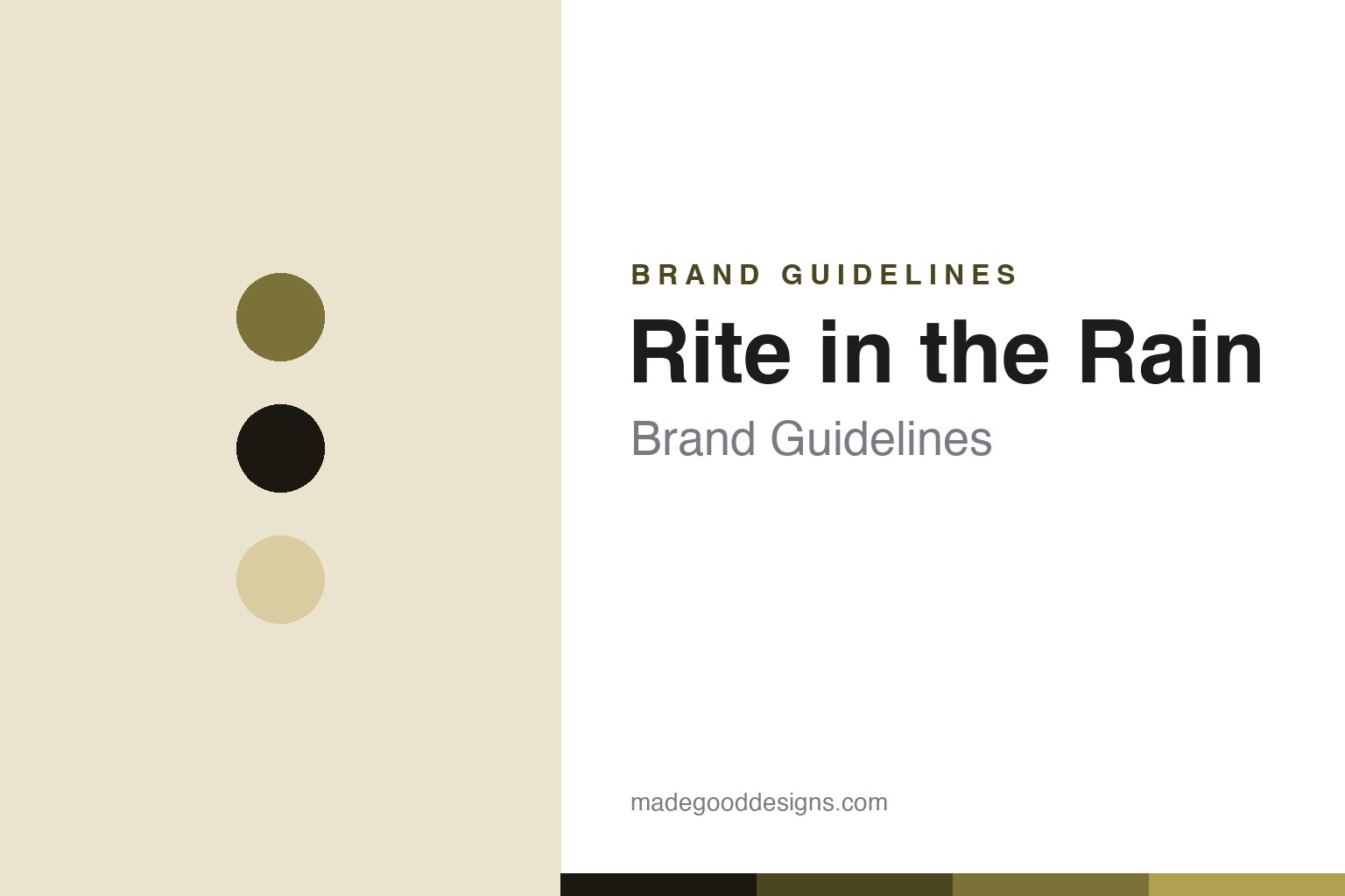
Rite in the Rain Brand Guidelines
The notebook that survives — all-weather waterproof paper, born in the rainy Pacific Northwest.
Aa
Two constants: a field-khaki palette and a condensed utility sans. Abstract homage — not the Rite in the Rain wordmark or cover.
The notebook that survives
Rite in the Rain sells survival.
Rite in the Rain is a lesson in pure function as the entire value proposition. It’s the flagship brand of J.L. Darling (today J.L. Darling LLC), a family-owned maker in Tacoma, Washington — a detail that matters, because the brand was born of the wet Pacific Northwest. Its origins trace to around 1916 (we hedge the exact year), when Jerry Darling developed an all-weather writing paper — by the company’s account, for the Pacific Northwest logging industry, where loggers and “timber cruisers” needed to write field notes in constant rain. (Brand vs. company: “Rite in the Rain” is the brand; J.L. Darling is the company.)
The product is all-weather waterproof paper: a patented water-shedding coating lets you write in rain, snow, mud, even underwater, where ordinary paper turns to pulp. One crucial, commonly-missed detail: the paper is only half the system — you write with a pencil or a pressurized “All-Weather Pen,” because ordinary wet ink can bead up and smear on the water-shedding surface. The market defines the brand: it’s heavily used by the military (the tan and green field books are ubiquitous in the field), plus surveyors, geologists and field scientists, foresters, first responders, law enforcement and outdoors people. (An honest caveat: it’s widely used by and sold to militaries — “standard-issue-adjacent” — rather than the single official standard issue of any one force.)
The line is all utility: spiral-bound field books, top-flip memo books, blacked-out “tactical” notebooks, all-weather pens and hardbound surveyor’s level books. This is a tool brand, not a lifestyle one: its “design language” is legibility and durability — grids, rules and reference data — and its iconic yellow/tan (and green, and black) covers are recognizable to outdoors and military users the way a design notebook is to everyone else. Still family-owned. (No official brand hex or typeface is published.)
Colour
Rite in the Rain lives in a field-khaki palette. Click a swatch to copy the hex.
Rite in the Rain’s identity is rugged, functional and field-tested — a field khaki/olive, deep ink and tan. The palette reads as utility and the outdoors: the tones of a weatherproof field book in a pocket on a wet job, tough and legible. It’s a rugged, utilitarian world that signals durability, the field and the tool. It’s a field-khaki palette that signals rugged utility, the outdoors and the all-weather notebook. The honest caveat: Rite in the Rain publishes no official brand hex, so the khaki, ink and tan here are an original, unofficial interpretation of its products, not first-party values.
The lesson is a field-khaki palette signals rugged utility. Rite in the Rain’s tool world reads as durable and functional. For designers, it’s a reminder that earthy, field tones — khaki, olive, tan — can express toughness and outdoor function honestly. The takeaways: use field tones for rugged utility; let function set the aesthetic; and treat specific hexes as unofficial when there’s no published spec.
Typography
The wordmark is a condensed utility sans — rugged and legible.
Rite in the Rain’s identity carries a rugged, functional, legible spirit — a “Rite in the Rain” wordmark whose sturdy forms read as tough and no-nonsense. A condensed utility sans captures the mood: it’s rugged and legible, matching a field tool built to survive. Set against a field-khaki palette, the condensed sans feels tough and functional — exactly the all-weather, field-book personality Rite in the Rain carries. It’s sturdy and legible rather than decorative or refined, mirroring a weatherproof notebook. (Rite in the Rain’s real wordmark is a trademark we describe but don’t reproduce.) Because the exact wordmark isn’t ours to use, the honest description is “a condensed utility sans spirit,” not the Rite in the Rain logo. The type behaves like the brand: rugged, functional and legible.
Aa
A condensed utility sans spirit — rugged and legible. (Specimen set in Saira Condensed, a condensed utility sans; NOT the Rite in the Rain logo, which is a trademark of J.L. Darling.)
Function as the whole value as the difference
Rite in the Rain sells the notebook surviving.
Rite in the Rain is a lesson in pure function as the entire brand. Design notebooks sell aesthetics, ritual and brand story; Rite in the Rain sells something more elemental — the survival of the notebook itself. Its value isn’t how it looks or how it makes you feel; it’s that it works when everything else fails: in the rain, in the mud, underwater, in the conditions that destroy ordinary paper. That single, uncompromising functional promise is the whole brand, and it’s made it indispensable to people whose notes genuinely can’t be lost — soldiers, surveyors, scientists, first responders. The lesson is that function alone, taken to an uncompromising extreme and aimed at people who truly need it, can be a complete and durable brand — no styling required, because when the product does something essential that nothing else does, that is the identity. Anyone can make a notebook that works in good weather; Rite in the Rain made the one that works in the worst. Solve the essential problem completely, and function becomes the difference.
For designers and brand-builders, Rite in the Rain offers a clear takeaway: uncompromising function can be a whole brand. The lessons: solve one essential problem completely (a notebook that survives the weather); serve the people who truly need it (military, field professionals); and keep the facts precise — Rite in the Rain is a J.L. Darling brand from Tacoma, with origins around 1916 in the Pacific Northwest logging trade. It’s also a reminder to keep it honest: the ~1916 date and founder story are the company’s own account (hedge them); you write with pencil or a pressurized all-weather pen (ordinary ink can smear); it’s “standard-issue-adjacent” rather than any one force’s official standard issue; and no official brand hex or typeface is published, so the palette and type here are an interpretation. Rite in the Rain sells the notebook surviving — proof that function can be the difference.
Explore & save
Keep Rite in the Rain’s identity on hand — save it to a board in the Made Good inspiration library.
Rite in the Rain identity set
Pin the field-khaki palette and the utility-sans spirit to your own board.