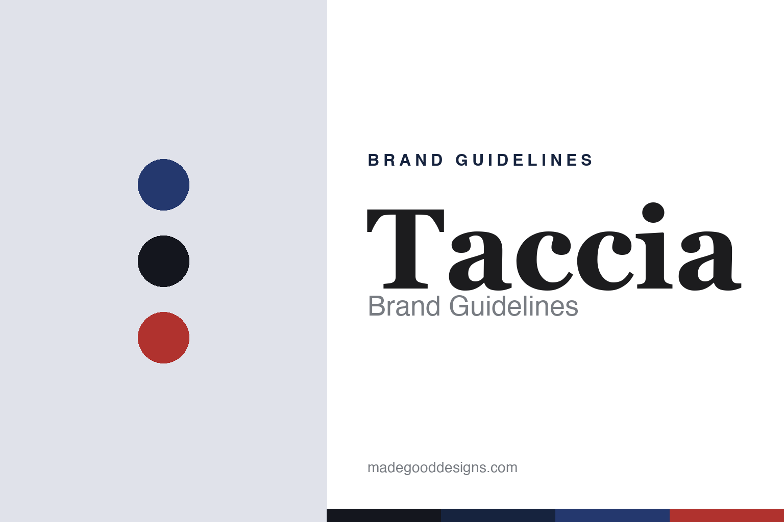
Taccia Brand Guidelines
Japanese ink and pens — colours drawn from ukiyo-e woodblock prints.
Aa
Two constants: a ukiyo-e-indigo palette and a Japanese serif. Abstract homage — not the Taccia wordmark or logo.
Ink drawn from woodblock prints
Taccia turned ukiyo-e into a colour range.
Taccia is a lesson in a culture as a colour concept. Founded by Shu-Jen Lin as a Japanese-American pen brand, Taccia was acquired by Nakabayashi Co. (an Osaka stationery firm dating to 1923) in April 2018 — so today it’s a Nakabayashi-owned brand whose inks are made in Japan (its US retail runs through specialist distribution; the exact arrangement is lightly sourced, so we hold it loosely).
Its signature is the Ukiyo-e series — fountain-pen inks whose colours are an homage to Edo-period woodblock masters: Hokusai, Sharaku, Hiroshige, Utamaro (later sets add Kuniyoshi). The colours carry traditional Japanese colour names — Ainezu, Nakamurasaki, Kokihanada and the like — and were developed with an ink “sommelier” and a colour consultant. It’s a whole aesthetic world in a bottle: the indigos, greys and muted reds of classic Japanese prints, reissued as writing ink.
Taccia also makes fountain pens — the everyday Spectrum and Covenant (an homage to the yatate traveller’s brush case) and the high-end Miyabi, hand-lacquered maki-e and urushi pieces from Wajima — and, importantly, its pens use nibs made by Sailor, one of Japan’s big three pen houses. So Taccia sits at a refined, artistic intersection: Japanese art as colour, Sailor’s nibs as hardware, Nakabayashi as parent. (Honest notes: the founding date of the Taccia brand is hedged; describe the ukiyo-e colours as homage, not licensed reproductions; Sailor makes the nibs, not Taccia; and no official brand hex is published.)
Colour
Taccia lives in a ukiyo-e-indigo palette. Click a swatch to copy the hex.
Taccia’s identity is artistic, Japanese and refined — a woodblock indigo, ink black, and a muted woodblock red. The palette reads as an ukiyo-e print: the deep indigo of Hokusai’s waves, the black of the key-block line, and a restrained vermilion. It’s a cultured, aesthetic world that signals art, tradition and refinement. It’s an indigo-and-woodblock-red palette that signals Japanese art in a bottle. The honest caveat: Taccia makes many colours and publishes no official brand hex, so the indigo, ink and red here are an original, unofficial interpretation, not first-party values.
The lesson is an indigo-and-woodblock-red palette signals Japanese art and refinement. Taccia’s world reads as cultured and artistic. For designers, it’s a reminder that borrowing a recognised aesthetic tradition (ukiyo-e) — its indigos, greys and muted reds — can give a colour system instant depth and meaning. The takeaways: draw a palette from a coherent aesthetic tradition; keep it muted and refined; and treat any single hex as unofficial when there’s no published spec.
Typography
The wordmark spirit is a Japanese serif — refined and classical.
Taccia’s identity carries a refined, classical, Japanese spirit — a “Taccia” wordmark whose elegant forms match a brand that turns ukiyo-e into ink. A Japanese serif (Mincho) captures the mood: it’s classical and refined, matching a house of woodblock-inspired colour and maki-e pens. Set against an indigo palette, the Mincho serif feels artistic and traditional — exactly the Ukiyo-e, Miyabi personality Taccia carries. It’s classical rather than modern, mirroring an Edo-period print. (Taccia’s real wordmark is a trademark we describe but don’t reproduce.) Because the exact mark isn’t ours to use, the honest description is “a Japanese serif spirit,” not the Taccia logo. The type behaves like the brand: refined, classical and Japanese.
Aa
A Japanese serif spirit — refined and classical. (Specimen set in Shippori Mincho, a Japanese Mincho serif; NOT the Taccia logo, which is a trademark.)
A cultural aesthetic as the difference
Taccia bottles an art tradition.
Taccia is a lesson in building a product around a coherent cultural aesthetic. Ink is colour, and colour is easy to make and hard to make mean something. Taccia gave its colours meaning by anchoring them in ukiyo-e — the Edo-period woodblock print tradition — so that a bottle isn’t just “a nice blue” but “the indigo of a Hokusai wave,” complete with a traditional Japanese colour name and the authority of a named master. That single decision turns a colour range into a cultural experience, gives every release a story, and positions Taccia as artistic and refined rather than merely colourful. Backing it with Sailor-made nibs and Nakabayashi’s manufacturing keeps the substance behind the story. It’s a model for how a well-chosen aesthetic frame can lift an ordinary product into something people collect.
For designers and brand-builders, Taccia offers a clear takeaway: a coherent cultural aesthetic can turn a colour range into a collectable experience. The lessons: anchor an abstract product (colour) in a recognised tradition (ukiyo-e) so each item carries meaning; back the story with real quality (Sailor nibs, Japanese manufacture); and keep the facts precise — Taccia is a Nakabayashi-owned Japanese ink-and-pen brand. It’s also a reminder to keep it honest: the Taccia brand’s founding date is hedged; the ukiyo-e colours are homage, not licensed art; Sailor makes the nibs; and no official brand hex is published, so the palette here is an interpretation. Taccia bottles an art tradition — proof that a cultural aesthetic can be the difference.
Explore & save
Keep Taccia’s identity on hand — save it to a board in the Made Good inspiration library.
Taccia identity set
Pin the ukiyo-e-indigo palette and the Japanese-serif spirit to your own board.


