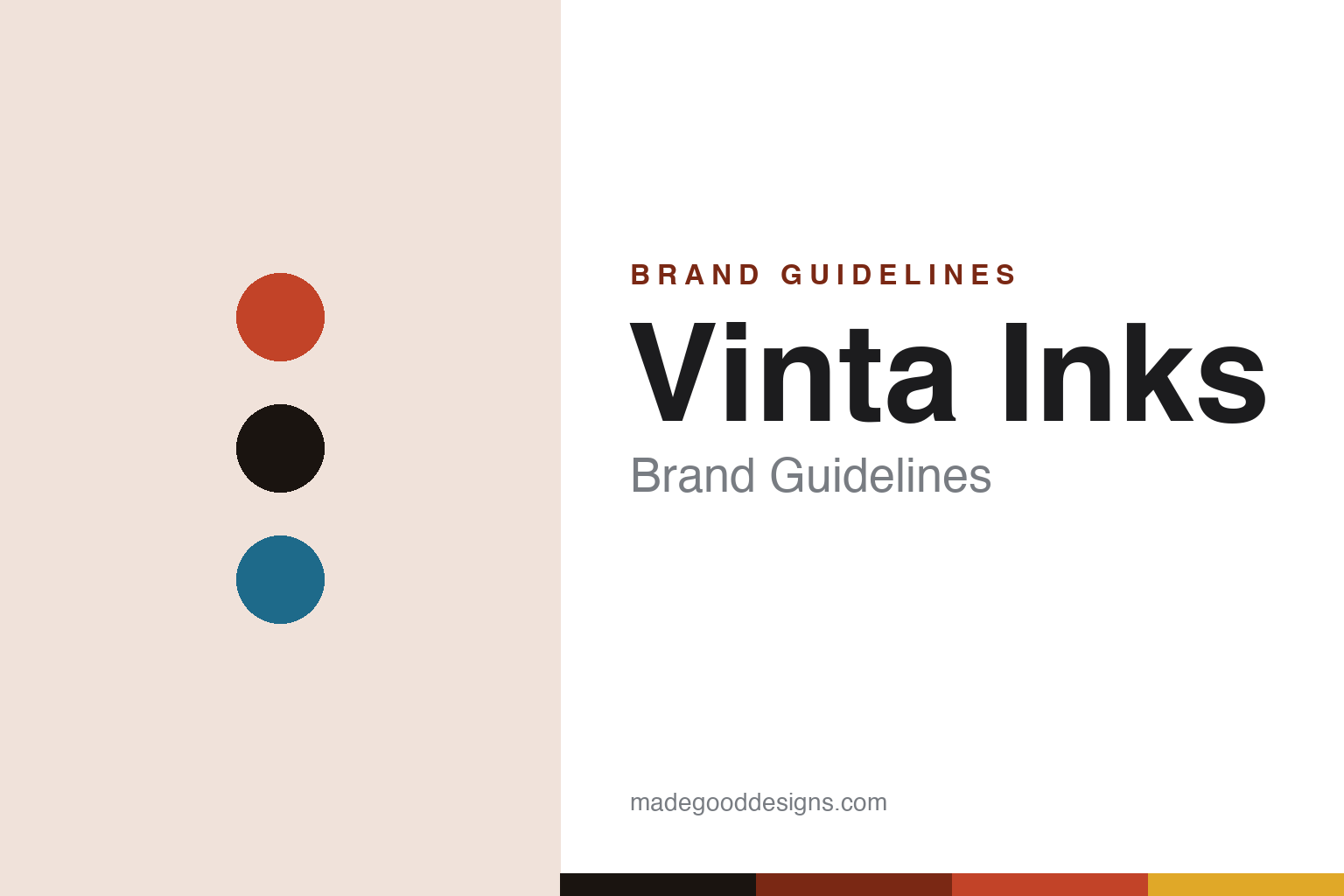
Vinta Inks Brand Guidelines
Filipino ink as a time capsule — colours named for the country’s history and folklore.
Aa
Two constants: a vermilion-and-sail-blue palette and a warm grotesque. Abstract homage — not the Vinta wordmark or logo.
Ink as a time capsule
Vinta bottles Philippine history.
Vinta Inks is a lesson in heritage as a colour concept. It’s a boutique fountain-pen ink brand from the Philippines (based in Quezon City, Metro Manila), founded around 2019 by the designer and educator Jillian Tan (we hedge the exact year). Its name is thematic: a “vinta” is one of the vividly striped-sail outrigger sailboats of Mindanao — colour and heritage built into the brand’s very name.
Its identity is Philippine history, culture and folklore. Vinta’s colours are named for places, eras, figures and stories of the Philippines — many pairing a place with a year, so each ink reads as a small “time capsule” of a moment from the Spanish-galleon era through 1990s Manila. Collections span the vintage/original range, Heritage, and Fairytale (inspired by Filipino folk tales), each colour arriving with the history behind it.
The inks themselves are prized for shading and sheen (with shimmer editions too), and the designed, story-forward packaging matches the concept. Vinta is part of the modern Asian and Southeast-Asian designer-ink wave — and it’s a distinctly Filipino voice in it, using the fountain-pen world’s appetite for beautiful colour to tell the story of a place. (Honest notes: the founding year is hedged; the bottles read simply “Vinta” while the brand is “Vinta Inks / Inks by Vinta”; we don’t assert an unverified parent company; cultural themes are described respectfully and generally; and no official brand hex is published.)
Colour
Vinta lives in a vermilion-and-sail-blue palette. Click a swatch to copy the hex.
Vinta’s identity is vivid, warm and storytelling — a tropical vermilion, ink black, and a sail blue. The palette reads as the vinta’s striped sails and the warmth of the tropics: saturated, sunlit colour with a maritime blue. It’s a heritage, narrative world that signals history, place and colour. It’s a vermilion-and-sail-blue palette that signals Filipino heritage ink. The honest caveat: Vinta makes many colours and publishes no official brand hex, so the vermilion, ink and blue here are an original, unofficial interpretation, not first-party values.
The lesson is a vermilion-and-sail-blue palette signals warmth and heritage. Vinta’s world reads as vivid and narrative. For designers, it’s a reminder that warm, saturated colour with a complementary accent (a maritime blue) can evoke place and story. The takeaways: use warm saturated colour to evoke place and heritage; add a complementary accent for balance; and treat any single hex as unofficial when there’s no published spec.
Typography
The wordmark spirit is a warm grotesque — friendly and characterful.
Vinta’s identity carries a warm, friendly, characterful spirit — a “Vinta” wordmark whose approachable forms match a brand that tells stories through colour. A warm grotesque captures the mood: it’s friendly and confident, matching a house that turns history into vivid ink. Set against a vermilion palette, the warm grotesque feels sunlit and narrative — exactly the heritage-colour, time-capsule personality Vinta carries. It’s warm rather than austere, mirroring a striped tropical sail. (Vinta’s real wordmark is a trademark we describe but don’t reproduce.) Because the exact mark isn’t ours to use, the honest description is “a warm grotesque spirit,” not the Vinta logo. The type behaves like the brand: warm, friendly and characterful.
Aa
A warm grotesque spirit — friendly and characterful. (Specimen set in Hanken Grotesk, a warm grotesque; NOT the Vinta logo, which is a trademark.)
A place as the difference
Vinta gives ink a nationality.
Vinta Inks is a lesson in giving a product a sense of place. Most boutique inks compete on how a colour looks; Vinta competes on what a colour means, by tying its whole range to Philippine history, culture and folklore. A bottle isn’t just a green or a gold — it’s a place and a year, a small window onto Filipino history, complete with the story behind it. That gives Vinta two things at once: genuine differentiation in a crowded field (no one else is telling this story), and a deeper connection with the people whose heritage it celebrates. The name itself — the striped-sail vinta boat — signals the strategy: colour, craft and country, inseparable. It’s a reminder that rooting a global-facing product in a specific place can be a strength, not a limitation.
For designers and brand-builders, Vinta offers a clear takeaway: a strong sense of place can differentiate a product and deepen its meaning. The lessons: root the range in a specific culture and tell its stories honestly; let the name and packaging carry the sense of place (the vinta boat, the time-capsule colours); and keep the facts precise — Vinta is a Filipino boutique ink house built on Philippine heritage. It’s also a reminder to keep it honest: the founding year is hedged; the brand is “Vinta Inks” though bottles read “Vinta”; an unverified parent company isn’t asserted; cultural themes are described respectfully and generally; and no official brand hex is published, so the palette here is an interpretation. Vinta gives ink a nationality — proof that a sense of place can be the difference.
Explore & save
Keep Vinta Inks’s identity on hand — save it to a board in the Made Good inspiration library.
Vinta Inks identity set
Pin the vermilion-and-sail-blue palette and the warm-grotesque spirit to your own board.


