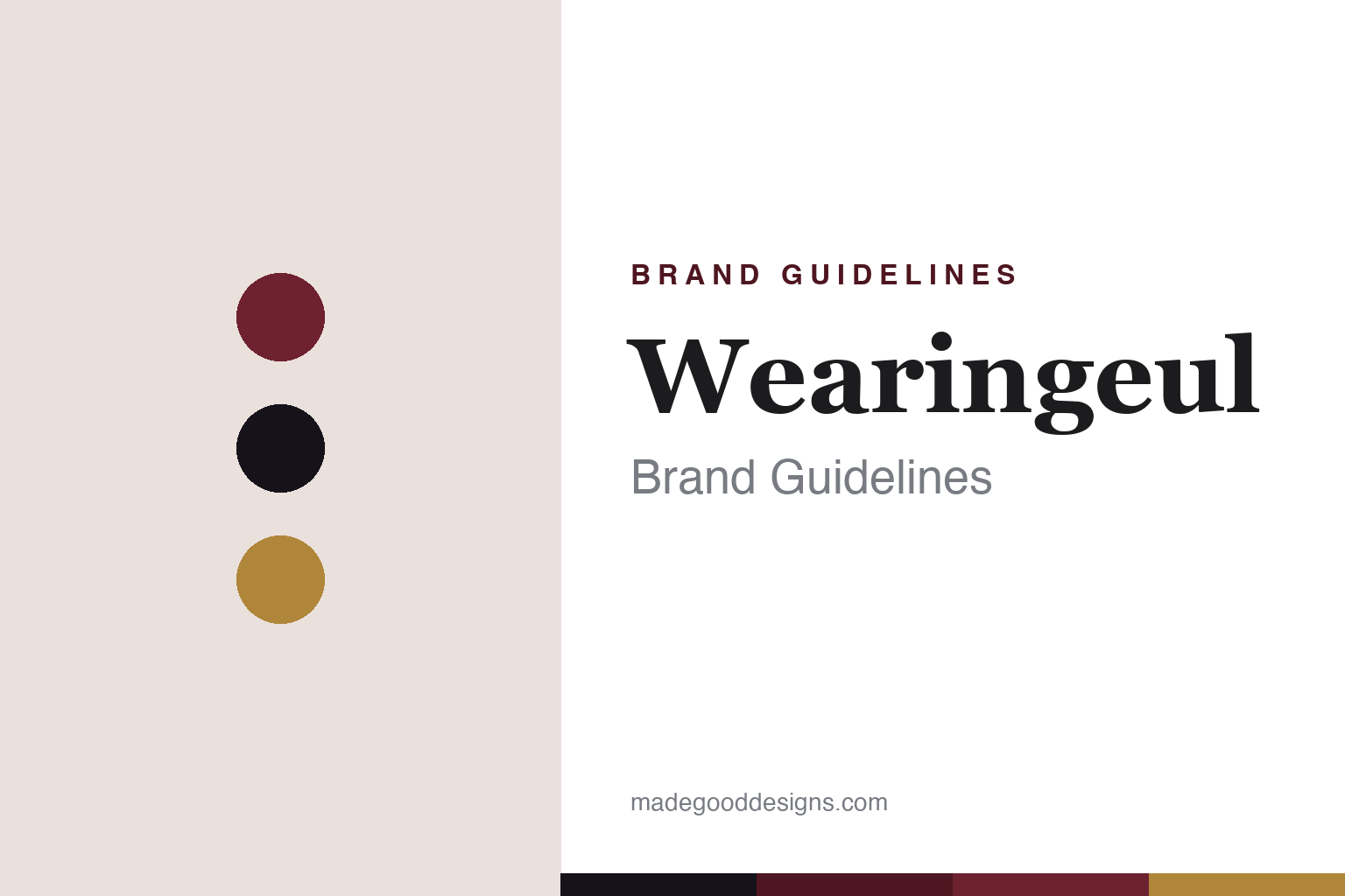
Wearingeul Brand Guidelines
Korean ink as literature — colours drawn from novels, poems and myths.
Aa
Two constants: an oxblood-and-gold palette and a literary serif. Abstract homage — not the Wearingeul wordmark or logo.
Ink as literature
Wearingeul turns books into colours.
Wearingeul is a lesson in a theme so strong it becomes the whole brand. It’s a boutique fountain-pen ink maker from South Korea, founded in the mid-to-late 2010s (sources conflict between ~2016 and ~2018, so we hedge). The name pairs “wearing” with the Korean word “geul” (writing / written works) — roughly, carrying the written word.
Its entire identity is literature. Wearingeul’s inks interpret novels, poems, myths and fairy tales, released in themed collections with evocative, story-linked names. The verified lines include a Korean Literature series (honouring writers like Yun Dong-ju and Yi Sang), a World Literature series (colours drawn from Jane Eyre, Dracula, The Old Man and the Sea and more, released almost monthly), and World Myth and Fairy Tale collections. Each release is a small act of literary interpretation — a book rendered as a colour.
The inks are prized for their drama: strong sheen (a contrasting colour that glints off the dried ink at an angle), shading, and optional shimmer added via separate “glitter potions.” The presentation matches the concept — designed packaging and illustrated art cards tied to each source text. Wearingeul is part of the modern Asian designer-ink wave, but where Colorverse takes science and space, Wearingeul takes the library. (Honest notes: the founding year and founder are hedged; sheen and shimmer apply to specific inks; and no official brand hex is published.)
Colour
Wearingeul lives in an oxblood-and-gold palette. Click a swatch to copy the hex.
Wearingeul’s identity is literary, dramatic and romantic — a bookish oxblood, ink black, and a gold sheen. The palette reads as an old library and a sheening ink: the deep red of a clothbound novel, the black of printed text, and the gold glint of dramatic sheen. It’s a storytelling world that signals literature, depth and drama. It’s an oxblood-and-gold palette that signals literature-themed ink. The honest caveat: Wearingeul makes many colours and publishes no official brand hex, so the oxblood, ink and gold here are an original, unofficial interpretation, not first-party values.
The lesson is an oxblood-and-gold palette signals literary romance. Wearingeul’s world reads as bookish and dramatic. For designers, it’s a reminder that a deep, bookish colour (oxblood) with a gold accent conjures literature, depth and a little theatre. The takeaways: use a bookish deep tone with a gold accent for literary romance; let a strong theme (books) shape everything; and treat any single hex as unofficial when there’s no published spec.
Typography
The wordmark spirit is a literary serif — bookish and expressive.
Wearingeul’s identity carries a literary, bookish, expressive spirit — a “Wearingeul” wordmark whose readerly forms match a brand that turns novels and poems into ink. A literary serif captures the mood: it’s bookish and warm, matching a house whose every release interprets a text. Set against an oxblood palette, the literary serif feels novelistic and dramatic — exactly the literature-themed, sheen-rich personality Wearingeul carries. It’s expressive rather than plain, mirroring a colour drawn from a story. (Wearingeul’s real wordmark is a trademark we describe but don’t reproduce.) Because the exact mark isn’t ours to use, the honest description is “a literary serif spirit,” not the Wearingeul logo. The type behaves like the brand: literary, bookish and expressive.
Aa
A literary serif spirit — bookish and expressive. (Specimen set in Lora, a literary text serif; NOT the Wearingeul logo, which is a trademark.)
A theme as the difference
Wearingeul owns literature.
Wearingeul is a lesson in owning a single theme completely. In an ink market full of colour, Wearingeul picked literature and committed to it without hedging: the name, the collections (Korean Literature, World Literature, Myth, Fairy Tale), the story-linked colour names, and the illustrated art cards all point the same way. The result is that Wearingeul isn’t “a Korean ink brand with some book colours” — it is the literature ink brand, instantly understood and instantly distinct from its Korean neighbour Colorverse (science) or the countless colour-first makers. The dramatic sheen and shimmer give the inks a performance that matches the romance of the concept. A strong, fully-committed theme did what a bigger catalogue never could: it made a young boutique brand unmistakable.
For designers and brand-builders, Wearingeul offers a clear takeaway: a single, fully-owned theme can define a brand faster than range or price. The lessons: choose a theme with endless material (literature never runs out of stories) and apply it to names, collections and packaging alike; let the product’s drama (sheen, shimmer) match the theme’s romance; and keep the facts precise — Wearingeul is a Korean boutique ink house built entirely on literature. It’s also a reminder to keep it honest: the founding year and founder are hedged; sheen and shimmer belong to specific inks; it’s distinct from Colorverse and Dominant Industry; and no official brand hex is published, so the palette here is an interpretation. Wearingeul owns literature — proof that a committed theme can be the difference.
Explore & save
Keep Wearingeul’s identity on hand — save it to a board in the Made Good inspiration library.
Wearingeul identity set
Pin the oxblood-and-gold palette and the literary-serif spirit to your own board.