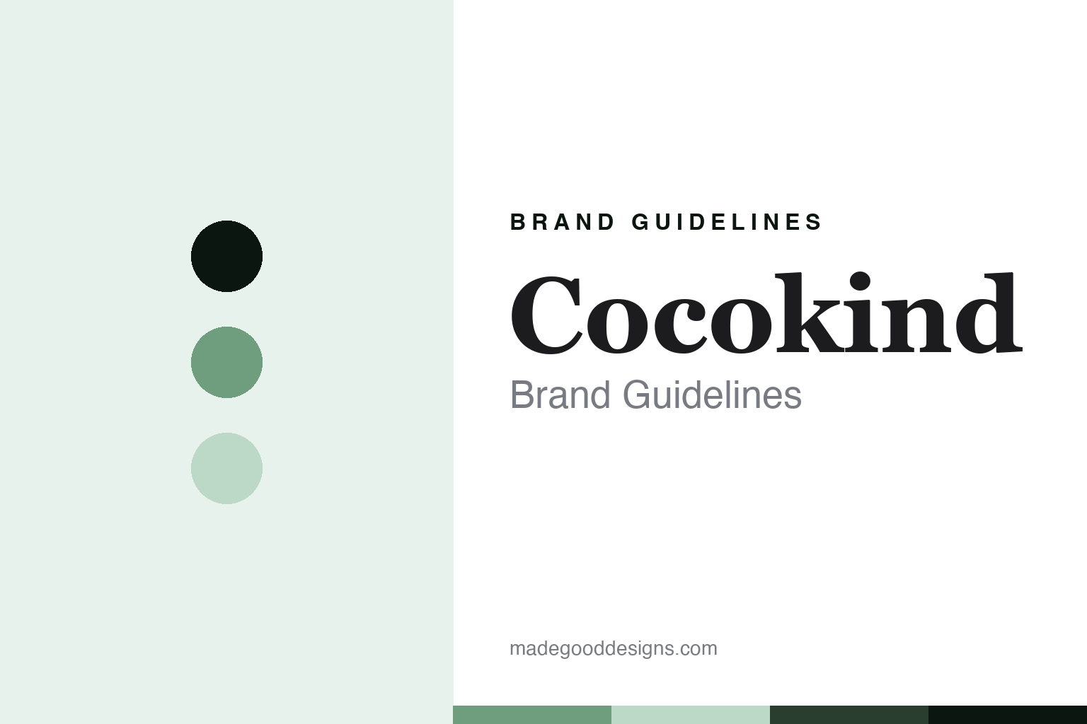
Cocokind Brand Guidelines
The skincare with a carbon label on the box.
Aa
Two constants: a eucalyptus palette and a carbon-panel-serif register. Abstract homage — not a Cocokind product or mark; the carbon panel is described, not reproduced.
The skincare with a carbon label on the box
Cocokind is the affordable, sustainable skincare brand of Priscilla Tsai with a carbon-footprint panel.
Cocokind brings the round transparency — the affordable, sustainable, botanical-forward skincare brand, founded by Priscilla Tsai, that prints a carbon-footprint panel on its packaging like a nutrition label. Cocokind makes sustainable skincare, and its answer to a round about the viral aisle is a disclosure: superior formulas at approachable prices, in a box that tells you what the product cost the planet. A brand, transparent.
Its identity is the skincare with a carbon label on the box. Cocokind’s carbon panel, its sustainable positioning and its founder are the story here. A brand, transparent. The skincare with a carbon label on the box.
(Honest notes, so the story stays precise, and the claims stay the brand’s own. Cocokind, at cocokind.com, makes affordable, botanical-forward skincare for sensitive skin — cleansers, toners, serums, moisturisers, retinol, sun and eye care, with heroes such as a ceramide barrier serum and an electrolyte water cream — under a superior-formulas-at-approachable-prices framing, and we report its clean, botanical-forward and sustainability language as the brand’s own marketing, not established fact. Its founder and chief executive, Priscilla Tsai, is confirmed on the brand’s own site; a founding year of around 2015, a San Francisco base and a finance background are widely reported, which we present as such rather than as re-verified fact. On where it is made, a theme of this round, a country of manufacture is not documented, so we do not assert one. On ownership, it is founder-led, and outside funding is likely but investors are unverified, so we name none. Its signature is a genuine one: the brand states it measures and shares the carbon footprint of a product’s life cycle on a nutrition-label-style panel, which we describe but do not reproduce. Its name, packaging and that panel layout are IP we describe but do not reproduce; there is no official brand hex; these tones are an unofficial interpretation.)
Colour
Cocokind lives in a eucalyptus green. Click a swatch to copy the hex.
Cocokind’s identity is transparent, botanical and calm — a eucalyptus, an ink, a sage mist, a deep pine, and a paper. The palette leans eucalyptus and sage mist: a soft, natural register that nods to a botanical formula and a sustainability disclosure rather than a loud palette. It signals sustainable skincare. The honest caveat: with no published brand hex, these values are an original, unofficial interpretation, not first-party colours.
The lesson is a eucalyptus signals a transparent, botanical identity. Cocokind’s world is a considered, made object. For designers, it is a reminder that a eucalyptus and a soft sage can carry a skincare brand — the tone of a sustainability panel. Because these tones can fail as small text, keep type dark and let the colour live in the accents, palette and band. The takeaways: label the impact; keep it botanical; report claims as marketing; and treat any single hex as unofficial.
Typography
The register is a carbon-panel serif — transparent, natural, refined.
Cocokind’s identity carries a transparent, natural, refined spirit — sustainable skincare, not a fashion. A carbon-panel serif captures the mood: refined, natural and confident, the register of a considered brand. Set in a eucalyptus palette, the carbon-panel serif feels transparent and natural — exactly the personality Cocokind carries. It is a disclosure rather than a logo, mirroring a serum and a botanical. (Cocokind’s real carbon panel is a thing we describe but do not reproduce, and the exact typeface is not ours to use.) Because it is not ours to use, the honest description is “a carbon-panel-serif skincare,” shown here in a stand-in. The type behaves like the brand: transparent, natural and refined.
Aa
A carbon-panel-serif skincare — transparent and natural. (Specimen set in Playfair Display, a carbon-panel-serif STAND-IN; NOT the Cocokind logo or its sustainability panel.)
The viral aisle
Cocokind stands for the skincare with a carbon label on the box.
Cocokind brings the round transparency. A eucalyptus palette, a carbon-panel serif and a sustainability disclosure make one thing — the skincare with a carbon label on the box — the whole identity: transparent, botanical and calm. The carbon panel is the signature, and the botanical formula is the substance. The point is a box that tells you what the product cost the planet, at an approachable price.
Put to work, the identity is a disclosure told straight, as design. A maker in this spirit would label the impact, keep it botanical, and report claims as marketing. A reader in this spirit would keep the facts right: Cocokind makes affordable, botanical-forward, sensitive-skin skincare, with a ceramide barrier serum among the heroes; its founder and chief executive is Priscilla Tsai, with a founding around 2015 and a San Francisco base reported; a country of manufacture is undocumented; and it is founder-led, with investors unverified. Cocokind anchors the round’s transparency thread, the way a cost or carbon disclosure can be a brand’s clearest signal. The honest editorial moves are to confirm Tsai from the site, to present the year and city as reported, to say the making is undocumented, and to describe the carbon panel without reproducing it. The lesson Cocokind teaches is that a disclosure can be a whole identity, and reporting the claims as marketing keeps it credible.
For designers and brand-builders, Cocokind continues the viral aisle: label the impact — and keep it botanical. The lessons: make transparency a design feature, like a carbon panel; keep a botanical, calm look; report clean and sustainability language as your own; present unverified founding details as reported; and never reproduce a panel layout. It is also a reminder to stay precise: Cocokind is the affordable, sustainable skincare brand of Priscilla Tsai with a carbon-footprint panel — with the palette here an unofficial interpretation. Read that way, Cocokind is less a bottle than a disclosure: a carbon label on the box. The lesson for a brand is that transparency and honest claims reinforce each other, and describing the panel without reproducing it keeps it earned. Cocokind made the-skincare-with-a-carbon-label-on-the-box the identity — proof that a disclosure can define a brand.
Explore & save
Keep Cocokind’s identity on hand — save it to a board in the Made Good inspiration library.
Cocokind identity set
Pin the eucalyptus palette and the carbon-panel-serif register to your own board.