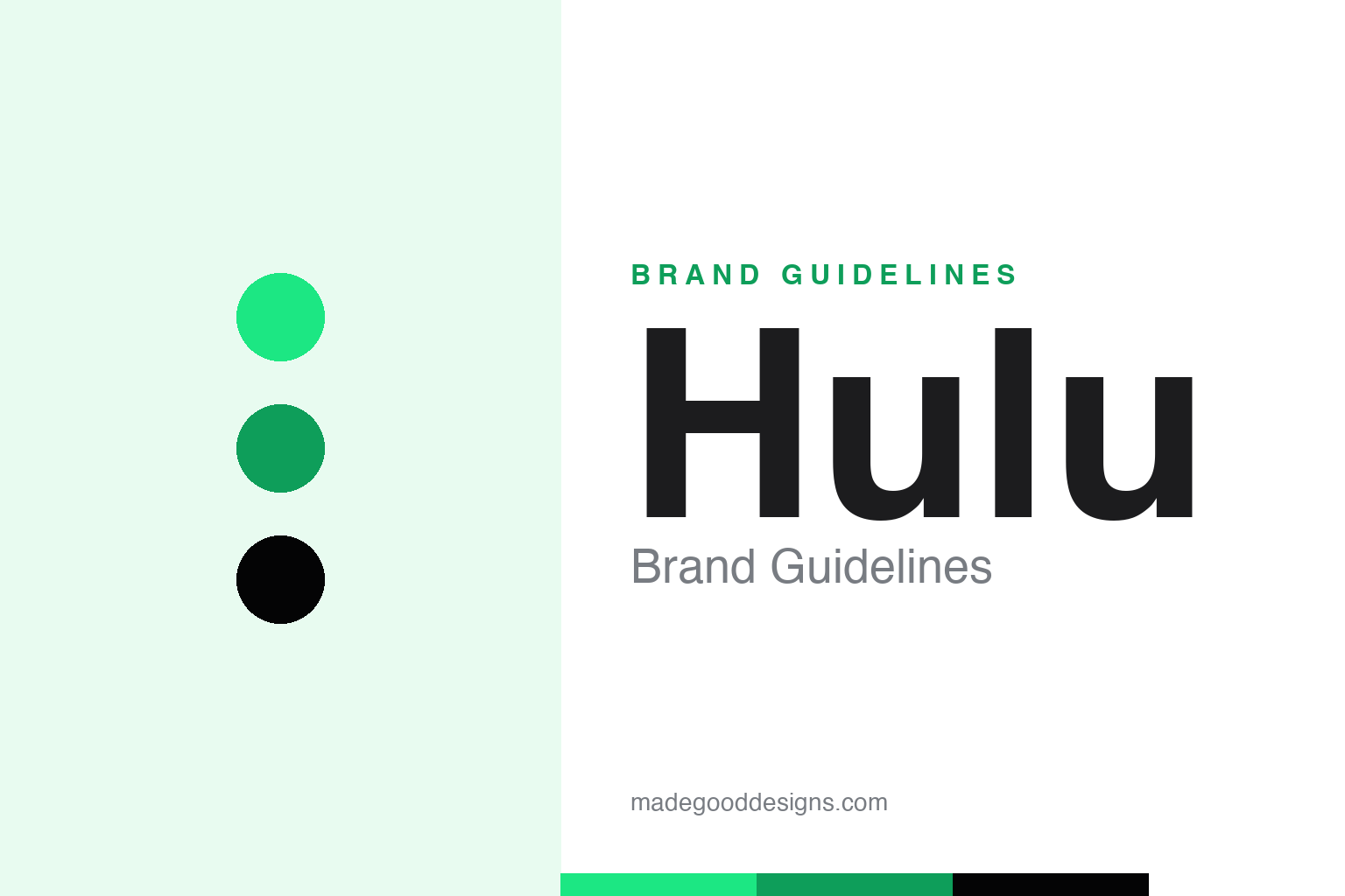
Hulu Brand Guidelines
One electric green and a lowercase name from a Chinese proverb — streaming’s most ownable colour.
Aa
Two constants: an electric, ownable green and a rounded lowercase wordmark. Abstract homage — not the Hulu wordmark.
A name from a Chinese proverb
Behind Hulu’s bright green wordmark is a surprisingly poetic origin — a gourd that holds precious things.
Hulu’s identity is almost entirely one thing: a bright, electric green wordmark, set in friendly lowercase — “hulu” — a deliberate contrast to the uppercase formality of most media brands. But the name is the hidden gem. As former CEO Jason Kilar explained in 2008, “Hulu” comes from Mandarin: húlú (葫芦), the calabash or bottle gourd, which in an old Chinese proverb is “the holder of precious things.” (A secondary sense, hùlù, roughly “interactive recording,” is also cited.) So a mass-market streaming brand is quietly named after a gourd that holds treasure — and that “vessel” idea later shaped its whole design system.
Hulu launched publicly in 2008 and is now Disney-controlled (Disney took full operational control in 2019). Its current look — the flat, bold green wordmark — dates to a 2018 refresh, but the comprehensive brand system was built by agency DixonBaxi with Hulu’s in-house “Greenhouse” team and unveiled in 2021, introducing the “Vessel,” a rounded-corner rectangle drawn from the wordmark’s “u” that flexes across app UI and out-of-home. Two dates worth keeping straight: 2018 gave the green wordmark; 2021 gave the full system.
Colour
Hulu owns one of streaming’s most distinctive greens. Click a swatch to copy the hex.
The signature is Hulu green #1CE783 (sometimes called “Malachite,” ≈ Pantone 7479 C) — a vivid, slightly electric green — grounded by a near-black #040405 and white. It’s the brand’s core equity: “green” is the single most common word-association for Hulu, and the identity leans on it hard, flat and gradient-free, for a modern, streaming-native feel. In a field crowded with reds (Netflix, YouTube) and blues (Max, Paramount+), a bright green is a genuinely ownable position.
As with every high-voltage colour, the usage discipline matters: #1CE783 is bright enough to struggle as small text on white, so Hulu tends to reverse a black or dark wordmark out of green fields (or set green on black) rather than run small green type on a pale ground. Follow that lead — let the green be the surface, the “Vessel” and the highlight, and let near-black carry the reading. The broader lesson is the value of claiming an under-used colour in your category: pick the hue your rivals avoided, commit to it flat and everywhere, and it becomes shorthand for your brand.
Typography
The 2021 system consolidated everything onto one confident typeface.
The “hulu” wordmark is custom rounded lowercase lettering, and the brand’s system typeface is Graphik (Commercial Type), adopted as the exclusive face across marketing and product to replace an earlier mix of inconsistent fonts. Graphik is a clean, neutral grotesque — modern without shouting — which is exactly right: it lets the green and the rounded “Vessel” shapes carry the personality while keeping long menus and metadata perfectly legible. Consolidating onto one face is an underrated move; it’s what makes a streaming app feel coherent from the home screen to the billing page.
aa 08
Rounded, friendly, neutral — one consolidated voice. (Specimen set in Manrope, a grotesque in the spirit of Hulu’s Graphik.)
The vessel that holds precious things
The poetic name quietly became the design system.
The nicest thing about Hulu’s brand is how the name and the system rhyme. A gourd that “holds precious things” becomes the “Vessel” — a rounded container, drawn from the wordmark, that literally holds content, colour and imagery across the interface and advertising. It’s a rare case of an etymology being turned into a functional design device years later, and it gives the identity a coherence that pure colour never could: the green makes Hulu recognisable, the Vessel makes it work.
For designers, Hulu offers two clean lessons. First, own an under-used colour: a single electric green, applied flat and relentlessly, carved out a distinct spot in a crowded streaming market. Second, let meaning drive form: mining the brand’s own name for a containing shape (the Vessel) produced a flexible system that feels purposeful rather than decorative. Find the story already inside your brand — even a gourd in a proverb — and build the design from it, and the identity will feel both distinctive and inevitable. Hulu managed both at once — a colour no rival had claimed and a shape pulled straight from its own name — which is why a lowercase green wordmark reads, at a glance, as nobody else.
Explore & save
Keep Hulu’s identity on hand — save it to a board in the Made Good inspiration library.