Kall Kwik Brand Guidelines
A 1978 high-street print franchise that grew into design, print and websites.
Aa
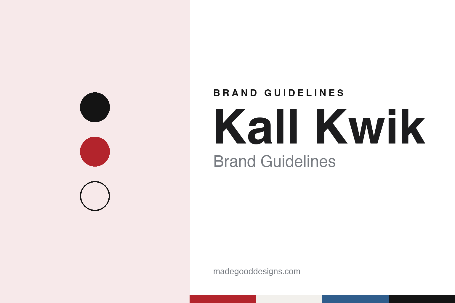
Two constants: a high-street red, proof grey and proof blue palette and a grotesque sans register. Abstract homage — not a Kall Kwik product or mark; no logo, shopfront or printed piece is reproduced.
KK Printing
A licence from America, a counter on the high street.
Kall Kwik began in Britain at the end of the 1970s. A history published in January 2018 by the Kall Kwik centre in Bury St Edmunds, marking the network’s 40th year, says the business was started in 1978 by the entrepreneur Moshe Gerstenhaber, with investment from 3i. It says he took the master licence for Kall Kwik in the United Kingdom from The International Center for Entrepreneurial Development, the company then running the Kwik Kopy print franchise in the United States.
The public register fits that date. Companies House records show the original franchisor company was incorporated in October 1978, took the name KK Printing (U.K.) Limited at the end of that year and was renamed Kall-Kwik Printing (UK) Limited in August 1984, with the hyphen it then carried. The company itself, and the trade magazine Print Monthly in 2024, date the start of trading to 1979, so both years appear in Kall Kwik’s own history.
The idea was speed on the high street. The 2018 centre history describes print in the 1970s as a trade where jobs took weeks and big printers served big clients, and says Kall Kwik set out to offer fast turnaround and quality printing to anyone who walked in from the local high street. The centre adds that customers could order the quantities they wanted, from a single copy upwards, and that the network was early to take up colour printing and digital production; those are the network’s own claims rather than an independent finding. The same history says that by its 40th year the network worked with thousands of companies, including many large British firms, and its main website still invites customers to call in for rush jobs and same-day printing at their nearest centre.
Colour
Design, print and online, under one name.
Kall Kwik’s current description of itself is “fast, local and personal”. Its website presents each centre as a one-stop design, print and online service for businesses, staffed by graphic designers, print specialists, website designers and marketing staff. The franchise pages list the services as print, large-format printing, digital marketing, website design and development, promotional products, graphic design, clothing and uniforms, and signage and displays.
The shift is visible in the network’s own account of itself. The 2018 Bury St Edmunds history says the centres had invested heavily in large-format work for customers such as conference and exhibition organisers, hotels and car dealerships, and that many had added web design and email marketing. When Print Monthly reported on the network in September 2024, it described Kall Kwik as a provider of printed materials and designs that also supplied personalised websites and marketing, sales and financial advice.
The centre selector on the Kall Kwik website lists London locations including Chelsea, Islington, Kensington and Fleet Street and the City, alongside towns such as Ashford, Banbury, Harrogate, Peterborough, Sevenoaks and Windsor, and cities including Birmingham, Cambridge, Liverpool and Oxford. Print Monthly put the total at 32 centres across the UK in 2024, and the company’s franchise page gives the same figure, more than 32 centres, together with more than 300 employees. Each centre trades under the network name followed by its place, as with Kall Kwik Bury St Edmunds, which runs its own website and news pages alongside the national site.
Typography
Design and documentation.
Sign, print and promotional-products franchises sell mostly to other businesses, through local centres run by franchisees under a shared name. Their identity is carried less by national advertising than by the surfaces the centres themselves produce: shop windows, vehicle wraps and reception displays. When Signarama renewed its colour scheme, logo, tagline and icon in 2014, Signs of the Times reported that the new look would be applied to exactly those three things across its franchise locations.
The photography such companies publish tends to show the same surfaces: storefronts with the brand name across the fascia, vans in full wraps, and finished signs installed on clients’ buildings, much of it carrying the client’s name rather than the franchise’s own. Individual centres are commonly identified by the town or district they serve, so one national name is repeated across hundreds of locations, and in some markets a network trades under a different name altogether, as FASTSIGNS does in Australia, where English Wikipedia says its centres operate as Signwave.
Service menus tend to be written plainly, as lists of what a centre can make and do: signs and banners, vehicle graphics, interior décor, wayfinding, digital signs, printed material and branded merchandise, often with design, permitting and installation alongside. The menus have widened over time; FASTSIGNS, which began with next-day cut-vinyl signs in 1985, now describes a much broader range of visual communications.
Behind the storefronts sit corporate pages about owners and franchise systems. Some networks belong to private-equity firms and have changed hands several times; others remain in family control, as the Titus family’s United Franchise Group does with Signarama. Location counts are given by date and by source, and they vary, because centres open, close, convert from independent shops or share premises with related franchises.
Aa
A grotesque sans for a counter-service brand built on a short, alliterative name. (Specimen set in Archivo, a sans STAND-IN; NOT the Kall Kwik logo or an official Kall Kwik typeface.)
Kall Kwik
New companies, new owners, the same name.
The legal structure behind the brand has changed. Companies House records show the original franchisor company, by then called Kall Kwik UK Limited, went into a creditors’ voluntary winding-up and was dissolved in October 2014, after the liquidators’ final meeting was returned to the register in July that year. The company that now trades as Kall Kwik was incorporated in November 2011 under the name New KK Limited and took the Kall Kwik name in December 2014; the register lists its business as the activities of a head office.
For a period the network belonged to The Bardon Group, a franchise group whose other brands, Print Monthly noted in 2024, included the promotional clothing and products brand Recognition Express and the IT cleaning brand Techclean. In September 2024 Print Monthly reported that the multi-brand franchise operator XplorerGroup had acquired Kall Kwik from The Bardon Group. The magazine said Kall Kwik joined XplorerGroup’s children’s education brands, ComputerXplorers and ActiveXplorers, and its lead management system, Discover My Franchise, and that ComputerXplorers had also been bought from Bardon in 2021.
The same report carried both sides’ reasons. XplorerGroup’s chief executive said Kall Kwik had already shown it could adapt by widening its offer from printing to a one-stop design, print and online service, and that the group planned to apply its own technology, digital and franchising experience to the brand. The Bardon Group’s managing director, who was also Kall Kwik’s non-executive chairman, called it an iconic brand with 45 years of history and said the new owner would bring fresh ideas and open opportunities to recruit new centre owners.
For a design guide, Kall Kwik shows how a short, alliterative name built for a 1970s print counter can carry a wider design, print and web offer, while each centre keeps its own town or street name. Compare Signs Express, another British franchise network, and Minuteman Press, an American print franchise built on local centres. For this guide we use high-street red, proof grey and proof blue with a grotesque sans, an unofficial interpretation; no product or logo is reproduced.
Explore & save
Keep Kall Kwik’s identity on hand — save it to a board in the Made Good inspiration library.
Kall Kwik identity set
Pin the Kall Kwik high-street red, proof grey and proof blue palette and the grotesque sans register to your own board.