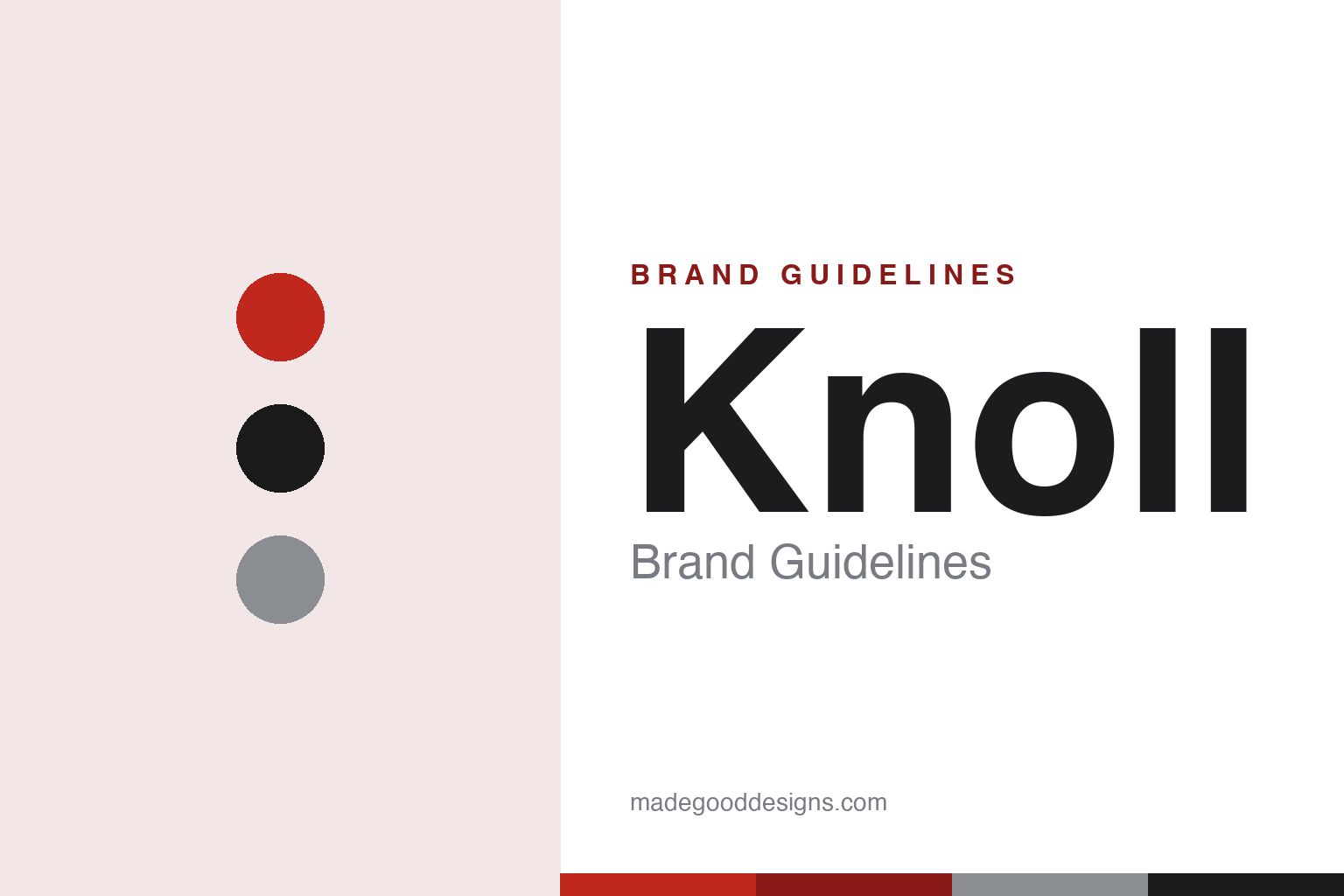
Knoll Brand Guidelines
A red Helvetica wordmark, Herbert Matter’s photomontage ads and a catalogue of modern classics — the look of American modernism.
Aa
Two constants: a warm-red-and-ink palette and a neutral Helvetica grotesque. Abstract homage — not the Knoll wordmark.
Helvetica, in red
Knoll’s identity is Helvetica — via Massimo Vignelli, over a mid-century graphics legacy by Herbert Matter.
Knoll’s modern identity is a clean Helvetica wordmark, most familiar in a warm, vermilion red — a piece of design attributed to Massimo Vignelli, working through Unimark International (the firm he co-founded in 1965), who built Knoll’s grid-based graphics program in the mid-to-late 1960s. But the story has two distinct eras, and it’s easy to cross them. The company’s first mark was an elongated slab-serif “K,” created by the Swiss graphic designer Herbert Matter around 1946. Matter was Knoll’s principal graphic-design consultant from 1946 to 1966, and his celebrated photomontage-driven ads, catalogues and posters — among the most acclaimed corporate graphic design of the mid-century — did as much to define Knoll as any chair. So Matter = the slab-serif mark and the great mid-century advertising; Vignelli/Unimark = the enduring Helvetica wordmark and the systematic identity program. (Honest caveats: the Helvetica attribution is documented, but sources disagree on the precise year of the first Helvetica logotype versus the broader program — “mid-to-late 1960s” is the safe framing; and Knoll publishes no official brand hex, so the “Knoll red” here is an approximation.)
Knoll’s product identity is a curated catalogue of modern classics, many licensed from the giants of modernism. The Barcelona Chair (Ludwig Mies van der Rohe, designed 1929) entered Knoll production in 1953, after Mies — who had mentored Florence Knoll at IIT — granted the rights. The Womb Chair (1948) and Tulip/Pedestal Collection (1955–57) came from Eero Saarinen; the Diamond Chair (1952) from Harry Bertoia; and the Wassily and Cesca chairs by Marcel Breuer arrived via Knoll’s 1968 acquisition of the Italian firm Gavina. (A precise point: Breuer designed the Wassily in the 1920s at the Bauhaus — Knoll didn’t originate it.)
The company was founded in New York City in 1938 by Hans Knoll, a German émigré from a furniture family. Florence Knoll (née Schust) — Cranbrook-trained, and a student of Mies — joined in 1943; she and Hans married in 1946, and the firm became Knoll Associates. Florence led design and the famous Knoll Planning Unit, which effectively invented the look of the modern corporate interior; by 1950 more than a third of the catalogue was her own work, which she modestly called the “meat and potatoes.” After Hans died in a car accident in 1955, Florence ran the company. In 2021, Herman Miller acquired Knoll (a roughly $1.8B deal, closed that July), forming MillerKnoll, within which Knoll continues as a brand. (Don’t confuse Knoll Inc. with the separate German firm Walter Knoll — Hans’s family business.)
Colour
Knoll lives in warm red and ink. Click a swatch to copy the hex.
Knoll’s palette is a warm vermilion red with black and white — the red of the Vignelli-era Helvetica logo, applied with total consistency across catalogues, ads and signage. It’s a confident, modernist scheme: neutral black-and-white as the base, one strong accent red to carry the identity. That restraint is exactly right for a company whose whole aesthetic is disciplined mid-century modernism — the colour does its work precisely because it’s the only bright note in an otherwise neutral system. The honest caveat: Knoll publishes no official public hex, so the “Knoll red” here (~#C0281E) is a commonly-cited approximation, not a confirmed brand value.
The lesson is one disciplined accent over a neutral base. Knoll’s black-white-red scheme feels timeless because it commits to a single, consistent accent and never wavers. For designers, it’s a reminder that a modernist identity gains power from restraint — a neutral foundation plus one ownable colour, applied everywhere. The takeaways: build on a neutral base (black and white) and let one accent carry recognition; apply it with rigorous consistency across every touchpoint; and treat specific hexes as approximate when no official value is published.
Typography
The wordmark is Helvetica — neutral, modern, systematic.
Knoll’s Helvetica wordmark is the perfect expression of its modernist values. Helvetica — neutral, rational, endlessly legible — was Massimo Vignelli’s lifelong favourite, and setting the Knoll name in it (lowercase-feeling, even, unfussy) signalled clarity, order and Swiss-modern discipline. Vignelli and Unimark then built an entire grid-based system around it: stationery, catalogues, price lists and four-colour trade ads that ran in The New Yorker, Vogue and Fortune, setting a new standard for the furniture industry. The type behaves like the brand: quiet, systematic and confident, letting the furniture — and Herbert Matter’s earlier photomontage imagery — supply the drama. (The honest description is “Helvetica, in the Vignelli/Unimark identity,” with the earlier slab-serif “K” credited to Matter.) It’s modernism as a typographic operating system.
Aa
Helvetica — neutral and systematic. (Specimen set in Archivo, a grotesque in the spirit of Knoll’s Helvetica wordmark; the real identity uses Helvetica, per Vignelli/Unimark.)
Modernism, curated
Knoll turned a catalogue of licensed classics into a coherent brand.
Knoll is a lesson in curation as brand-building. Rather than rely on a single designer, Knoll assembled a catalogue of modern classics — Mies’s Barcelona, Saarinen’s Womb and Tulip, Bertoia’s Diamond, Breuer’s Wassily, plus Florence Knoll’s own case goods — and unified them under one rigorous graphic identity (Matter’s ads, Vignelli’s Helvetica system) and one interior-design philosophy (the Planning Unit). The result is that “a Knoll interior” means something specific and coherent, even though the pieces come from many hands across many decades. The brand’s genius was editorial: choosing the right designers, licensing the right classics, and presenting them with unmatched graphic discipline.
For designers and brand-builders, Knoll offers a clear takeaway: a strong, consistent identity can unify a diverse catalogue into a single, coherent brand. The lessons: curate rather than merely produce (assemble the best work and give it one voice); invest in world-class graphic design as a core asset (Matter’s photomontage era, Vignelli’s Helvetica system); and let a disciplined identity — neutral type, one accent colour, rigorous grids — hold everything together. It’s also a reminder to keep the history precise — Matter did the 1946 slab-serif mark and the mid-century ads; Vignelli/Unimark did the Helvetica wordmark of the mid-late 1960s; the Barcelona Chair was designed in 1929 but licensed by Knoll in 1953; and Herman Miller and Knoll merged into MillerKnoll in 2021. Knoll turned curated modernism into one of design’s most coherent identities — proof that editorial discipline can be a brand’s greatest asset.
Explore & save
Keep Knoll’s identity on hand — save it to a board in the Made Good inspiration library.
Knoll identity set
Pin the red-and-ink palette and the Helvetica spirit to your own board.