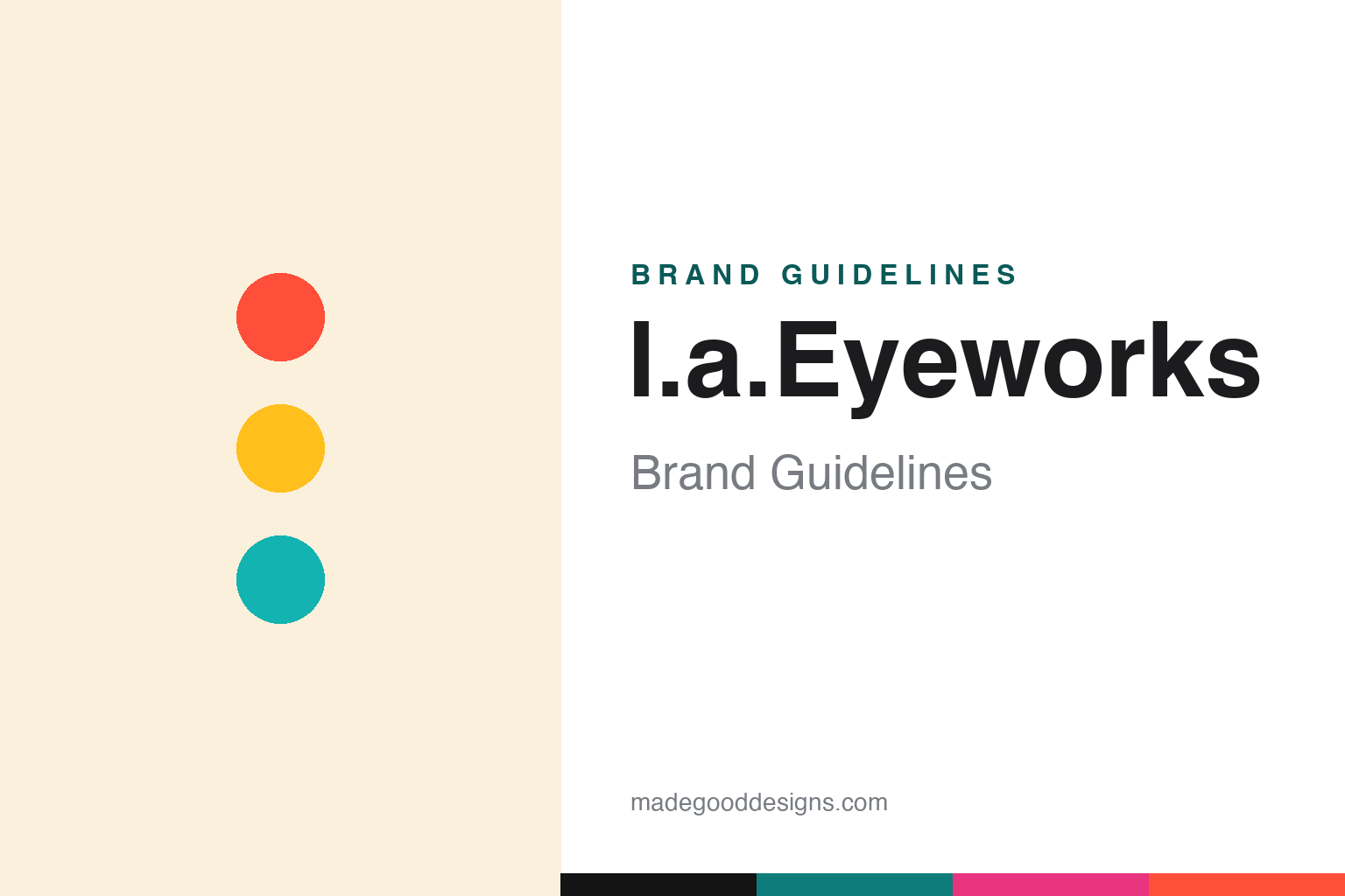
l.a.Eyeworks Brand Guidelines
Pioneering LA avant-garde eyewear — “a face is like a work of art.”
Aa
Two constants: a coral-and-turquoise artistic palette and a bold display face. Abstract homage — not the l.a.Eyeworks wordmark or logo.
A face is like a work of art
l.a.Eyeworks pioneered eyewear as expression.
l.a.Eyeworks is a lesson in eyewear as self-expression. It was founded on September 9, 1979 by Barbara McReynolds and Gai Gherardi — friends since high school — as a single storefront on Melrose Avenue in Los Angeles. Their aim was to challenge conventional eyewear: bold shapes, imaginative materials, technical experiments and expressive colour, offered in limited editions. They were among the pioneers of the “eyewear as art” movement decades before it was mainstream.
Its most famous asset is a portrait advertising campaign, launched in the early 1980s and photographed largely by Greg Gorman, pairing diverse cultural figures with the frames under the tagline “A face is like a work of art. It deserves a great frame.” Over more than thirty years it grew to hundreds of portraits — Grace Jones, Debbie Harry, David Hockney, John Waters and many more — one of the longest-running photo campaigns in advertising, later collected in the book Framed.
l.a.Eyeworks remains an independent, founder-run design house, still selling through independent opticians and its own Los Angeles stores. (Honest notes: it is styled “l.a.Eyeworks” (lowercase with periods, capital E), not “LA Eyeworks” or “L.A. Eye Works”; it was founded in 1979, while the portrait campaign began in the early 1980s — a couple of years apart; the tagline was written by ad creatives Jeff Gorman and Gary Johns, while Greg Gorman photographed the campaign (two different Gormans); claims that specific frames sit in named museum permanent collections are best left general unless sourced; and no official brand hex is published.)
Colour
l.a.Eyeworks lives in a coral-and-turquoise artistic palette. Click a swatch to copy the hex.
l.a.Eyeworks’ identity is bold, playful and artistic — an electric coral, a marigold yellow, a hot magenta, a turquoise, and a grounding ink black. The palette reads like its portrait campaign: high-contrast, colour-blocked, expressive and fun, eyewear treated as art. It signals creativity and individuality rather than restraint — a Los Angeles avant-garde sensibility. The honest caveat: with no published brand hex, these tones are an original, unofficial interpretation, not first-party values.
The lesson is a coral-and-turquoise palette signals artistic, expressive design. l.a.Eyeworks’ world reads as bold and creative. For designers, it is a reminder that high-contrast, playful colour — coral, marigold, turquoise on ink — conveys art and individuality, matching a brand that treats a face as a work of art. The takeaways: use high-contrast playful colour for artistic expression; ground it with one dark neutral; and treat any single hex as unofficial when there is no published spec.
Typography
The wordmark spirit is a bold display face — expressive and confident.
l.a.Eyeworks’ identity carries a bold, expressive, confident spirit — an “l.a.Eyeworks” wordmark, lowercase and understated, that lets its loud frames and famous portraits carry the drama. Paired here with a bold display face, the mood is clear: expressive and artistic, the register of a Melrose avant-garde house rather than a conservative optician. Set against a coral-and-turquoise palette, the bold display feels creative and assured — exactly the eyewear-as-art personality l.a.Eyeworks carries. It is expressive rather than timid, mirroring frames made to provoke and delight. (l.a.Eyeworks’ real wordmark is a trademark we describe but do not reproduce, and the exact typeface is not something we assert.) Because the specific mark is not ours to use, the honest description is “a bold display spirit,” not the l.a.Eyeworks logo. The type behaves like the brand: bold, expressive and confident.
Aa
A bold display spirit — expressive and confident. (Specimen set in Big Shoulders Display, a bold display sans; NOT the l.a.Eyeworks logo, which is a trademark.)
A campaign as the difference
l.a.Eyeworks stands for expression.
l.a.Eyeworks is a lesson in a campaign that became the brand. Its portrait series — diverse cultural figures shot in the frames under “a face is like a work of art” — ran for over thirty years and did more than sell glasses: it defined the brand as a champion of individuality and self-expression. That long, consistent, artful campaign is a rare asset, giving a small independent house cultural weight far beyond its size, and it perfectly matched the product philosophy of eyewear as art. The message and the frames said the same thing.
For designers and brand-builders, l.a.Eyeworks offers a clear takeaway: a consistent, meaningful campaign can define a brand for decades. The lessons: find a message that expresses your philosophy (“a face is like a work of art”) and commit to it for the long run; let a signature campaign carry the identity so the wordmark can stay quiet; and keep the product bold enough to live up to it. It is also a reminder to keep the facts honest: l.a.Eyeworks was founded in 1979 by Barbara McReynolds and Gai Gherardi in Los Angeles, is independent and founder-run, and is defined by its long portrait campaign (photographed by Greg Gorman) — with the palette here an unofficial interpretation. l.a.Eyeworks made a campaign the brand — proof that expression can be the difference.
Explore & save
Keep l.a.Eyeworks’s identity on hand — save it to a board in the Made Good inspiration library.
l.a.Eyeworks identity set
Pin the coral-and-turquoise palette and the bold-display spirit to your own board.