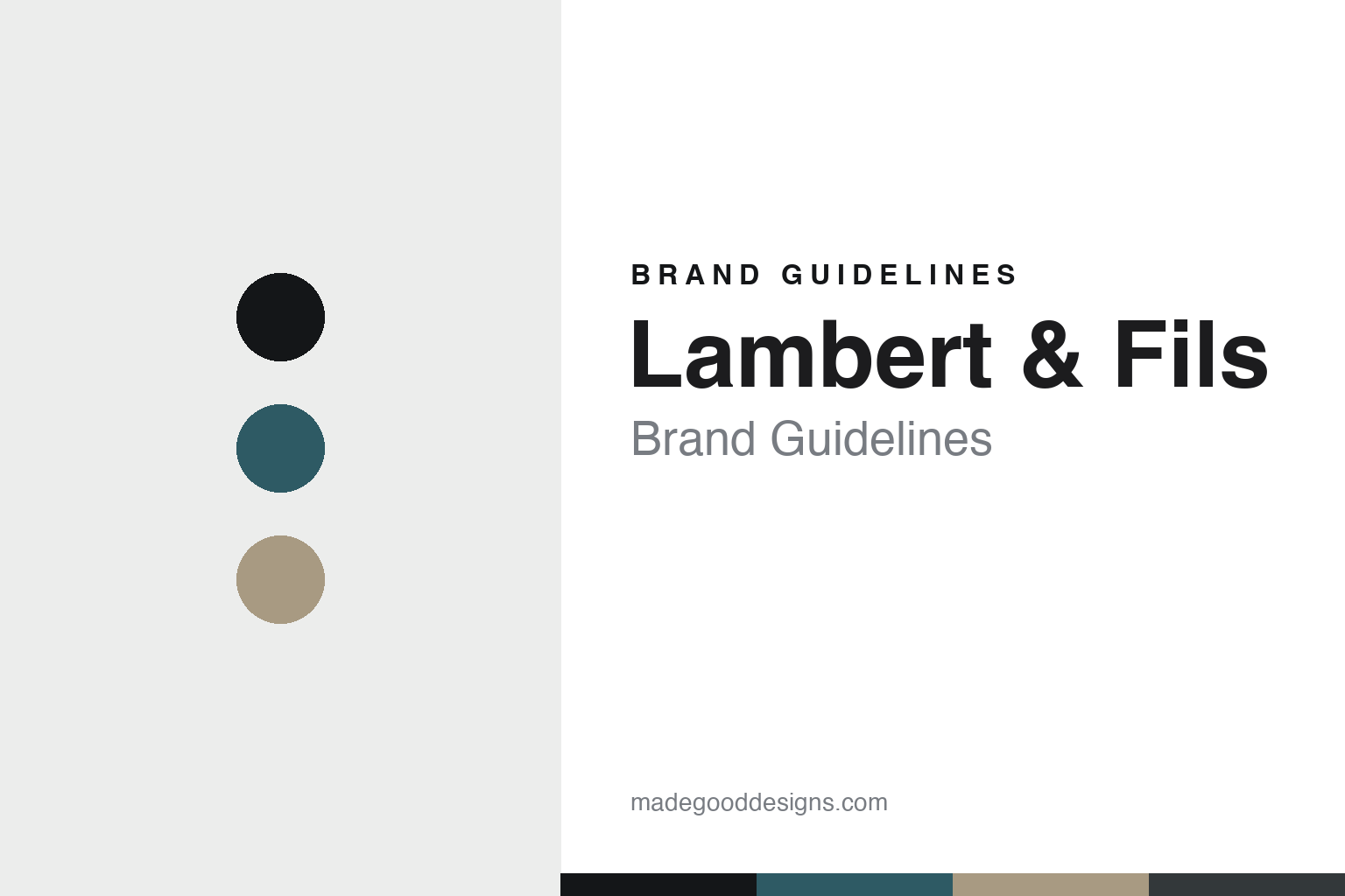
Lambert & Fils Brand Guidelines
The modernist light.
Aa
Two constants: a petrol-and-sand palette and a modernist sans register. Abstract homage — not a Lambert & Fils fixture or wordmark.
The modernist light
Lambert & Fils composes light from clean, tubular, modernist geometry.
Lambert & Fils is a lesson in modernist restraint as the identity. A Canadian studio from Montreal, it composes light from clean, minimal, gallery-like geometry — nothing more than it needs.
Its identity is the modernist light. Lambert & Fils’s tubular and geometric fixtures — spare, warm, composed like small sculptures — are the work it is known for. Light as composition. Restraint, lit warm.
(Honest notes: Lambert & Fils is a Canadian lighting studio in Montreal, founded in 2010 by Samuel Lambert, who opened in a small storefront on Rue Beaubien. Its signature is modernist minimalism — a “poetry of materials,” gallery-like, tubular and geometric compositions in warm LED light, across the collections the studio is known for. On production, it is handmade in-house, in the studio’s own Montreal atelier, where hundreds of custom fixtures a month are made by hand and prototyped on site. It is an independent studio, with Samuel Lambert as its guiding force. One thing to keep straight: “& Fils” — “and Sons” — is not literal; there are no sons in the firm. It is a homage to Lambert’s parents, a ceramic artist and a painter, in Quebec’s Eastern Townships, so we don’t call it a family firm of sons. Its collection names and its collaborations with outside designers are IP we describe but don’t reproduce. There’s no official brand hex — these tones are an unofficial interpretation. This is design commentary and does not promote any product.)
Colour
Lambert & Fils lives in a petrol-and-sand palette. Click a swatch to copy the hex.
Lambert & Fils’s identity is modern, minimal and warm — a petrol, an ink, a sand, a graphite, and a chalk. The palette leans petrol and sand — the register of cool, composed metal warmed by a gallery light. It signals restraint and craft rather than novelty. The honest caveat: with no published brand hex, these tones are an original, unofficial interpretation, not first-party values.
The lesson is a petrol-and-sand palette signals modernist restraint. Lambert & Fils’s world is a modern, minimal, warm object. For designers, it is a reminder that restraint — clean geometry, nothing extra — can be the whole identity, and that a cool-and-warm neutral palette signals that discipline. Because a mid petrol can fail as small text, keep type dark and let the colour live in the accents, palette and band. The takeaways: compose with restraint; keep it warm; own the atelier; and treat any single hex as unofficial.
Typography
The register is a modernist sans — clean, geometric, composed.
Lambert & Fils’s identity carries a clean, geometric, composed spirit — a minimal, warm object. A geometric, modernist sans captures the mood: it is calm and exact, the register of composed restraint. Set in a petrol-and-sand palette, the modernist sans feels clean and geometric — exactly the personality Lambert & Fils carries. It is composed rather than decorative, mirroring a modernist fixture. (Lambert & Fils’s real fixtures and wordmark are works we describe but do not reproduce, and the exact typeface is not ours to use.) Because it is not ours to use, the honest description is “a modernist sans spirit,” shown here in a stand-in. The type behaves like the brand: clean, geometric and composed.
Aa
A modernist sans spirit — clean and geometric. (Specimen set in Jost, a geometric modernist sans STAND-IN; NOT the Lambert & Fils wordmark.)
Modernist restraint as identity
Lambert & Fils stands for the modernist light.
Lambert & Fils is a lesson in making restraint the identity. A petrol-and-sand palette, a modernist sans and a spare, geometric fixture make modernist restraint the whole brand — clean, minimal, warm. The restraint is the differentiator. The differentiator is composition: tubular, geometric light reduced to what it needs, made by hand in the studio’s own atelier.
Put to work, the identity is restraint as design. A designer building in this spirit would strip a fixture to its geometry, warm it just enough to feel human, and keep the making in-house so the minimalism reads as considered rather than cheap. The lesson Lambert & Fils teaches is that a clear, restrained language plus an own workshop can build a brand: a gallery-like sensibility, hand-made production, and a calm, geometric design language give it an identity that feels like a studio, not a catalogue. Less, composed well, becomes the whole signature.
For designers and brand-builders, Lambert & Fils offers a clear takeaway: compose with restraint, and own the making. The lessons: reduce to the geometry; keep it warm; own the atelier; and be honest about the story. It is also a reminder to stay accurate: “& Fils” is a homage to the founder’s parents, not literal sons, and the studio was founded in 2010 — the palette here is an unofficial interpretation. And it is a reminder that made-where honesty can be a genuine boast: Lambert & Fils is handmade in its own Montreal atelier, and that is worth stating plainly. Lambert & Fils made the modernist light the brand — proof that restraint can be the difference.
Explore & save
Keep Lambert & Fils’s identity on hand — save it to a board in the Made Good inspiration library.
Lambert & Fils identity set
Pin the petrol-and-sand palette and the modernist-sans register to your own board.