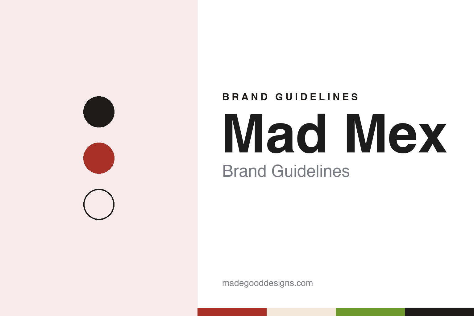
Mad Mex Brand Guidelines
A 2007 Sydney burrito chain and its lucha libre wrestler.
Aa
Two constants: a Mad Mex chilli red, lime and cream palette and a Condensed sans register. Abstract homage — not a Mad Mex product or mark; no food, logo or signage is reproduced.
Crown Street, 2007
A Californian, one shop and a home-made IT department.
Mad Mex Fresh Mexican Grill, usually shortened to Mad Mex, is a Sydney-based chain of fast-casual Mexican restaurants. Its founder is Clovis Young, a Californian who, English Wikipedia says, moved to Australia in 2006. ZDNet reported in August 2017 that Young opened the first Mad Mex Fresh Mexican Grill on Sydney’s Crown Street in 2007, and that he had grown up near Baja California. The company’s own website dates the business to 2006 and quotes Young saying he started Mad Mex that year; the restaurant opening reported by the press came in 2007.
In the early years Young ran most of the business himself. ZDNet described him acting as the finance department, the marketing team and IT support as well as chief executive and head chef, and buying a small business server to run the systems of the first restaurant. As more restaurants opened he hired a general manager of IT in 2014. By 2017 the chain ran its tills on Oracle Hospitality software and was moving its systems to Microsoft Azure, with plans to apply machine learning to its sales data. The same report counted 60 restaurants in Australia and 10 in New Zealand in 2017, ten years after the Crown Street opening.
New Zealand came through a master franchise. English Wikipedia says a company called Mad Group was appointed master franchisee there in the early 2010s, opened the first New Zealand outlet in 2013 and was running six by 2015, when it raised growth capital through equity crowdfunding. English Wikipedia also says that all of the New Zealand outlets closed during 2023, after several holding companies went into liquidation.
Colour
A wrestler’s mask made of words.
The look of Mad Mex is built around lucha libre, Mexican professional wrestling. A project page published in October 2013 by SEGD, the Society for Experiential Graphic Design, credits the Sydney studio Holy Cow! Design & Advertising with the brand and visual identity, at a time when the chain had five restaurants in Sydney. The identity centres on a lucha libre wrestler character whose role, in the studio’s description, is to fight for flavour and defend freshness against duller food.
The focal point of each restaurant in that scheme was the Mad Mex Mask, a large wall graphic in the shape of a traditional wrestling mask, but built from blocks of shaped Spanish words naming the brand’s values, such as Fresco. Colour carried the meaning: SEGD describes green for Fresco (fresh), red for Sabor (flavour) and white for Puro (pure). A second large illustration, the “Patterna,” set out foods and flavours in drawing and lettering, and a series of mock posters for wrestling bouts, made in the manner of real lucha libre posters, starred the Mad Mex wrestler. Menus, signs and the website carried the same graphics.
The wrestler outlived that first scheme. In March 2019 Franchise Executives reported the chain’s first refresh in more than ten years, which included an updated version of the Luchador logo for new packaging and staff uniforms. It was launched with outdoor advertising on bus backs, in shopping centres and in train stations, a 30-second cinema advertisement and social media. English Wikipedia still describes the restaurants as decorated after lucha libre.
The voice has stayed loud. In June 2025 Mediaweek reported a campaign called “Bye Bye Bland, Hello Bold,” made with the agency Connecting Plots as the first creative work under a new “Mad For !t” positioning. Its films showed people going to absurd lengths to escape dull meals, with scenes such as crocodile-filled water and a microwave flung out of a window, made with generative-AI visual effects, and it ran across digital, social, influencer and outdoor media.
Typography
The category.
Mexican and burrito fast-casual chains tend to present themselves through the counter as much as the sign. The format is usually the same in outline: a menu of burritos, bowls, tacos and nachos, a kitchen line where each order is made up in front of the customer, and a choice of eating in, taking away or ordering ahead. The Caterer described one Australian chain’s signature dishes in 2025 simply as “customisable burritos and bowls,” and companies in the category describe their own kitchens in terms of speed and made-to-order assembly.
Names in the category often borrow Spanish words or invented surnames, and the shortened form can matter as much as the full one. Guzman y Gomez, named after two of a founder’s childhood friends according to English Wikipedia, is generally shortened to three initials. The same company calls its head offices Hola Central, and Zambrero’s UK chief executive called the chain’s franchise partners the “Zam Fam” in 2025, so the naming habit often reaches past the menu into the business itself.
Visual identities in the category often lean on bright colour and hand-made graphic details, as the companies describe them. Guzman y Gomez says its logo letters are drawn to look like sticky tape, a nod to street art in Mexico, and Inside Retail reported in 2023 that Zambrero had moved to a brighter, more upbeat look for posters, decals, signage and menus while keeping its green colourway. In both cases a small set of colours and one recognisable graphic idea are meant to carry from the shop front to the menu board.
Behind the counters sit very different businesses: founder-owned franchisors, private-equity-backed groups, chains that have been through administration or Chapter 11, and companies listed on a stock exchange. Their corporate pages set out founding stories, founders and timelines of openings, while dated press and official records fill in owners, listings and closures.
Aa
A heavy condensed sans, loud like a fight poster. (Specimen set in Anton, a sans STAND-IN; NOT the Mad Mex logo.)
Mad Mex
From Sydney to Singapore and back.
Ownership has changed twice. In September 2018 The Business Times of Singapore reported that the Singapore fried-chicken chain 4Fingers had bought a 50 per cent stake in Mad Mex for an undisclosed sum, with Young keeping the other half and staying on as chief executive. The aim was to take Mad Mex into South-east Asia, and the paper reported that 4Fingers had shortlisted sites in Singapore and Malaysia. English Wikipedia dates the deal to 2019, but the newspaper report is dated 19 September 2018. Under the partnership Mad Mex opened restaurants in Singapore and Malaysia in 2019, Inside Retail reported.
The Asian venture did not last. In December 2021 Inside Retail reported that Mad Mex had bought back the half held by 4Fingers International, making the business fully Australian-owned again and ending the Asian expansion; the company said it had opened 11 new restaurants in Australia over the previous twelve months. English Wikipedia counted 71 Mad Mex restaurants in operation in late 2022.
The menu is assembled to order. The company’s website describes burritos, quesadillas, nachos and tacos built the way the customer chooses, with fillings such as a slow-cooked pulled pork in the style of the Yucatán, and an app for ordering ahead and collecting rewards.
For a design guide, Mad Mex shows how a single character can carry a restaurant identity for well over a decade: a masked wrestler drawn from Mexican popular culture, rebuilt in type on the wall and redrawn for the packaging. Compare Guzman y Gomez, another Sydney-based Mexican chain, and Zambrero. For this guide we use a chilli red, a lime green and a warm cream with a heavy condensed sans, an unofficial interpretation; no product or logo is reproduced.
Explore & save
Keep Mad Mex’s identity on hand — save it to a board in the Made Good inspiration library.
Mad Mex identity set
Save the Mad Mex chilli red, lime and cream palette and the Condensed sans register to your own board.