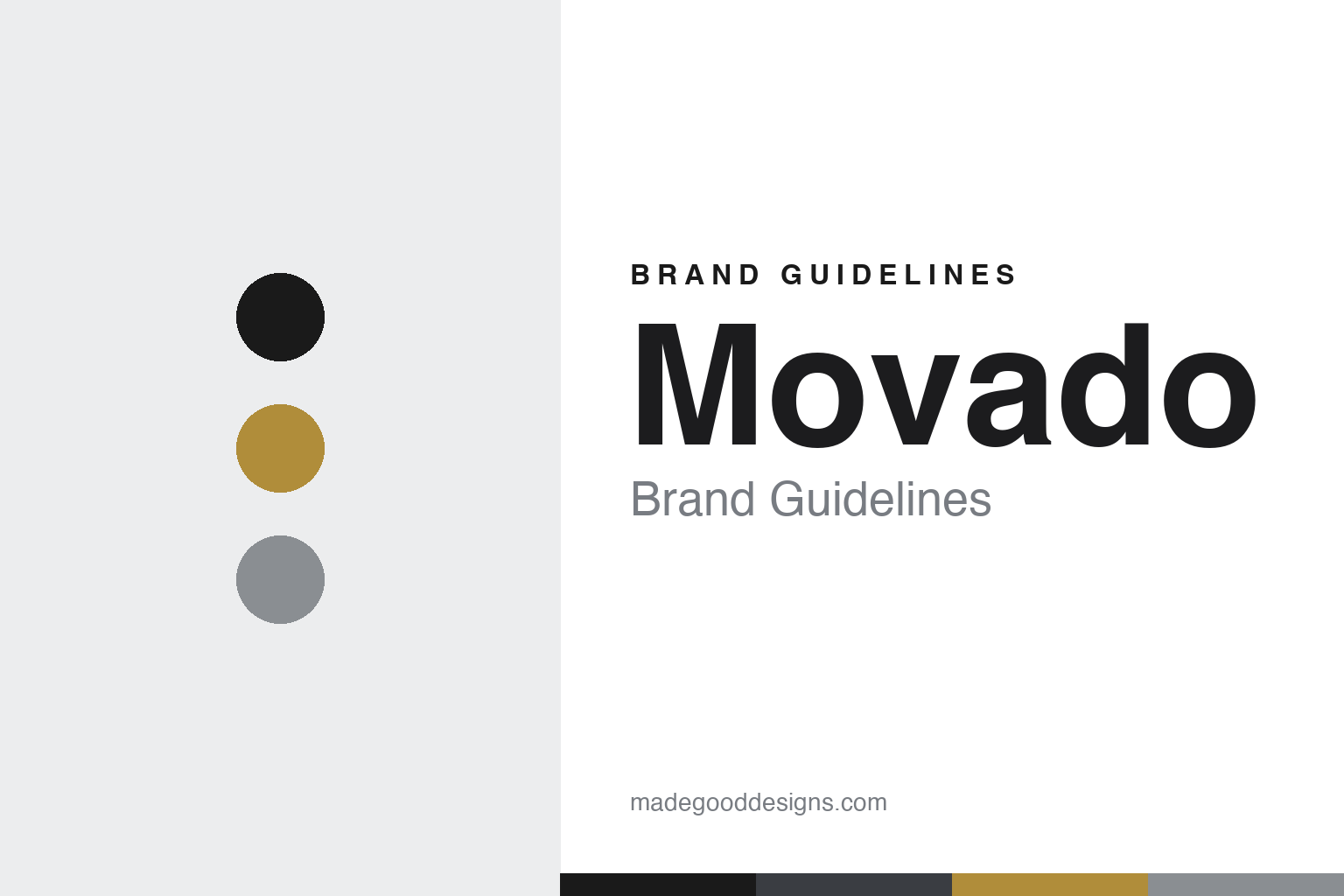
Movado Brand Guidelines
A black dial, no numbers, a single gold dot at 12 — the ‘Museum Watch’ that put minimalism on the wrist.
Aa
Two constants: an ink-and-gold palette (black dial, gold dot) and a clean geometric sans. Abstract homage — not the Movado dial or wordmark.
The single dot
Movado’s identity is one gold dot on an empty black dial.
Movado’s identity is one of the purest in watchmaking: the Museum Watch — a solid black dial with no numerals and no markers, just a single gold dot at 12 o’clock and two hands. The dot represents the sun at high noon, and the empty black field evokes the sky. It’s minimalism distilled to a single point, and it’s so purely designed that the dial became the first watch dial accepted into the Museum of Modern Art’s permanent collection (around 1960) — which is exactly why it’s called the “Museum Watch.” The design was created by the American industrial designer Nathan George Horwitt in 1947 (he received a patent for the dial in 1957). (Honest caveats: Movado publishes no official brand hex, so the black-and-gold here is descriptive; and while its current wordmark is a bespoke “Movado Sans,” the historic mark is only reported as Friz Quadrata, so don’t assert a font.)
There’s an important, honest twist to the story. Horwitt designed the dial, but Movado produced versions of the single-dot design without his authorisation, from around 1948, and the dispute over credit ran for decades; the two sides did not settle until 1975 (Movado paid Horwitt $29,000), and Movado’s heavy “Museum Watch” branding largely postdates that settlement. It’s a reminder that a beloved design icon can have a complicated attribution history — worth telling accurately rather than glossing over.
The name and the company are Swiss and old. “Movado” is an Esperanto word — literally “movement,” which the brand renders idiomatically as “always in motion.” The company was founded in 1881 in La Chaux-de-Fonds, Switzerland, by Achille Ditesheim (then nineteen), and adopted the Movado name in 1905. Today Movado is the flagship of Movado Group, Inc. — an American company, publicly traded on the NYSE (ticker MOV) and based in Paramus, New Jersey, which also owns and licenses other watch brands. A Swiss watchmaker, an American design classic, and one perfect gold dot.
Colour
Movado lives in black and gold. Click a swatch to copy the hex.
Movado’s palette is black and gold — the deep black of the empty Museum dial and the single gold dot that is its entire ornament. It’s about as minimal as a palette can be: one dark field, one metallic point. That radical restraint reads as elegant, modern and timeless, and it makes the Museum Watch instantly recognisable — a black circle with a gold dot is Movado. The honest caveat: Movado publishes no official public brand hex; the identity is descriptively “black dial plus a metallic gold (or silver) dot,” so treat the values here as approximations rather than a confirmed spec.
The lesson is radical minimalism as identity. Movado shows how a single, perfectly-placed element — one gold dot on black — can be a complete, instantly recognisable brand. For designers, it’s the ultimate reminder that removing everything except the essential can create something iconic; restraint, done with conviction, is powerful. The takeaways: strip a design to its essential element and own it (the single dot); let a two-colour, minimal palette (black and gold) carry the whole identity; and treat specific hexes as approximate when the brand’s “colour” is really a material (gold) on black.
Typography
The voice is a clean geometric sans — modern and quiet.
Movado’s clean geometric sans voice matches the purity of the dial. Modern, even, unadorned letterforms read as elegant and quiet — the typographic equivalent of the empty black face and single dot — and they never compete with the minimalist design that is the brand’s whole point. The recent identity uses a bespoke face, “Movado Sans” (made with the foundry Schick Toikka), reinforcing that modern, refined character; the historic wordmark is often reported as the glyphic serif Friz Quadrata, though that isn’t brand-confirmed. Either way, the type stays restrained so the dot can speak. (The honest description is “a clean geometric sans / bespoke Movado Sans,” not an assumed off-the-shelf font.) The type behaves like the brand: modern, quiet and minimal — letting one gold dot do the talking.
Aa
A clean geometric sans — modern and quiet. (Specimen set in Jost, a geometric sans in the spirit of the bespoke “Movado Sans”; the historic mark is only reported as Friz Quadrata.)
Less, made iconic
Movado turned radical restraint into a design classic.
Movado is a lesson in the power of radical restraint. The Museum Watch removes everything a watch dial normally has — numbers, markers, ornament — and keeps just one thing: a single gold dot for the sun at noon. That fearless subtraction produced a design so pure it entered MoMA and became instantly, permanently recognisable. It’s proof that the boldest design move is often removal: strip away until only the essential remains, and what’s left can be iconic. The brand’s entire identity rests on that one confident decision, made in 1947 and unchanged since.
For designers and brand-builders, Movado offers a clear takeaway: subtraction can be the most powerful design decision. The lessons: have the confidence to remove everything non-essential (numbers, markers) and keep one perfect element (the dot); let a minimal, two-colour palette carry the identity; and tell your history honestly, including the complicated parts. It’s also a reminder to keep the facts precise — the Museum dial’s single dot (the sun at noon) was designed by Nathan George Horwitt in 1947 and entered MoMA around 1960; Movado produced it without his authorisation and settled with him in 1975; “Movado” is Esperanto (literally “movement,” rendered “always in motion”); the company was founded in 1881 by Achille Ditesheim in La Chaux-de-Fonds and took the Movado name in 1905; and it’s the flagship of the US-listed Movado Group. Movado turned less into an icon — proof that restraint, done with conviction, can define a brand.
Explore & save
Keep Movado’s identity on hand — save it to a board in the Made Good inspiration library.
Movado identity set
Pin the ink-and-gold palette and the geometric-sans spirit to your own board.