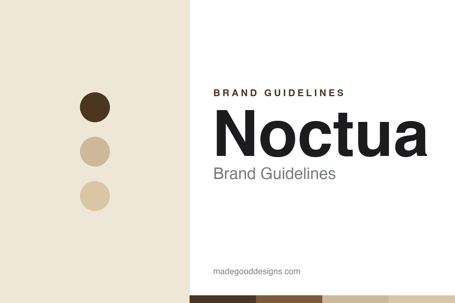
Noctua Brand Guidelines
The most deliberately divisive palette in tech — brown and beige, chosen on purpose, and defended for years.
Aa
Two constants: a brown-and-beige palette and a clean humanist sans. Abstract homage — not the Noctua wordmark.
Divisive on purpose
Noctua chose brown, and kept it.
Noctua is a lesson in owning a deliberately divisive design choice. It’s an Austrian brand founded in 2005, headquartered in Vienna and developed by Austria’s Rascom Computerdistribution in cooperation with Taiwan’s Kolink International (CEO Roland Mossig). It makes premium quiet cooling — CPU coolers and case fans — and it is instantly recognisable for one thing: its brown-and-beige colour scheme. (Honest caveats: Noctua publishes no official brand-colour hex — the tones below are community approximations — and the wordmark typeface is undocumented. It’s an Austrian brand, not German or Taiwanese.)
Noctua’s products are benchmarks. The dual-tower NH-D15 is its halo CPU cooler, and the NF-A12x25 fan became famous for a near-sub-millimetre blade-tip-to-frame gap achieved with a special liquid-crystal-polymer compound Noctua calls “Sterrox” — an extreme manufacturing-tolerance story for a modest fan. The reputation: top performance, very low noise, meticulous engineering, and long (up to six-year) warranties.
The crucial, myth-correcting fact: the brown-and-beige is not an accident or an “ugly by mistake.” Noctua has publicly stated the colour scheme is a deliberate brand signature, chosen for instant recognisability and kept despite years of mockery — later adding an all-black chromax.black line for customers who want a blacked-out look, without abandoning the original palette. The name comes from Athene noctua, the “little owl” — a classical symbol of wisdom — and the badging line is “designed in Austria.” Divisive, deliberate, and beloved.
Colour
Noctua lives in brown and beige. Click a swatch to copy the hex.
Noctua’s identity is defined by its famous two-tone brown and beige/tan — one of the most deliberately divisive palettes in all of tech. The earthy browns and beiges read as warm, understated and unmistakably Noctua — a scheme that looks like nothing else in a category obsessed with black and RGB, which is exactly the point: instant recognisability. Mainstream outlets have mocked it as “khaki-and-mud,” yet enthusiasts have come to love it as a badge of authenticity and engineering focus. It’s proof a “polarising” palette can become a beloved, ownable signature. For customers who want stealth, the all-black chromax.black line coexists alongside — not replacing — the browns. The honest caveat: Noctua publishes no official brand hex — the brown (~#4B3621) and beige (~#CDB99A) here are community approximations, not first-party values.
The lesson is a divisive, ownable palette beats a safe, forgettable one. Noctua’s brown-and-beige is instantly recognisable precisely because it refuses the category norm. For designers, it’s a reminder that being distinctive — even polarising — can be more valuable than being universally liked. The takeaways: choose a distinctive, ownable palette over a safe one (brown-and-beige); commit to it despite criticism (Noctua kept it for years); and offer an alternative without abandoning the signature (chromax.black).
Typography
The wordmark is a clean humanist sans — warm and understated.
Noctua’s clean, slightly rounded humanist sans wordmark — the lowercase “noctua,” typically in its signature brown — is warm and understated. The even, friendly letterforms read as approachable, precise and unpretentious, matching a brand of meticulously-engineered but quietly-styled cooling, and the warm brown ties the type straight to the palette. Set against beige and tan, the wordmark feels calm and distinctive — exactly the understated, engineering-first personality Noctua carries, with the little-owl name adding a note of wisdom. It’s clean and warm rather than aggressive, the opposite of RGB-gaming loudness. Because the exact face is undocumented, the honest description is “a clean humanist sans,” not a named font. The type behaves like the brand: warm, understated and precise.
Aa
A clean humanist sans — warm and understated. (Specimen set in Mulish, a clean humanist sans in the spirit of the noctua wordmark; the real face is undocumented.)
Distinctive beats likeable
Noctua’s palette is the point.
Noctua is a lesson in choosing distinctive over universally-liked. In branding, the instinct is to pick a palette everyone finds attractive — but Noctua did the opposite, committing to a brown-and-beige that many people actively dislike, precisely because it makes Noctua instantly recognisable. On a shelf or in a build full of black-and-RGB hardware, a Noctua fan is unmistakable. That recognisability, paired with genuinely excellent engineering, converted a “polarising” choice into a cult brand: the browns became a badge of authenticity, so beloved that Asus, Drop and even Seasonic released products in Noctua’s brown. It’s a powerful lesson — being distinctive and being liked are not the same, and distinctiveness (backed by substance) can be the more valuable asset. Noctua kept the palette that everyone told it to change, and won because of it. Be recognisable, not just pretty.
For designers and brand-builders, Noctua offers a clear takeaway: a distinctive, even divisive, identity backed by real quality can beat a safe, forgettable one. The lessons: prioritise recognisability over universal appeal (the brown-and-beige); commit despite criticism, and let quality justify it (top-tier quiet cooling); and offer a variant without diluting the signature (chromax.black). It’s also a reminder to keep the facts precise — Noctua is an Austrian brand founded in 2005 (Rascom + Kolink), famous for the NH-D15 and NF-A12x25, named for the “little owl,” with a deliberately-chosen brown-and-beige palette and a coexisting chromax.black line. Noctua’s palette is the point — proof that distinctive beats merely likeable.
Explore & save
Keep Noctua’s identity on hand — save it to a board in the Made Good inspiration library.
Noctua identity set
Pin the brown-and-beige palette and the humanist-sans spirit to your own board.


