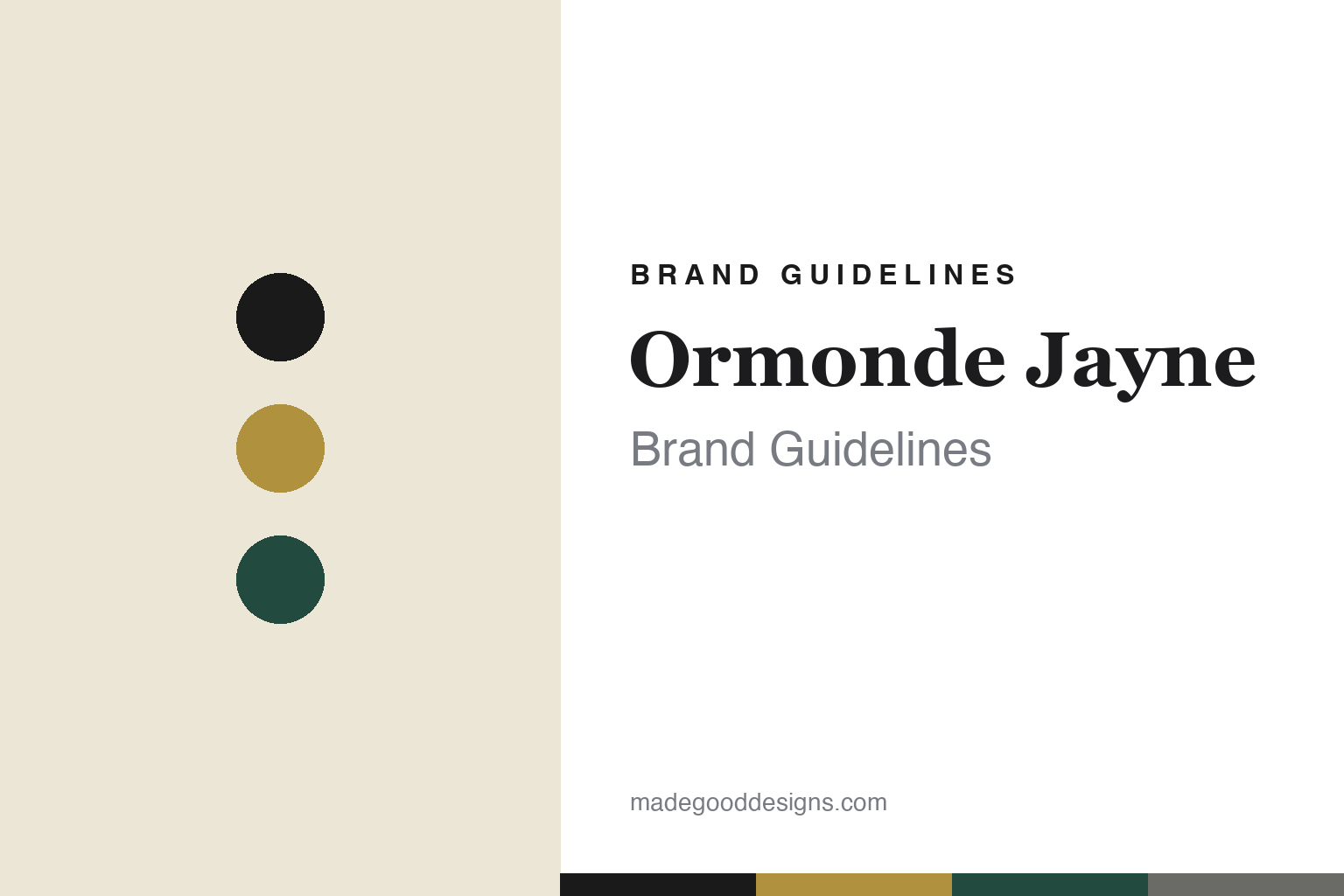
Ormonde Jayne Brand Guidelines
The octagon.
Aa
Two constants: a black-and-gold palette and a refined serif wordmark. Abstract homage — not the Ormonde Jayne octagon or bottle.
The octagon
Ormonde Jayne bottled Mayfair in eight sides.
Ormonde Jayne is a lesson in understated British luxury. Founded in 2000 (with its first fragrances in 2002) by Linda Pilkington, and based in Mayfair’s Royal Arcade off Old Bond Street, it built a niche house on rare, exotic ingredients. Its hero, Ormonde Woman (2002), is famous for black hemlock — a dark, woody note almost unused in perfumery before it.
The design is quietly distinctive: black-and-gold packaging (black boxes and bottles with gold detailing and a gold wordmark) and a signature eight-sided octagonal bottle and cap. It’s Mayfair sophistication — refined, understated, and precise rather than showy.
(Honest notes: the name is personal — “Ormonde” from Ormonde Terrace, a former home, plus Pilkington’s middle name “Jayne” (not, as sometimes said, from travel or flowers). And notably, the original Ormonde Jayne fragrances were composed by Geza Schön — the perfumer who went on to found Escentric Molecules — so the same nose behind clinical molecule-minimalism also made this Mayfair house. It’s independent and founder-owned. No official brand hex is published.)
Colour
Ormonde Jayne lives in black and gold. Click a swatch to copy the hex.
Ormonde Jayne’s identity is refined, understated and luxurious — a black, a gold, a deep green, a cream, and a grey. The palette is black and gold with deep jewel accents (a nod to Ormonde Woman’s dark, woody character), the register of understated Mayfair luxury. It signals refined British elegance rather than opulent excess or bright modernity. The honest caveat: with no published brand hex, these tones are an original, unofficial interpretation, not first-party values.
The lesson is black and gold read as understated luxury. Ormonde Jayne’s world is a quiet Mayfair arcade. For designers, it is a reminder that a restrained black-and-gold palette, plus one distinctive form (the octagon), can signal refined, exotic luxury without shouting — elegance through precision, not ornament. The takeaways: pair black with gold for understated luxury; add one distinctive geometric signature (the octagon); and treat any single hex as unofficial — using a deep gold-brown for small text so the gold stays refined.
Typography
The wordmark spirit is a refined serif — understated and elegant.
Ormonde Jayne’s identity carries a refined, understated, elegant spirit — a gold wordmark on a black, eight-sided flacon. A refined serif captures the mood: it is graceful and quietly luxurious, the register of understated Mayfair sophistication. Set against black and gold, the serif feels elegant and understated — exactly the octagon personality Ormonde Jayne carries. It is refined rather than showy, mirroring precise, geometric packaging. (Ormonde Jayne’s real octagonal bottle and wordmark are trademarks and trade dress we describe but do not reproduce, and the exact typeface is not published, so we don’t assert it.) Because the specific mark is not ours to use, the honest description is “a refined serif spirit,” not the Ormonde Jayne logo. The type behaves like the brand: refined, understated and elegant.
Aa
A refined serif spirit — understated and elegant. (Specimen set in Cormorant Garamond, a refined serif; NOT the Ormonde Jayne logo, which is a trademark.)
Elegance through precision
Ormonde Jayne stands for the octagon.
Ormonde Jayne is a lesson in understatement as luxury. Black-and-gold restraint, a precise eight-sided bottle and genuinely rare ingredients (black hemlock) make it feel refined and exotic without the maximalist theatre of some rivals — elegance through precision. The octagon and the restraint are the differentiator. The differentiator is understated, precise British elegance.
For designers and brand-builders, Ormonde Jayne offers a clear takeaway: restraint plus one distinctive form can signal luxury. The lessons: keep the palette restrained (black + gold); add a single distinctive geometric signature (the octagon); and let genuine substance (rare ingredients, a notable perfumer) carry it. It is also a reminder to stay accurate: the name is personal (Ormonde Terrace + Jayne), the original scents were by Geza Schön, and the house is independent — with the palette here an unofficial interpretation. Ormonde Jayne shaped an octagon — proof that precise restraint can be the difference.
Explore & save
Keep Ormonde Jayne’s identity on hand — save it to a board in the Made Good inspiration library.
Ormonde Jayne identity set
Pin the black-and-gold palette and the refined-serif spirit to your own board.


