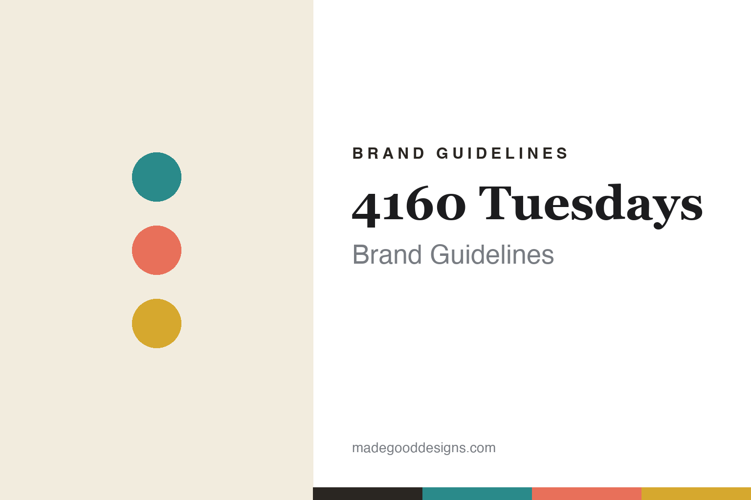
4160 Tuesdays Brand Guidelines
Make every Tuesday count.
Aa
Two constants: an eclectic, vintage palette and a characterful serif spirit. Abstract homage — not the 4160 Tuesdays labels or artwork.
Make every Tuesday count
4160 Tuesdays bottles stories, by hand.
4160 Tuesdays is a lesson in storytelling from a writer’s hand. Founded (making scents in its London studio since 2011) by Sarah McCartney — a former Lush writer who taught herself perfumery to bring to life the fictional scents in her own novel — it is a genuinely small, hand-run indie. The name is a philosophy: there are about 4,160 Tuesdays in an 80-year life, so make each one count.
Every scent is a story — from memories, songs, literature and her novels — hand-made in small batches (200 or fewer). The names are gloriously long and playful: “Sunshine & Pancakes,” “The Sexiest Scent on the Planet. Ever. (IMHO),” “A Kiss by the Fireside.”
The design matches: playful, quirky, vintage and homemade-craft — deliberately not slick — with colourful, eclectic, vintage-collage labels using Sarah’s own fruit-and-foliage artwork (packaging developed with Project Works London).
Colour
4160 Tuesdays lives in eclectic, vintage colour. Click a swatch to copy the hex.
4160 Tuesdays’ identity is eclectic, warm and vintage — a teal, a coral, a mustard, a cream, and an ink. Rather than one house colour, it uses a varied, colourful, vintage palette, different per scent and story. It signals a handmade, playful, indie world rather than sleek luxury minimalism. The honest caveat: with no published brand hex, these tones are an original, unofficial interpretation, not first-party values.
The lesson is an eclectic vintage palette signals handmade and human. 4160 Tuesdays’ world is a colourful, well-loved workshop. For designers, it is a reminder that warm, varied, vintage-collage colour — the opposite of a single slick brand colour — can make a product feel personal, crafted and story-rich. The takeaways: embrace an eclectic, warm palette; let vintage-collage artwork and long, human names lead; and treat any single hex as unofficial — using a deep teal for small text so the palette stays warm.
Typography
The wordmark spirit is a characterful serif — warm and story-rich.
4160 Tuesdays’ identity carries a warm, characterful, story-rich spirit — vintage-collage labels and long, playful names. A soft, characterful serif captures the mood: it is friendly and a little old-fashioned, the register of a writer-perfumer’s handmade world. Set against eclectic vintage colour, the serif feels warm and story-rich — exactly the handmade personality 4160 Tuesdays carries. It is characterful rather than slick, mirroring hand-crafted, illustrated labels. (4160 Tuesdays’ real labels and artwork are trademarks and trade dress we describe but do not reproduce, and the exact typeface is not published, so we don’t assert it.) Because the specific mark is not ours to use, the honest description is “a characterful serif spirit,” not the 4160 Tuesdays logo. The type behaves like the brand: warm, characterful and story-rich.
Aa
A characterful serif spirit — warm and story-rich. (Specimen set in Fraunces, a characterful serif; NOT the 4160 Tuesdays artwork, which is a trademark.)
Handmade, on purpose
4160 Tuesdays stands for handmade storytelling.
4160 Tuesdays is a lesson in the charm of the handmade. Small batches, a writer’s stories, long human names and eclectic vintage-collage design make a fragrance brand feel personal, warm and un-corporate — the deliberate opposite of slick luxury. The handmade craft is the differentiator. The differentiator is genuine, handmade, story-driven design.
For designers and brand-builders, 4160 Tuesdays offers a clear takeaway: imperfection and warmth can be a strength. The lessons: let the design feel handmade and human (collage, illustration, long names); build each product around a real story; and let a distinctive founder voice run through it. It is also a reminder to stay accurate: 4160 Tuesdays is a genuinely independent, founder-owned indie making scents by hand in London since 2011 — with the palette here an unofficial interpretation. 4160 Tuesdays bottled stories by hand — proof that handmade warmth can be the difference.
Explore & save
Keep 4160 Tuesdays’s identity on hand — save it to a board in the Made Good inspiration library.
4160 Tuesdays identity set
Pin the eclectic vintage palette and the characterful-serif spirit to your own board.

