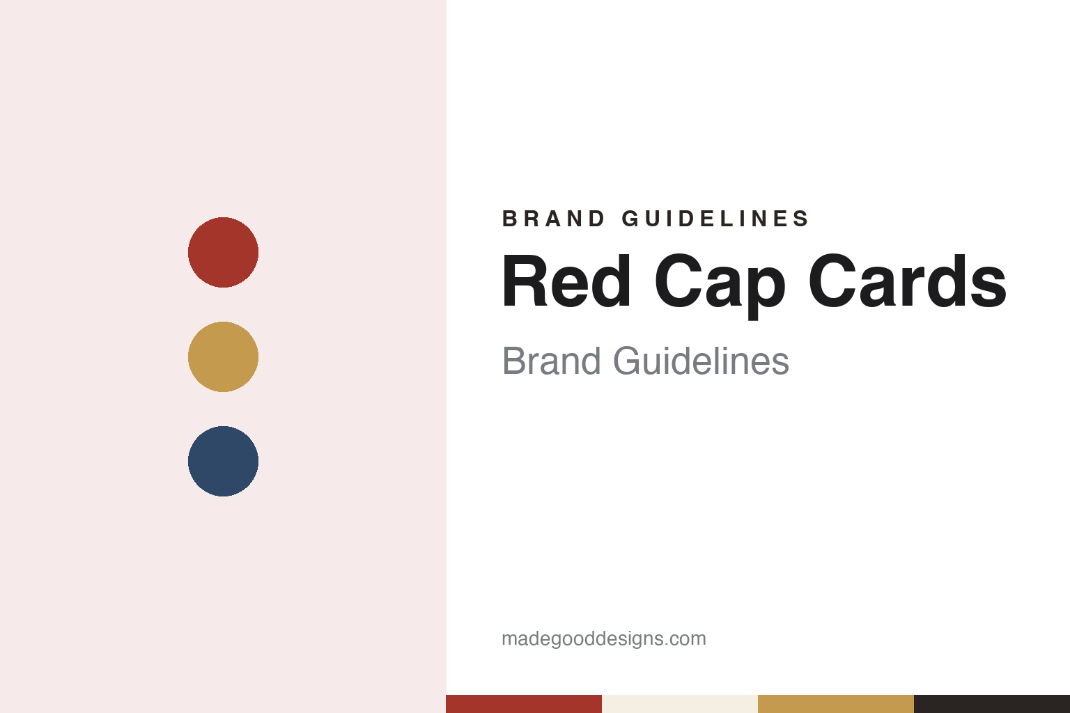
Red Cap Cards Brand Guidelines
A Los Angeles card line built around illustrators.
Aa
Two constants: a brick red, ink and card-stock palette and a bookish serif register. Abstract homage — not a Red Cap Cards product or mark; no card, illustration or logo is reproduced.
A West Hollywood bungalow
A theatre director, a coffee roaster and a stack of hand-drawn cards.
Red Cap Cards is a stationery company based in Los Angeles, California, run by the husband-and-wife team Carrie Gifford and Hal Mertz. In an August 2016 feature for the stationery site Oh So Beautiful Paper, the pair said the business began in 2005, when they decided to work together and build a creative company that let them run their own time. Hal was then running a coffee-roasting business and Carrie was a children’s theatre director. She was also illustrating cards as a hobby, and people liked them; those cards became the start of the line. They said Red Cap Cards was born in a small bungalow in West Hollywood.
The line changed shape within two years. In 2007, the founders told Oh So Beautiful Paper, they began working with artists from around the world, starting with a few friends and adding more over time. At the start Carrie had been the only illustrator; by 2016 the line carried more than twenty artists. She said she stopped illustrating for the company in 2012 to become its creative director and collection curator, while Hal looked after the logistics side, including wholesale and print jobs.
The pair described a small team that worked from its own studios rather than a shared office: a designer, a writer who handled the blog and press, a wholesale manager, a print coordinator in Los Angeles and a warehouse partner in Minnesota, which they said was another business run by a husband-and-wife team. They said they had never wanted to manage people closely, and that the remote set-up suited the work.
The company’s own “Our Story” page, read in November 2026, calls Red Cap Cards “a celebration of art and correspondence” and a platform for artists to reach a broad audience, bringing together an artist’s work and the handwritten letter. It says each illustrator is chosen for their work and point of view, with backgrounds that include children’s book illustration, animation, design and modern art.
Colour
The illustrator comes first.
Red Cap Cards’ catalogue is arranged around occasions and around artists. Its online shop, as of November 2026, sorts greeting cards by occasion — birthday, love, wedding, baby, sympathy, thank you, the seasonal holidays and more — next to gift bags, wrapping paper in rolls and flat sheets, tissue paper and stickers. A separate “By Artist” menu lists dozens of names, among them the picture-book illustrators Jon Klassen and Christian Robinson, the illustrators Kate Pugsley and Carolyn Gavin, and a collection under the name of Richard Scarry.
Independent coverage has picked out the illustration. In February 2017 Oh So Beautiful Paper included a birthday card by Dinara Mirtalipova for Red Cap Cards in a round-up of animal-themed birthday cards, pointing to its gold foil, script lettering and illustrated scene. In December 2017 the same site chose a Christmas card by Kate Pugsley for Red Cap Cards for its list of twelve holiday cards, describing colourful shapes and a non-traditional, modern design.
On making, the founders told Oh So Beautiful Paper in 2016 that they used several printing processes, including offset printing and gold foil stamping, and kept a special collection of spot-colour cards. They said all of their products were printed and manufactured in Los Angeles and checked against their own standards. They described turning up at nine in the morning for every press run, working with pressmen who had been in printing for decades, and adjusting colours on press until they were as close as they could get, since some colours are hard to print. The finished cards then went to the Minnesota warehouse. These are the company’s own statements.
Curation is the other half of the method. Carrie Gifford said she begins each collection with the illustrator: she looks at the artist’s existing body of work, then talks with them about the kind of collection they would like to make. Some artists want direction and some do not, she said. Card occasions are meant to prompt the story of a card without boxing the artist in, and the aim is a line that hangs together while each card can stand on its own.
Typography
Cards as a publishing trade.
Greeting card brands sell something small and personal, and the way they present themselves follows from that. Card shops lean on the card wall: rows of designs grouped by occasion, from birthdays and anniversaries to weddings and Christmas, with signage that sets the tone before a shopper reaches the shelves. When The Guardian compared two British card chains on the same London afternoon in January 2012, it judged them on range, pricing, staff and the feel of the shop as much as on the cards themselves.
Online card services present the same product through photographs and screens. Each card appears as the company chooses to photograph it, and the design often matters more than the brand around it. Some services credit the illustrators and photographers behind their cards, and a marketplace such as Thortful builds its whole offer around independent creators, presenting the range by maker as well as by occasion.
Personalisation is the shared interface. Websites, apps and in-store kiosks let buyers add names, photos and messages, choose whether a card goes straight to the recipient or to themselves, and see a posting cut-off for same-day dispatch. Several companies describe these steps plainly on their own sites and app listings, together with how and where cards are printed, which paper they use and whether cards are sold wrapped.
Behind the shop fronts sit corporate pages and public records. Company registers show who owns a card business, when it was incorporated and what it was once called, and they can tell a quieter story than the brand voice: a cheeky high-street name may be a founder-held family company, and a young app may sit on a company formed a year before its public launch. This guide sets out what can be checked about each brand and marks what rests on the company’s own word.
Aa
A bookish serif for an illustrator’s card line. (Specimen set in Fraunces, a serif STAND-IN; NOT the Red Cap Cards logo.)
Red Cap Cards
From cards to wrap, bags and stickers.
Red Cap Cards has widened from cards into a broader set of paper goods. In 2016 the founders said seven of their artists had made the company’s first line of coordinating wrapping paper, notebooks and greeting cards. To keep the suites in tune, Carrie Gifford said, each artist created a colour story and shared it with the others, so that the palettes could shape one another. The founders named the NY NOW trade show of August 2016 as the collection’s launch. By November 2026 the shop listed wrapping paper, gift bags, tissue paper and stickers alongside the cards.
The company also sells beyond its own shop. Its website says more than one hundred of its designs can be customised and sent through Paperless Post, the online card and invitation service, and its wholesale page points retailers to order through the Faire marketplace. Red Cap Cards remains a small, owner-run business: the founders described themselves in 2016 as working from home at one long shared desk, with the rest of the team spread across their own studios.
For a design guide, Red Cap Cards shows how a card publisher can make the illustrator the brand: the occasion sets the prompt, and the artist’s own hand, colour and lettering carry the card, with print finishes such as foil and spot colour doing the rest. Compare Paperless Post, which carries Red Cap designs in digital form, and Rifle Paper Co., another American stationery publisher. For this guide we use a brick red, ink, warm card stock, a muted gold and a deep blue with a serif, an unofficial interpretation; no product or logo is reproduced.
Explore & save
Keep Red Cap Cards’s identity on hand — save it to a board in the Made Good inspiration library.
Red Cap Cards identity set
Pin the Red Cap Cards brick red, ink and card-stock palette and the bookish serif register to your own board.