Ryobi Brand Guidelines
Fluorescent lime on black — one heritage name, two companies, and one battery that runs the whole system.
Aa
Two constants: a lime-green-and-black palette and a bold italicised sans. Abstract homage — not the Ryobi wordmark.
One name, two companies
Ryobi’s heritage is split in two.
Ryobi is a lesson in a single heritage name shared by two separate companies — the key thing to get right. It began in December 1943 when Yutaka Urakami founded Ryobi Seisakusho in Fuchu, Hiroshima, Japan — not as a tool company but in die casting (production reportedly began in a converted soy-sauce warehouse). Ryobi Limited still exists today as an industrial firm doing die casting, builders’ hardware and even offset printing presses (now via the RMGT joint venture with Mitsubishi Heavy Industries). The familiar green consumer power tools, however, are not made by Ryobi Limited: they are made and sold by Techtronic Industries (TTI) under a trademark licence from Ryobi Limited (TTI took on the North American tool operations around 2000). (Honest caveats: no official public brand hex exists for the green, and the wordmark typeface is undocumented/proprietary.)
The TTI-run RYOBI brand is a consumer/DIY powerhouse, built around the ONE+ platform — an 18V cordless system where a single battery powers the entire tool range (battery-platform compatibility TTI traces back to 1996). In North America, RYOBI is sold exclusively at The Home Depot (an exclusive-retail arrangement, not Home Depot ownership).
So there are two coherent worlds under one name: Ryobi Limited (Japan) in die casting and printing presses, and TTI’s RYOBI in green consumer tools — the same TTI that also owns Milwaukee. The consumer identity is unmistakable: a fluorescent lime-green against black, with a bold, slightly italic uppercase “RYOBI” wordmark. One heritage name, two companies, one very recognisable green.
Colour
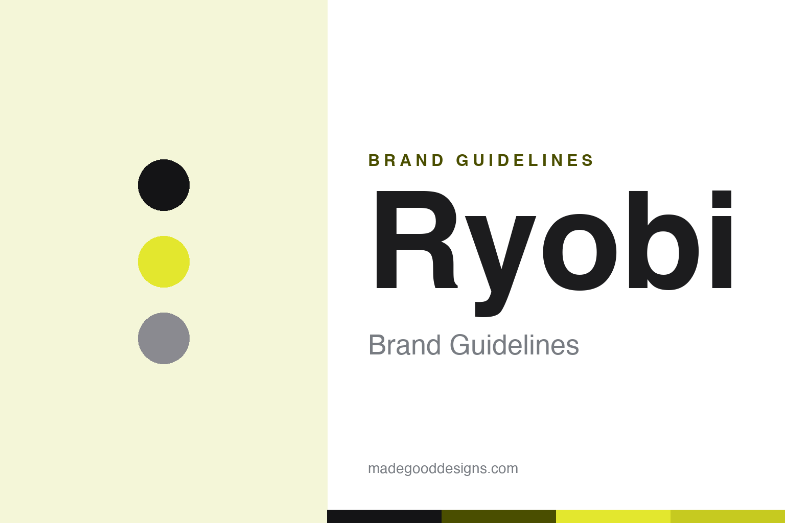
Ryobi lives in fluorescent lime and black. Click a swatch to copy the hex.
The RYOBI tools brand is defined by a fluorescent lime-green paired with black (and grey). The lime-green is loud, energetic and instantly recognisable — a high-visibility colour that pops on a Home Depot shelf and in a garage, signalling approachable, get-it-done DIY energy — while the black grounds it and reads as rugged and tool-like. It’s a bold, ownable scheme that stands well apart from the reds, yellows and teals of rival tool brands, making a RYOBI tool identifiable across a room. It’s the colour that is the brand. The honest caveat: neither Ryobi Limited nor TTI publishes an official public brand hex — the lime here (commonly cited around #E3E72E) is an approximate, community value, not a first-party spec. As a design note, this fluorescent lime is a fill/background colour, not a small-text colour — dark ink carries the type.
The lesson is own a loud, high-visibility colour in a crowded category. RYOBI’s lime-green is unmistakable among tool brands precisely because it’s so specific and consistent. For designers, it’s a reminder that in a category where everyone owns a colour, a bold and differentiated one is the whole identity. The takeaways: pick a loud, ownable colour that stands apart from rivals (the lime-green); keep type in a dark ink on the bright field; and treat specific hexes as approximate when no official spec is published.
Typography
The wordmark is a bold italicised sans — energetic and rugged.
Ryobi’s bold, slightly italicised sans wordmark — the uppercase “RYOBI,” usually green on black or black on green — is energetic and rugged. The heavy, forward-leaning letterforms read as active, powerful and get-it-done, matching a consumer tool brand built for weekend DIYers, and the italic gives it momentum and energy. Set in fluorescent lime and black, the type feels loud and approachable — exactly the accessible, DIY-friendly personality the RYOBI tools brand projects. (The logo has changed several times over the years; there’s no single enduring official tagline, and “ONE+” is the platform brand, not a slogan.) Because the exact face is proprietary and undocumented, the honest description is “a bold italicised sans,” not a named font. The type behaves like the brand: energetic, rugged and approachable.
Aa
A bold italicised sans — energetic and rugged. (Specimen set in Exo 2 italic, a bold techy sans in the spirit of the RYOBI wordmark; the real face is proprietary and undocumented.)
One battery, one system
ONE+ is Ryobi’s big idea.
The TTI-run RYOBI brand is a lesson in a platform that locks in loyalty. The ONE+ promise — one 18V battery that powers the entire, ever-growing range of tools — is brilliant brand strategy: once you own a few ONE+ batteries, every new RYOBI tool is cheaper (buy the bare tool, reuse your batteries), and switching to a rival means re-buying batteries. That compatibility, which TTI traces back to 1996, turns a colour and a name into an ecosystem with real lock-in, and it’s a big reason RYOBI dominates the consumer/DIY cordless market at Home Depot. It’s the razor-and-blades logic applied to power tools: the battery platform is the moat, the loud lime-green makes the family instantly recognisable, and Home Depot exclusivity concentrates the shelf. A simple, consistent promise — one battery, one system — became a durable competitive advantage.
For designers and brand-builders, RYOBI offers a clear takeaway: a consistent platform (plus an ownable colour) can turn products into a loyalty-building ecosystem. The lessons: build a compatible platform that rewards staying (ONE+ batteries); own a loud, recognisable colour so the family reads at a glance (the lime-green); and keep a simple, repeatable promise (“one battery, one system”). It’s also a reminder to keep the facts precise — Ryobi Limited was founded in 1943 in Japan in die casting (and still makes printing presses), while the green consumer tools are made by TTI under licence, sold exclusively at Home Depot in North America, built around the ONE+ platform, in a fluorescent lime-and-black identity. RYOBI’s ONE+ is its big idea — proof that a consistent platform and an ownable colour can build a loyal ecosystem.
Explore & save
Keep Ryobi’s identity on hand — save it to a board in the Made Good inspiration library.
Ryobi identity set
Pin the lime-and-black palette and the bold-sans spirit to your own board.