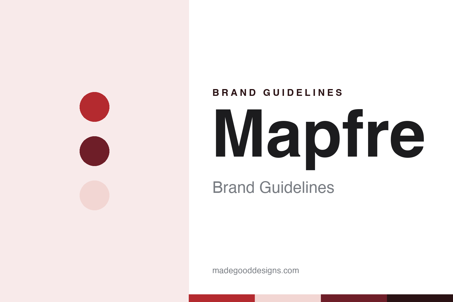
Mapfre Brand Guidelines
The Madrid farm mutual that became a multinational insurer.
Aa
Two constants: a Mapfre red, wine and pink palette and a humanist sans register. Abstract homage — not a Mapfre product or mark; no clover, logo or wordmark is reproduced.
A Farm Owners’ Mutual
Madrid, 1933, and a long acronym.
Mapfre began in Madrid on 16 May 1933, Spanish Wikipedia says, as the Mutualidad de Seguros de la Agrupación de Propietarios de Fincas Rústicas de España, a mutual set up through an association of rural landowners to insure farm workers as a new work-accident law came into force. The brand name is an acronym of that long title. English Wikipedia notes that the company now refers to itself only as Mapfre, a name it long set in capitals, MAPFRE. Spanish Wikipedia links the early backing to the Miguel-Romero family of Extremadura.
The first decades were uneven. In 1943 the mutual signed a ten-year agreement with the Ministry of Labour to help run a new compulsory state insurance scheme introduced by the Franco government, Spanish Wikipedia says, and by the mid-1950s the company was close to bankruptcy. English Wikipedia credits Ignacio Hernando de Larramendi, who took over general management in 1955, with putting it back on its feet. A later social-security law took work-accident cover out of private hands, and the business split in two: Mapfre Mutua Patronal, today Fremap, and Mapfre Mutualidad, which kept the private lines. Spanish Wikipedia ties the split to the 1963 social-security law, while English Wikipedia dates the separation to 1966.
From 1970 Mapfre was run as a group, with the mutual as parent and subsidiaries such as Mapfre Vida for life cover, English Wikipedia says. The Fundación Mapfre followed in the mid-1970s; Spanish Wikipedia dates its activity from 1975. In January 2007, Spanish Wikipedia says, a restructuring placed all of the group’s activities in the listed holding company Corporación Mapfre, renamed Mapfre S.A., with majority control assigned to the foundation and the rest of the shares traded on the stock exchange. The head office is in Majadahonda, outside Madrid, and the shares sit in the Ibex 35 index.
Colour
From Spain to five continents.
Expansion abroad began in the 1980s. English Wikipedia lists Mapfre RE, Mapfre Asistencia and Mapfre Vida Pensiones as set up in 1988, alongside a run of purchases in Latin America from the mid-1980s: Mapfre Aconcagua in Argentina in 1986, Seguros Tepeyac in Mexico in 1989, and Cruz Seguradora and Vera Cruz Vida e Previdência in Brazil in 1992. In 2010 the group put a strategic alliance with Banco do Brasil into effect.
The United States came by a separate route. Insurance Journal reported in July 2026 that Mapfre entered the country in 1995 by buying Western Pioneer Insurance in California, later renamed Commerce West, added the Automobile Club Insurance Company of Columbus, Ohio, in 1999 and bought The Commerce Group of Massachusetts in 2008. In 2017 Mapfre USA narrowed its focus to 11 core states. In the same July 2026 report, the publication said Mapfre had agreed to acquire Safety Insurance Group of Boston, which writes car, home and commercial vehicle cover, with closing expected in the first quarter of 2027; the deal was agreed in July 2026 and not completed at the time of writing, and Safety is to keep its own brand.
Closer to home, Mapfre launched Verti, a direct insurer for car and home cover, in Spain in 2011, Spanish Wikipedia says, and in 2015 bought Direct Line’s business in Italy and Germany. It organises its activity in four units, the same source says: insurance, assistance, global risks and reinsurance. In 2017 it raised its stake in the Indonesian insurer ABDA. English Wikipedia also lists InsureandGo, a British travel insurer bought in 2010 and sold again in 2021.
Typography
Design and documentation.
European insurers sell something that cannot be seen or held, so their identities do a great deal of the work. Many rely on a short wordmark or a simple symbol, often drawn in a single strong colour such as orange, blue, red or green, and repeated on offices, apps, letters and roadside-assistance vans. Several of these marks have been redrawn in recent years with softer shapes, lowercase letters or brighter tones meant to read well on small screens.
The language tends to be plain. Product pages for home, car, life and pension cover usually lead with short sentences about what is included, what a customer can expect when making a claim and how to get in touch, and campaign lines often speak directly to the reader. Photography leans towards customers, families, homes and everyday moments rather than abstract imagery, and many groups add illustration systems and short animations to explain how a policy or pension works.
Sponsorship is another common thread. Insurers attach their names to running events, football teams, sailing races, stadiums, music festivals and museums, which puts the colour and symbol in front of large audiences far from any policy document. Some also run foundations or corporate art collections that hold exhibitions under the group name.
The paperwork matters too. Listed insurers publish annual reports, sustainability reports and investor presentations that follow the same typography and colour rules as their marketing, and these documents are often the clearest public record of how a brand is applied in long-form layouts, charts and tables. For a designer, the useful lessons sit in that consistency: one mark, a short palette and a calm, readable voice used across many countries and channels.
Aa
A humanist sans — the register of a lowercase wordmark. (Specimen set in Nunito Sans, a sans STAND-IN; NOT the Mapfre logo or its custom typeface.)
Mapfre
A clover set free from its circle.
The current identity arrived on 8 January 2026. As 20minutos and El Español reported that day, Mapfre kept its three-leaf clover but freed it from the circle that had enclosed it, set the name in lowercase letters and made its red brighter and better suited to screens. The work was done with Design Bridge and Partners, part of WPP, after almost two years, and a Mapfre executive called it the first global brand campaign in the company’s more than 90 years. 20minutos reported that the previous logo change came in 2015, when a “bridge” element was removed, and that the mark had been modified 15 times over the company’s history. The roll-out began at the Majadahonda head office and is to reach offices, websites and roadside-assistance trucks over the next few years; Verti keeps its own identity, and the assistance arm Mawdy is to follow with its own redesign in 2027.
The company’s brand page explains the parts. It calls the clover “our legacy,” describes the new lowercase logo as more approachable and contemporary, and says its red now sits alongside a wider set of new shades. It also lists a custom-made typeface with humanist geometry and high contrast, a set of illustrations and a renewed sound logo. The line it leads with is “We care about what matters to you,” and it names five values: solvency, innovation, service, integrity and team.
Beyond the logo, Mapfre has spent decades in sport and culture. English Wikipedia lists the tennis player Rafael Nadal among its sponsorships, along with a team in the 2014–2015 Volvo Ocean Race and the naming rights to the Columbus Crew’s stadium in Ohio, called Mapfre Stadium from 2015 until the deal ended in 2020. Fundación Mapfre runs exhibition spaces for photography and painting, including a Madrid photography space opened in 2014, the Casa Garriga Nogués in Barcelona from 2015 and the Espacio Miró, opened in Madrid in December 2016.
For a design guide, Mapfre shows how a long-running symbol can be loosened rather than replaced. Compare Allianz and AXA, two other European insurers whose marks are used across many countries. For this guide we use a bright red, a deep wine and a soft pink with warm greys and a humanist sans, an unofficial interpretation; no product or logo is reproduced.
Explore & save
Keep Mapfre’s identity on hand — save it to a board in the Made Good inspiration library.
Mapfre identity set
Pin the Mapfre red, wine & pink palette and the humanist sans register to your own board.