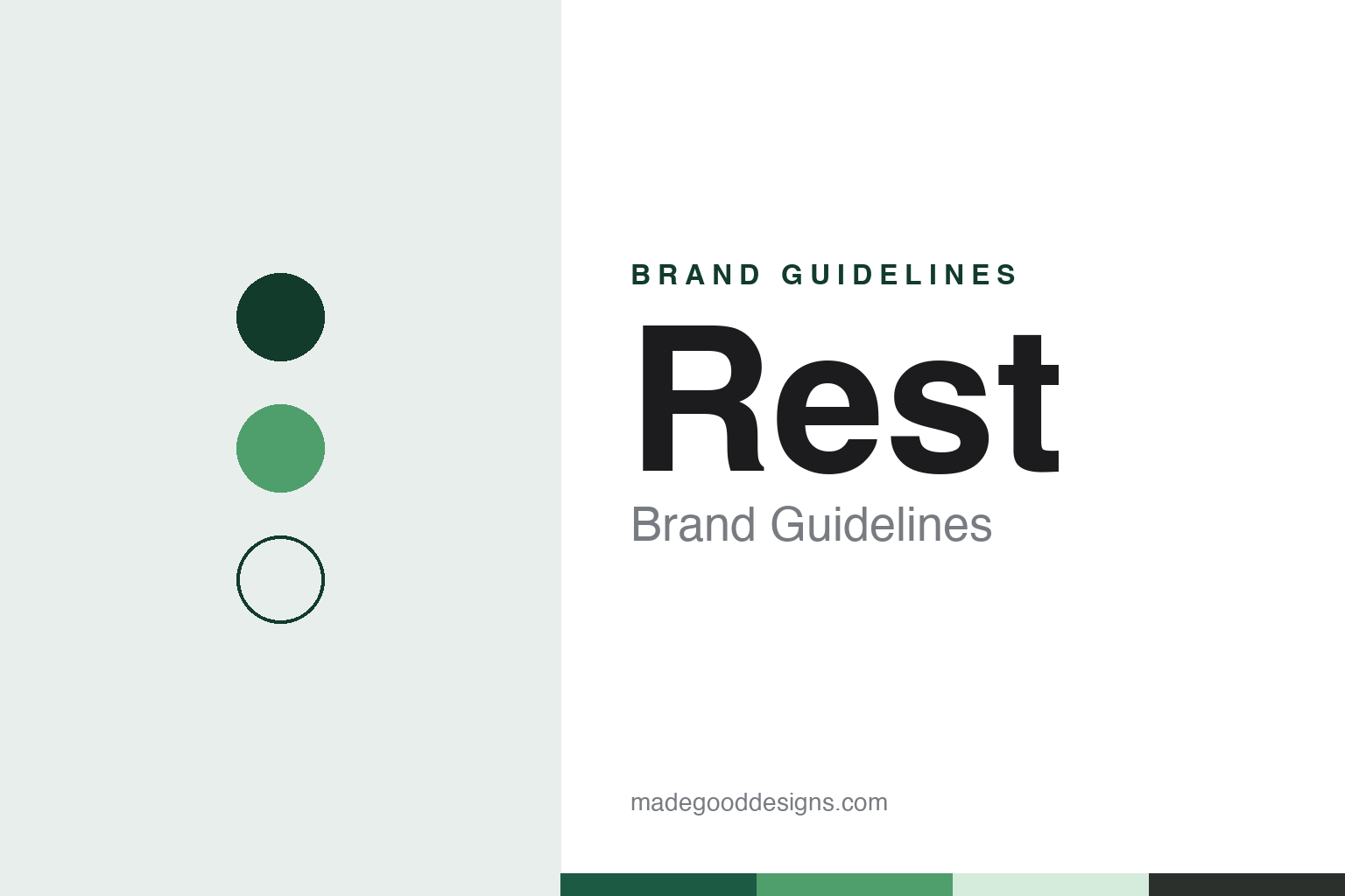
Rest Brand Guidelines
A retail workers’ fund that made “simple” its whole identity.
Aa
Two constants: a green, mint and charcoal palette and a rounded modern sans register. Abstract homage — not a Rest asset; no logo, heart symbol or campaign image is reproduced.
Retail Employees Superannuation Trust
A 1988 fund rooted in the retail trade.
Rest is the trading name of the Retail Employees Superannuation Trust, an Australian superannuation fund. The fund says it was established in 1988, and English Wikipedia describes it as an industry fund founded that year. Its trustee is a company, Retail Employees Superannuation Pty Ltd.
As its full name suggests, the fund grew up around the retail trade. Its board has long mixed employee and employer nominees: English Wikipedia says four directors are nominated on behalf of employees by the Shop, Distributive and Allied Employees Association and four on behalf of employers and employer associations. Rest’s own media page now describes a board of nine trustee directors: four nominated by employee representatives, four nominated by employer bodies, and an independent director as chair.
Rest says it has been known for its large membership in the retail industry, but that its members now come from many industries, and that as a regulated public offer fund it is open to any Australian who is eligible to receive superannuation. Its administration has been handled since 1992 by Australian Administration Services, a Parramatta-based administrator that is now part of MUFG Pension & Market Services, according to English Wikipedia, which says the administrator provides full administrative and call-centre services.
The fund describes itself as profit-to-member, meaning that profits go back to members, and as one of Australia’s largest such funds by membership. It gives its membership as more than 2 million, of whom about 60% are women and about half are under 30, as at 30 September 2026. Mediaweek reported in March 2024 that Rest said it represented around one in seven working Australians, including more than a million people younger than 30.
Colour
A 2020 settlement on climate risk.
Rest became widely known beyond the superannuation industry in November 2020. On 2 November that year The Guardian reported that the fund had settled a court case brought by a 25-year-old member, who had argued that it failed to act in his interests by not properly considering the risks climate change posed to its investments. The settlement was reached as the trial was due to start.
Under the settlement, The Guardian reported, the fund committed to ensure its actions were consistent with a net zero carbon footprint by 2050, to disclose its full portfolio holdings, to conduct climate scenario analysis to inform its investment strategy, and to encourage the companies it invests in to comply with the goals of the Paris agreement. In a statement quoted by the newspaper, the fund said climate change was “a material, direct and current financial risk” across several risk categories, including investment, market and reputational risk. The case had been described as the first legal test of whether the requirement for super funds to keep members informed applied to climate-related risks, The Guardian said.
The fund’s more recent announcements lean on everyday digital service. Rest says that in the 2026 financial year more than 947,000 members logged into the Rest App, and in September 2026 it described new in-app pathways to advice, letting members book appointments with its super specialists from inside the app. The same month it launched Fund-amentals, a digital learning program built with the youth platform Anyway to help young Australians understand their super, alongside research by Anyway into how people aged 14 to 25 understand superannuation.
Typography
How super funds present themselves.
Australian superannuation funds and wealth firms present themselves to members as much as to the public, and a fund’s identity has to work inside an account as well as in an advertisement: on a login screen, in an app, on a yearly statement and in an annual report. The funds in this guide tend to use friendly sans-serif wordmarks, and their palettes often reach for teal, purple, orange and navy.
Their language is member-first. Industry funds describe themselves as run for members, and many carry their origins in their names: a trade, a sector, a state or an employer. Mergers have blurred those names over time, and several funds now carry names that no longer point to a single industry or state. Their websites often say which workers a fund was set up for, even after it has opened to everyone.
The pictures follow the same idea. Fund websites and reports tend to show members at work and at home in everyday settings rather than buildings or products. The pages themselves are practical: what super is, how to join or combine accounts, retirement income, insurance in super, and member tools such as calculators and retirement planners, with annual reports and governance pages for those who look further.
This guide sets out what can be checked about each fund or firm: when it was founded, how it merged, who owns or runs it, and how regulators have dealt with it, with figures for members and assets given only as a dated source states them. The palettes and typefaces shown are unofficial interpretations, and no logo or mark is reproduced.
Aa
A rounded modern sans for a one-word name. (Specimen set in DM Sans, a sans STAND-IN; NOT the Rest logo or typeface.)
A heart and a green
From REST Industry Super to Rest.
The name itself has changed shape. In April 2018 Mumbrella reported that the fund, then known as REST Industry Super, had rebranded to Rest, written in upper and lower case, in what the fund described as its first major brand repositioning since 1988, reflecting its transformation, strategic direction and customer focus.
In December 2023 the agency Reunion won Rest’s creative account, and in March 2024 it launched “Super.Simple”, a campaign that turned the fund’s “super simple” mission into a series of ads drawing humour from everyday challenges, Mediaweek reported. The work ran on broadcast television, streaming video, cinema, outdoor, digital and social channels and on Rest’s own platforms. The fund’s stated purpose, on its website, is to “create super our members love,” and its mission is to “make super simple.”
Six months later came a visual refresh. In September 2024 B&T and Mumbrella reported that KPMG Creates had worked with Rest on a refreshed identity, rolling out first on its website and app and then across its digital platforms and member communications. According to B&T, the refresh brought a streamlined logo whose standout feature is a heart symbol, meant to show members at the heart of the fund; a refined colour palette with green as the signature colour; new design elements for mobile screens; and an AI tool that generates non-photographic visuals for member communications. Rest’s chief member officer called the refresh “more than a facelift” and “a statement of purpose,” and a KPMG partner said it was the result of three years of collaboration with the fund.
For a design guide, Rest shows how a fund can reduce a long institutional name to one short word and carry a single idea, simplicity, through campaign, app and logo alike. Compare Australian Retirement Trust, which built its brand around a character, and AustralianSuper. For this guide we use a deep green, a leaf green, a pale mint and charcoal with a sans, an unofficial interpretation; no product or logo is reproduced.
Explore & save
Keep Rest’s identity on hand — save it to a board in the Made Good inspiration library.
Rest identity set
Save the green, mint and charcoal palette and the rounded modern sans register to your own board.