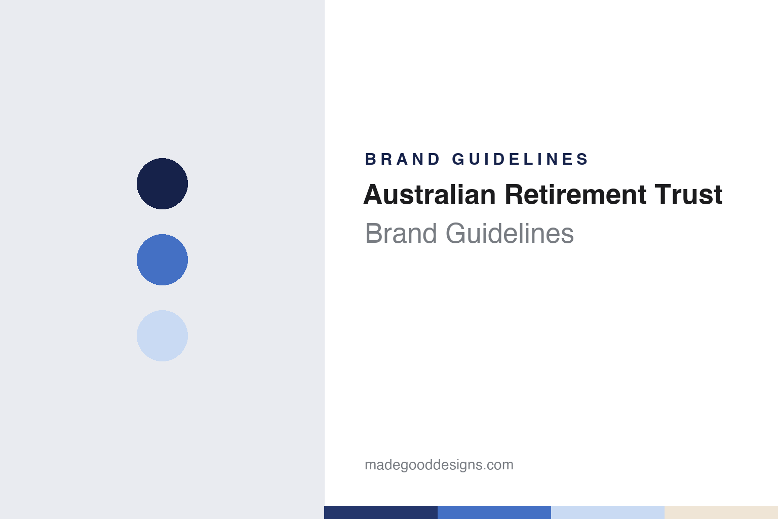
Australian Retirement Trust Brand Guidelines
Two Queensland funds, one short name and a blue monster.
Aa
Two constants: a navy, blue and sand palette and a friendly geometric sans register. Abstract homage — not an Australian Retirement Trust asset; no logo, character or campaign image is reproduced.
Two Queensland funds
A 1912 state scheme and a 1987 multi-industry fund.
Australian Retirement Trust, usually shortened to ART, is a superannuation fund headquartered in Brisbane. It came into being on 28 February 2022, when two Queensland funds, Sunsuper and QSuper, merged, according to English Wikipedia and the trade title Chief Investment Officer, which reported the merger in March 2022. English Wikipedia calls it the largest superannuation fund merger in Australian history.
The older of the two partners was QSuper. English Wikipedia traces it to Queensland’s Public Service Superannuation Act 1912. For most of its life it served the state’s public-sector employees, and its fund was managed by a board of trustees known as the QSuper Board. Legislation passed by the Queensland Government on 1 December 2016 lifted the rule that had limited applications to government employees and their spouses, with effect from 30 June 2017, the same article says.
Sunsuper was younger and built differently. It was established in Brisbane in 1987 as a multi-industry fund open to all workers and run on a profit-for-members basis, English Wikipedia says. Its trustee board had equal numbers of independent directors, member representatives and employer representatives, and its sponsors included the Queensland Chamber of Commerce and Industry and the Queensland Council of Unions. Through the late 2010s Sunsuper took in a series of smaller funds: a merger with Kinetic Super was announced in April 2017, AustSafe Super joined in March 2019, CBH Super in April 2019 and the IAG & NRMA Superannuation Plan in November 2020. Sunsuper also lent its name to Riverfire, Brisbane’s public fireworks event, according to the same article.
The two funds announced their merger in March 2021. Chief Investment Officer reported that they had been in talks for about two years before that announcement, and that one aim set out in their press releases was to reduce fees through size. At launch the new fund’s chief investment officer came from Sunsuper, the magazine said.
Colour
A merger fund that kept merging.
ART did not stop at two. The Australia Post Superannuation Scheme was set to transfer into the new fund on 30 April 2022, two months after launch, Chief Investment Officer reported, and English Wikipedia records that it did so on that date. The magazine quoted the scheme’s independent chairman as saying that a review begun three years earlier had led it to choose a successor fund transfer into ART. In May 2022 Woolworths appointed ART to run its corporate superannuation, English Wikipedia says.
Corporate funds kept arriving. In July 2024 the board of Qantas Super confirmed plans to merge into ART, subject to a final assessment of members’ financial interests, Chief Investment Officer reported. The airline fund, which had looked after its members’ retirement savings for 85 years, had about 26,000 members, and it said it chose ART partly because ART was “one of the largest defined benefit administrators” with the expertise to run a fund that had both defined benefit and accumulation divisions. Qantas Super also said the move would give its members a broader choice of investment options, digital and education tools, seminars and advice. English Wikipedia dates the completed merger to 29 March 2025.
At launch, ART’s chief executive described it as “the second-largest super fund in the industry,” Chief Investment Officer reported in March 2022. In September 2026 Mediaweek described it as one of Australia’s largest superannuation funds, with more than 2.4 million members.
The merger trend is wider than one fund. Chief Investment Officer noted in 2022 that fifteen Australian super fund mergers had been announced in 2021, according to KPMG Australia, and that a JP Morgan survey found about half of Australian pension fund leaders expected mergers to increase.
Typography
How super funds present themselves.
Australian superannuation funds and wealth firms present themselves to members as much as to the public, and a fund’s identity has to work inside an account as well as in an advertisement: on a login screen, in an app, on a yearly statement and in an annual report. The funds in this guide tend to use friendly sans-serif wordmarks, and their palettes often reach for teal, purple, orange and navy.
Their language is member-first. Industry funds describe themselves as run for members, and many carry their origins in their names: a trade, a sector, a state or an employer. Mergers have blurred those names over time, and several funds now carry names that no longer point to a single industry or state. Their websites often say which workers a fund was set up for, even after it has opened to everyone.
The pictures follow the same idea. Fund websites and reports tend to show members at work and at home in everyday settings rather than buildings or products. The pages themselves are practical: what super is, how to join or combine accounts, retirement income, insurance in super, and member tools such as calculators and retirement planners, with annual reports and governance pages for those who look further.
This guide sets out what can be checked about each fund or firm: when it was founded, how it merged, who owns or runs it, and how regulators have dealt with it, with figures for members and assets given only as a dated source states them. The palettes and typefaces shown are unofficial interpretations, and no logo or mark is reproduced.
Aa
A friendly geometric sans for a short, three-letter name. (Specimen set in Plus Jakarta Sans, a sans STAND-IN; NOT the Australian Retirement Trust logo or typeface.)
Awaken Your Super
A young brand and a blue monster.
A merged fund needs a name people recognise, and ART has built much of its brand through advertising. In April 2024 it launched “Awaken Your Super”, a campaign developed with M&C Saatchi and the media agency Bohemia Group, Mediaweek reported. Its central idea was a visual metaphor: a monster, brought to life by The Glue Society, standing for the “monstrous” potential of a member’s super, and inviting people to take control of their own “monster” through ART. The fund’s marketing head told Mediaweek that the young brand wanted to build awareness and trust quickly in order to grow; the launch ran across outdoor sites, social media and bespoke integrations.
The monster has since become a fixture. In September 2026 Mediaweek reported that Saatchi & Saatchi had won ART’s creative account after a competitive tender and would evolve the Awaken Your Super platform, including the role of the fund’s blue super monster, Artie. The fund’s chief member experience officer described its role as “guardians of our members’ retirement savings.”
The approach is character-led. The campaign returns to one creature, and the character’s name, Artie, echoes the fund’s short form, ART. The full name, Australian Retirement Trust, names neither an industry nor a state, which fits a fund assembled from a state public-sector scheme, a multi-industry fund and a run of corporate plans.
For a design guide, Australian Retirement Trust shows how a fund formed by merger can give a long institutional name a short form and a single recurring character. Compare AustralianSuper, another Australian super fund, and Rest, which refreshed its identity in 2024. For this guide we use a deep navy, a clear blue, a pale sky and a warm sand with a sans, an unofficial interpretation; no product or logo is reproduced.
Explore & save
Keep Australian Retirement Trust’s identity on hand — save it to a board in the Made Good inspiration library.
Australian Retirement Trust identity set
Save the navy, blue and sand palette and the friendly geometric sans register to your own board.